


Remember when you were a student in high school and had textbooks with hundreds of pages of information?
Do you recall how daunting it felt to have to read that information every day in class?
If someone told me that a creative infographic could summarize all that information AND make it visually stimulating, I would’ve immediately thrown my textbook away without a second thought.
Don’t believe me?
Just check out how powerful some of these creative infographics are! Below we have collected over 75 of our favorite infographics just for you.
To make it easier to find examples relevant to you, I’ve organized the infographic examples by different types of creative infographics.
Click the links below to jump ahead:
- Timeline Infographics
- Process Infographic
- Creative Infographics
- Business Infographics
- Marketing Infographics
- Comparison Infographics
- List Infographics
- Statistical Infographics
- Food Infographics
New to infographics? Get a simple definition of an infographic plus more amazing examples.
Creative Timeline Infographics
1. Vibrant Design Creative Infographic Template
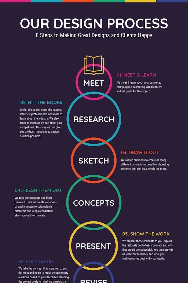
Every designer has a unique design process that they follow. This process infographic example visualizes the creative timeline of one of the Venngage designers from start to finish.
What really stuck out to me in this infographic example is how they used circles to show how long each step usually takes. This gives the infographic a ton of extra content, without having to spell it out to the reader.
2. Evolution Of The Internet Timeline Infographic

Sometimes the information for each date on your timeline isn’t exactly the same size or length. One point might only need a few words, and the next might need a paragraph.
To prevent your infographic from looking too cluttered, use an alternating pattern of date and description, like above. They also used an alternating pattern to give each point some extra space!
Additionally, this approach allowed them to keep the spacing between each date on the actual timeline consistent.
3. Morning Routine Timeline Infographic Template

Not all timeline templates have to look exactly the same. In fact, you don’t even have to have an actual timeline in your infographic, as you can see above.
A simple format like this is perfect if you only have a handful of points or dates you want to visualize. Sometimes it helps to keep things simple, especially with infographics.
This template is perfect because you can quickly swap the icons and add your own text in a matter of minutes.

4. Olympic Evolution Timeline Circle Infographic

At first, this timeline infographic may look a bit overwhelming but you’re able to quickly see how creative it is.
The objective of the infographic is achieved with very little written content, using just flags and circular lines. There are barely any words but you’re still able to gather a lot of information based solely on the shape of the timeline.
5. Story of Jazz Infographic Example
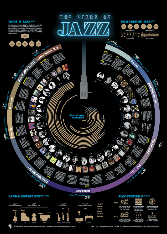
I’m automatically drawn to this creative infographic because of the circular timeline and the neon title. If you’re looking for a summary of jazz history from the 1700s-1990s, this infographic is for you!
This timeline uses images to illustrate interesting facts and concepts. It translates pictures into information. Its circular design is able to compress a large amount of information in just a page.
6. Nicotine Withdrawal Side Effects Timeline Infographic

Source: now-stop-smoking.blogspot.com
This timeline infographic compiles a lot of information in a simple and easy to read infographic. If you’re a smoker and thinking about quitting, the infographic breaks down what to expect day-by-day.
What’s interesting about this infographic, outside of its aesthetics, is its ability to draw an emotional response. It leaves a hopeful impression on you.
The images and icons make the infographic more engaging and the fonts and colors are used strategically to highlight the most important information. I’ll be sending this out to my smoker friends.
7. NASA Deep Space Missions Timeline Infographic

Looking at this timeline infographic may seem a little complicated at first glance because of the density of the information, as it did for me. But, the illustrator does a great job of making the infographic flow in a manner that is easy to follow.
There’s a lot of vertical movement in this creative infographic that allows for a cohesive understanding of the information being displayed.
The lines, colors, and imagery immediately capture the attention of the audience, leaving you in a spacey dream-like state.
8. Picasso’s Paintings Timeline Infographic

It’s interesting that despite this infographic being about a painter, the creator chooses to keep it colorless. This approach forces the audience to focus on the information displayed rather than getting distracted by colors and images.
The intention behind this timeline infographic is to display all of Picasso’s work, in just one infographic and through a single linear form. With an almost infinite number of works, it’s incredible how much information can be displayed in a single infographic.
9. Timeline of a Great Burger Infographic

This infographic does a great job of making you hungry for a huge burger. Speaking of that, is it lunchtime yet?
The visuals of the infographic design are central to the timeline infographic, and they contrast extremely well with the simple negative space behind it. The number of the years also jump off the page, demanding your focus because of the large font.
10. Pink Floyd Horizontal Timeline Infographic Example

Source: tomorrowsverse.com
Instantly, the bright pink hues against the neutral black background jump off the page and grabs your attention. If you want parts of your design to jump off the page, use contrasting colors.
The explosion of color evokes a curiosity that makes you examine what this timeline infographic is actually all about.
For such an elaborate design, the words are minimal yet effective.
11. Fashion’s Biggest Brands On Social Media Timeline Infographic

Any fashion enthusiast would relate to the appeal of this design. What’s appealing about this infographic is the hand-illustrated fashion drawings that make this infographic unique and interesting than any other infographic.
The images look raw and authentic, they barely look digital. The color palette is gentle, giving the impression that watercolors were used. Using well known social media icons also give the infographic a feeling of familiarity.
The information is not overwhelming and it is easy to follow for anyone interested in the relationship of social media to high fashion brands.
Creative Process Infographics
12. Product Design Roadmap Infographic Template

As you can see, not all process infographics have to follow the traditional or linear format. In this roadmap infographic template, the creators used a circle to show that this process can be continuous and used for multiple products or projects.
I really like how compact this infographic is as well. You can quickly absorb this information in a minute or two just by following the circle. A small infographic like this can easily be sent to your team, shared on social media, or even turned into a poster!
13. 6 Step Creative Infographic Template

This creative example shows how the infographic creation process takes a lot of steps to get right. It also illustrates, how you need to go through all of them before you can create a fantastic infographic.
Color coding each of the steps and icons make it easy to move through this process as well. But I think the best part of this infographic is how the designers highlighted key phrases in different colors and font weights.
14. Bizarre Animal Facts Process Infographic Template

How do you turn a relatively simple process into an interesting infographic? By using a lot of unique icons, a vivid color palette and keep your text brief, like in this creative infographic.
Additionally, I really like how this designer used a zig-zag pattern to illustrate the process.
Now this infographic might stand out already because of the rather unique process of making coffee. But all of the design elements come together to elevate it!
15. How To Write A Resume Process Infographic Template

For such a mundane topic, this designer used a unique S layout to create a process infographic.
There are probably thousands of creative infographics and articles about crafting the perfect resume. We even have a few on our blog.
But this infographic stands out from the others because of the unique layout. If you want to create an infographic about a rather simple topic, make sure the design is actually unique or eye-catching.
16. Interconnected World of Tech Process Infographics

The designers of this infographic did a great job portraying how the tech world is so interconnected. You find yourself getting lost in the wealth of information, intrigued by all the little details.
It also evokes a feeling of nostalgia, reminding you of companies you forgot existed but may have been important to you at one point.
Although it’s a long infographic, the illustrator does a great job of making it easy to follow. With an infographic like this, it’s probably best to avoid complex graphics and let the content be the focal point.
17. Simple Hiring Timeline Creative Infographic

Source: openviewpartners.com
Making certain business decisions may be difficult, but HR infographics like this one should make the process a bit easier for you.
This infographic has many statistics and great complementary colors. The efficiency of the data visualization allows for the infographic to act as a storyteller with a purpose. It’s visually appealing and the layout is organized in a manner that allows the icons to stand out.
The data is balanced in its form and function. In order to have successful infographics such as this one, making sure that your main points are only outlined is essential.
Polluting the infographic with points that are not important will cause people to lose interest and get lost, using infographic templates helps you outline your main ideas.
18. How To Make An Apple Pie Process Infographics

Simple as pie. This infographic keeps it simple and cohesive, making you want to make an apple pie this minute. But don’t, we still have like 50 infographics left on this list!
The creator begins by displaying the amount of time it would take during each stage of the recipe using a pie chart. Creative! The icons of the ingredients make the infographic easy to follow despite the lack of color.
As you can see, you can definitely get away with a lack of color in an infographic if approached correctly.
19. Emotional Self Care Guide Process Infographic

The colors in this process infographic immediately evoke a calming feeling, which is a perfect fit for its theme. With 5 simple yet uplifting tips, you’re left with a sense of compelling motivation.
The alternating layout and visually appealing images, that fit with the theme, makes it easy to jump from one point to the next.
The entire infographic is filled with tasteful graphics that compliment the layout. I’d definitely hang this up somewhere in my home.
20. Short Film Creative Process Infographic

I didn’t think I’d want to create my own short film until I stumbled on this process infographic. It does an excellent job at breaking down the complicated information for any level of filmmaker, using a flow chart strategy.
The various lines in this flow chart connect all the graphics and processes allow for the infographic to not feel overwhelming. Including connecting lines like this makes creative infographics extremely easy to follow.
Everything from the steps to costs, to important stakeholders, is included as well. Now that I know so much about making a short film, I’m about to spend my weekend filming!
21. The Creative Process Infographic Example
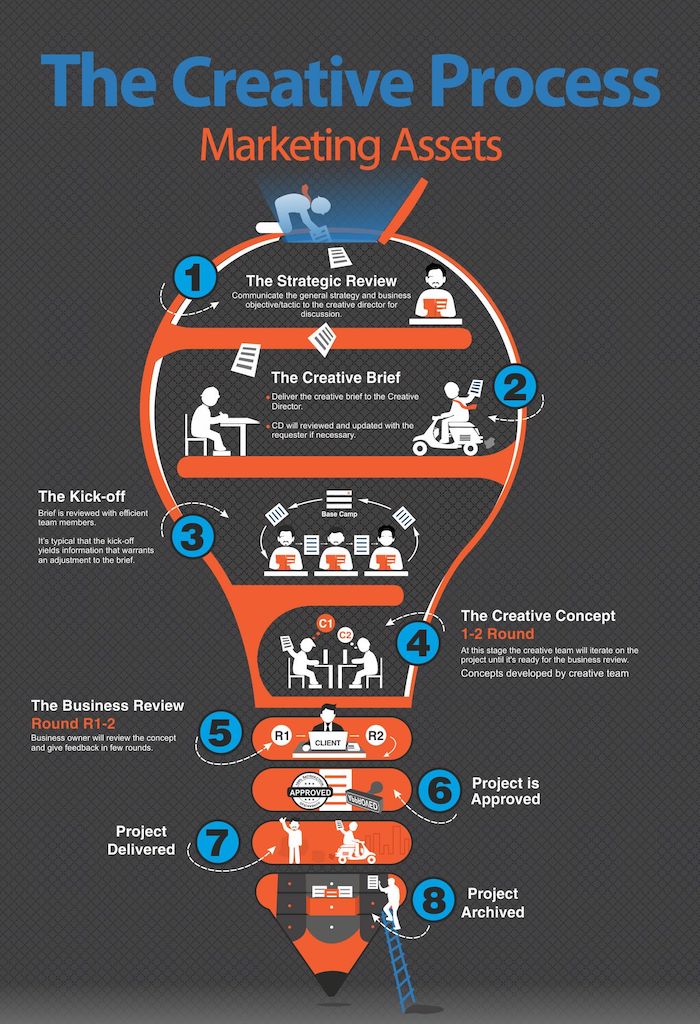
With the majority of people being visual learners, an infographic with a focus on visuals is one that will automatically resonate with its audience.
The light bulb layout with the lines separating the process allows for your eyes to be drawn into not only the accessible organization but the colors and patterns.
The various illustrations make it go from boring to alluring. Little words are used as the visuals illustrate the process, making it quick to read and understand.
General Creative Infographics
22. Geological Layers Creative Infographic

If you like geology, you’re going to enjoy this creative infographic.
3D visualization modernizes your infographic. It generates more attention because of its complexity and attention to detail. It’s a great method to use if you have boring information that you need to make more interesting.
Do you ever really think about the layers of soils beneath you? Now you will. Sometimes your information can be displayed by using one very detailed infographic, which requires a good designer.
23. New York Map Creative Infographic

Using a map of New York City, the author of this infographic is able to illustrate all the major landmarks and points of interest.
As you can see, they used almost no words on this entire map infographic. Instead, they used a hundred or more unique icons to clearly illustrate the Big Apple.
24. Two-Wheeled Technique Bicycle Creative Infographic

Want to learn about everything there is to know about bicycles? Then this is the perfect infographic for you.
This creative infographic outlines not only the history and types of bikes, but it also elaborates on tire sizes, gears, parts, tools and safety with very relevant images. It truly is a one-stop-shop for all things bikes!
25. Captain Marvel Comparison Infographic

For anyone who appreciates comic books, this comparison infographic not only gives you great visuals, but it’s filled with lots of facts about Captain Marvel. There’s great attention to detail in each illustration and the images speak for themselves.
Coming directly from the Marvel team, this creative infographic is professional from the start.
They have done a great job at making the infographic rich in facts and information, but not making it feel overwhelming or cluttered. As we know, visual storytelling is a strong suit for Marvel.
26. How To Be A Street Artist Creative Infographic
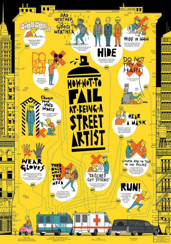
Have you ever had the urge to just buy some spray paint and vandalize a wall somewhere in your city? No? Oh, me neither.
The creator of the infographic explores every important aspect of creating street art, in an entertaining manner. Despite all the graphics and colors, the information is simple and readable.
I liked this infographic because it sticks to the street art theme with all of the graphics. It also is an excellent guide for anyone who is interested in getting into street art.
27. Self Care Types Creative Infographic

I think it’s important for any mental health infographic to have a somewhat calming color palette or theme. I’m a sucker for cute and colorful infographics, they automatically put me in a good mood.
This infographic lists all the types of self-care that are important to achieving a balanced lifestyle, which is an important reminder for anyone. The handwritten fonts and cute illustrated icons make the information feel more authentic.
28. Nuclear Slowdown Creative Infographic

For any fans of Netflix’s Chernobyl, your nuclear interests will be elevated with this infographic.
This designer used multiple colors to differentiate between the different categories and stretches out to display longer time periods.
It also lists major nuclear incidents that have happened in the past, in general, it gives a great overview of nuclear history in the world. The legend makes it easy to follow given how complex the graph appears.
29. The Hunters and the Hunted Infographic Example

You can’t look at this infographic and not admire the artistic talent behind the focal image. It’s easy to draw people into what you have to say when the main subject is attention-grabbing, like in this creative infographic example.
This infographic examines all aspects of whaling in Japan and all the stats associated with the issue. It’s a great summary for such a heavy topic, that people may otherwise not care to know so much about.
Creative Business Infographics
30. How to Earn Money Creative Infographic

Sometimes you can get away with creating a pretty simple infographic if the information it contains is valuable, like in this case.
If you don’t want to take a traditional job, this infographic outlines over 150 apps that you can make money with.
This infographic is organized very well and is visually appealing. There are no distracting images or information. I may just explore some of these opportunities–I’m convinced!
31. AI Startup Industries Business Infographic

This infographic is successful in making a complicated process easy to follow.
There are four graphs being presented that are all related to each other and as a result interconnect. This minimalist color scheme and font selection gives the infographic a sleek finish that works for the audience it is targeting.
32. Online Product Management Infographic Example

For anyone who requires more clarity on the role of a product manager, this infographic does a good job. This business product management infographic is heavy on the graphics. It’s bright and has a nonlinear layout. The circular design of the gears attracts your attention.
The colors differentiate each gear to bring together the explanation of product management.
33. Simple Carpet Business Infographic Example

This business infographic definitely makes boring product information a lot more interesting. The designer used a bold yellow to highlight the most important info, and draw your eye to the infographic.
The layout is busy but the neutral color scheme font allows it to get in the way of fulfilling its purpose. This infographic has you visually wired and does a great job at convincing you that the product is worth giving a chance.
34. Women in Business Creative Infographic Example

The more women in business, the better. This business infographic is has a traditional layout, but that doesn’t mean it’s not interesting or useful. The infographic would not be easy to read if it didn’t have diverse data visualizations
It uses colors to distinguish between the data being presented. It’s snackable and not complex. Finally, the infographic brings value and is well structured.
Creative Marketing Infographics
35. Social Media Marketing Infographic Template

Like the Graphic Design Trends infographic, this infographic template actually includes design tips with real-world examples. You can tell people about something all day, but unless you show them, it will never click. Especially when it comes to something so visually driven.
A social media infographic like this will definitely stand out on Twitter, Pinterest or Facebook because of the gradients, eye-catching images, and bold fonts. And that just happens to be where the people that would benefit from this information are. Who would have thought?
Also, if you’re going to tell people how to design better social media images…you better create a beautiful infographic. Otherwise, you won’t be seen as an actual authority on that topic.
36. Conversion Rate Marketing Infographic Template

There’s a lot to like about this creative marketing infographic, from the bold color palette to the terrific font combinations. But I think the thing that makes this infographic template great is the simple lines that take you from one point to the next.
There really isn’t anything special about them, but they will help pull readers further into your infographic or content.
A simple guideline like this is usually used for timeline or process infographics. But you can use it on really any infographic. Just make sure the lines don’t distract from the main content.
37. Freelancer Marketing Strategy Statistics Infographic Template

There’s a TON of interesting information in this creative marketing infographic but it doesn’t feel overwhelming. Our team worked hard collecting a lot of data to find the best marketing strategies.
The designer of this template used a combination of different infographic charts and graphs to present the data in an engaging way. Instead of using the same bar graph for each section, they mixed it up as much as possible.
Variety is always good when presenting a lot of information. Not to mention, the color palette they selected will grab the reader’s attention instantly. I mean, who else is using vivid colors like that?
38. 14 Visual Content Marketing Statistics Infographic Template

This creative infographic template another example that is filled with a ton of interesting data about visual content marketing, without feeling like a chore to read.
First, they use a bunch of different data visualizations, such as pie charts, icon graphs and more, that fit each of the sections very well. Only a few are actually repeated throughout the 14 sections!
Next, the designer used icons to draw your eye to important information in each section. Whether it be to give the graph more context or simply highlight a key statistic.
Finally, the varied color palette made it easy to jump from one section to the next, without feeling overwhelmed. I would recommend using this alternating color tactic if you want to make your infographics easy to scan or read on smaller devices.
39. 6 Blog Mistakes Marketing Infographic Template

This marketing infographic has some actionable tips and tricks that you can use on your blog right now!
I really like how the creator used a different colored box to place a helpful tip in each section of this infographic. By placing the icons right next to each box, the reader’s eye will naturally be pulled directly to the tips as well.
These tips will stand out to a reader, and push them to, hopefully, read your whole infographic or blog post. Plus, if someone only remembers those simple tips that you highlighted in your infographic, you still provided value to them!
40. Social Sites Creative Infographic Example
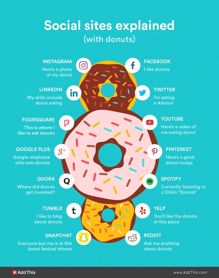
The first word that comes to mind when I look at this infographic is: delicious. This infographic is a great example of how to use some humor and a few words to display an entertaining yet informative infographic.
It doesn’t need to be an intricate design, the infographic can be simple yet achieve the same results. This infographic catches your eyes then pulls you into the main content, a great strategy to get people interested in your infographic!
Creative Comparison Infographics
41. Types of Rocks Comparison Infographic Template

I bet you didn’t think you would find a creative infographic about rocks in this article. Right? Well, I know that rocks aren’t the most exciting infographic topic but this designer made me want to learn more.
Instead of using boring stock photos of rocks, this infographic features colorful icons that grab your attention instantly. This approach also made the infographic very visually consistent across each section. On the whole, it rocks.
Additionally, the creator didn’t try to get too technical when describing each of the rocks. Instead, they made it easy for almost anyone to absorb some helpful information in a few minutes.
42. Coffee vs. Tea Comparison Infographic Template

Coffee vs. tea might be the oldest rivalry in the book.
This simple creative infographic breaks each drink down to its core components to make it easy to make direct comparisons. The simple color palette also makes you keep the information organized, without being a distraction as well.
Now you can make an informed decision about what is the superior drink, which is obviously coffee.
43. Hip Hop Love Blueprint Comparison Infographic

This incredibly creative comparison infographic is an immediate show stopper. The blueprint theme automatically makes this infographic seem like it’s from an engineer’s office, yet it’s about hip hop.
The blueprint design of this infographic makes you feel like some sort of detective. Plus the intricacies of this infographic are amazing, it goes into such detail and has so many connections within each area.
If you have what seems like never-ending information, use a blueprint design to your advantage. It requires no images, yet still visualizes your data in a fascinating way for your audience.
44. Colors of Indian Classical Music Infographic

This infographic shows the connection between Indian music and the cycle of days, seasons, and moods–a new and refreshing topic.
The main graphic in this creative infographic flows seamlessly to display the content because of all the connecting lines. Despite including lots of information, the creator does a great job organizing the infographic so that the information doesn’t feel overwhelming.
The colors and icons complement the font and give the impression of a professional-looking infographic.
45. What Can I Control Comparison Infographic

The simplicity of this comparison infographic is what makes it so captivating. A simple neutral background color to make the colors pop off the infographic.
The message in this infographic is impactful enough that it doesn’t require so much effort to consume. The different colors also make it easy to jump from one keyword to the next.
46. Evolution & Classification of Life Comparison Infographic

This comparison infographic contains a monstrous wealth of information, that would have me feeling overwhelmed had the creator only used words.
Thankfully the colors make it easy to move from one cluster to the next. Because the information is color-coded, the design is easy to navigate.
The color choices are tasteful and the titles are descriptive. This is probably the biggest mind map I’ve ever seen!
47. Illustrated Global Warming Comparison Infographic

This comparison infographic uses graphics and stats to create a convincing set of data against climate change skeptics. There are contrasting images and icons to support each fact. The conclusion at the end helps to create a powerful infographic.
48. Do Students Eat Like Prisoners Comparison Infographic

This comparison infographic does a great job of presenting the hard facts about this topic using creative imagery and bolded stats. The information is presented concisely and leaves you with a wealth of knowledge about the cafeteria food system in schools and prisons.
There is a good balance between the visuals and the text. It’s simplified enough for both students and adults to be able to engage with.
Creative List Infographics
49. Graphic Design Trends 2019 Infographic Template

I have always like our yearly Graphic Design Trends infographics because they use a lot of the popular trends that we highlighted in the design. As you can see above, the designer decided to use a futuristic color pattern, multiple gradients and very eye-catching fonts to make this infographic wholly unique.
Not only does this approach inform the reader about the upcoming trends, it shows them how each of those can be used in real-time.
However, even though there are a bunch of examples in this creative infographic, it doesn’t feel overwhelming or messy. That’s because the designer used consistent headers and images frames for each section.
50. Trusted Logo Styles Infographic Template
![]()
Now technically this example is a list infographic, but it also could be called a comparison infographic as well. The designer didn’t set out to compare all of these logo styles directly, but you still could draw some conclusion about all of them if needed.
Each section of this creative infographic uses a similar layout, but by using different colors for each logo section, the designer made it easy to scan. Plus it helps pull the reader’s eye down the page. Now if each section used the same color palette, it wouldn’t have the same effect.
51. Myers Briggs Personality Types List Infographic Template

One of the first things that you probably notice on this creative infographic is all of the incredible illustrations. Every unique icon seems to fit the description of the personality type exceptionally well, and are very eye-catching.
Also, all of these icons can be added to all of our templates with a single click.
I think my favorite part of this list infographic template is the color palette. It’s warm, inviting, and grabs your attention from the get-go. Plus, this color palette somehow matches each of the icons as well, which is not an easy feat with 15+ sections!

52. 5 Happiness Tips Infographic Template

Out of all the thousands of infographic templates, we offer on Venngage, this example is created the most.
That’s because it’s a very flexible infographic template that can be used by both novice and experienced designers. This template is also a lot smaller than other infographics, so it can also be used as an infographic poster or flyer as well.
With our Brand Kit, you can quickly change the simple color palette or background to fit your company perfectly.
53. Star Wars Design Principles Creative Infographic Template

Now I’m not going to lie to you, I love Star Wars and everything associated with it. So it really should be no surprise that there are Star Wars infographics on this list. Honestly, I’m surprised there aren’t more!
That said, I would have added this creative infographic to the article if it was about any other show or movie.
I’m a huge fan of how the designer included both an image of the scene and then a simpler breakdown below.
This approach helps almost any reader, no matter their design skill level, understand what each section is focusing on. And when you’re creating a mashup infographic that brings two distinct audiences together, it’s important to make sure everyone can understand your topic or infographic.
54. Illustrated Survival Kit Creative Infographic

With the state of the world these days, it only makes sense to have a survival kit list infographic like this one easily accessible.
This particular infographic does a good job of visualizing all the essentials using illustrations, with minimal text used. This is because their icons are descriptive within themselves that they replace the need for text.
I feel like if an apocalypse were to happen, this infographic makes me feel like I’d be well prepared.
55. Strategies To Manage Anxiety List Infographic

While this creative infographic has a lot of text, in comparison to others, it still serves an important purpose in relaying information. The white text against the dark background color allows the text to stand out.
The central image alongside the small icons also enhances the infographic. Every human being can take some tips from this infographic–it’s extremely relevant.
56. Creative Process Ice Cream List Infographic

When you have a giant ice cream cone as the main image in your list infographic, you’re letting your audience know that you’re about to make their day better.
Each layer of the ice cream is different than the other, this helps to illustrate the various parts of the creative process for nondesigners.
An attractive main image can make your infographic pop amongst others. It allows your audience to gain your trust so they feel comfortable reading what you have to say.
57. 8 Benefits Of Personal Branding List Infographic

If laid out properly, you can use color selection to your advantage to create subtle separations between your points. Also, using big fonts to emphasize the numbers on your infographic is a great strategy to gain undivided attention.
The icons in this personal branding infographic are also simple but effective, I couldn’t imagine this infographic without any visuals.
Creative Statistical Infographics
58. 15 Presentation Design Statistical Infographic Template

When you’re working with a large set of data, it can quickly become hard to read your infographic.
This creative infographic avoids that problem by organizing the information into sections.
The designer also used a color hierarchy to categorize the data on the charts. As you can see orange was used for the top-scoring one, yellow for the second, and so on.
Simple consistency like this can help everyone navigate your infographic more effectively.
59. Simple Running Statistical Infographic Template

Although this example is about the size of a creative poster, it’s actually an infographic!
Statistical infographics like this are very flexible, which is why I like them so much. You could hang this up in your gym, or email it to all of your clients.
This is a perfect example of using a stock photo effectively Instead of using that interesting running photo as a simple background, the designer built the infographic around it.
60. Women Entrepreneurs Creative Infographic Template

This infographic is fantastic based on the topic alone, but the designers also presented the information exceptionally well. This format makes comparing the two sides of the argument a lot easier as well.
Instead of just making a big claim and then using one piece of data to support it, the creators included a ton of data to back it up.
I also really like how they used two contrasting background colors for each section. This approach makes it very easy to keep the information organized.
61. Millennials Creative Infographic Example

Source: mymodernmet.com
Although this infographic isn’t mindblowing in its creativity, it contains a ton of helpful information. There are plenty of colorful illustrations, charts, graphs, and statistics.
Bright colors help to emphasize key pieces of information. Time to start decreasing screen time!
62. Measuring Brand Value Statistical Infographic

This infographic looks into the biggest brands and their total value.
Dividing data into different sections makes this statistical infographic consumable. Since it has a lot of information, the creator of the infographic makes a good decision by avoiding any distracting images or colors.
63. Latin American Economy Statistical Infographic

This statistical infographic is able to summarize large sets of data while being organized and concise. Despite there being little text, the data is still easy to understand thanks to the flags.
Using icons to represent information can make your infographic more engaging–and save on space.
64. Learning Out of Poverty Statistical Infographic

Education is a basic human right that not everyone is afforded. This nonprofit statistics infographic’s main focus is the imagery– it elicits an emotional reaction that draws you in.
The stats are powerful and impactful as well. Overall, the infographic achieves its goals of getting you to thoroughly read because of the manner in which the path in the infographic leads you further into the end of the information.
65. Profession Statistical Infographic Example

With the number of people constantly on the job hunt, a statistical infographic like this one can be helpful. Not only is this statistical infographic colorful and fun, but the cartoon graphics also grab your attention. It also makes the information more appealing.
There are stats, maps, icons, graphs and lines that keep the infographic well organized. Each section of this infographic has a compelling title–you could end up spending a long time studying and analyzing every point, as I did. I was most surprised by the high turnover rates in professions!
66. Instructional Design Statistical Infographic

The popping orange on this statistical infographic brings attention to the most important information. It also uses attractive fonts and icons to make the information more interesting.
Visualizing the data in this infographic is essential. There are a lot of statistics and in terms of data visualization. This infographic takes various techniques to organize the data in the form of bolded numbers, bigger fonts for the stats, and different complementary colors.
67. Internet Firsts Timeline Infographic

Source: ssls.com
If I could, I would give this timeline infographic the “longest timeline award”…because of how long it is.
What is interesting is that despite its length, the infographic does a great job of directing your eyes. This is not only because of its compelling information about internet firsts, but also the consistency of its design from point to point using different shades of purple. This makes it easy to follow along.
68. The History of eCommerce Timeline Infographic

This timeline infographic has a lot of information and is able to organize itself successfully. The icons guide the history of eCommerce timeline and grab your attention to keep you interested.
The colors and icons make it visually pleasing. The icons aren’t just any icons, they are the symbols of the biggest companies in the world. Each icon is very diverse, and the simple color palette allows for the icons to match one another although they are all so different in design.
The familiarity of the icons makes the infographic more engaging as well.
Creative Food Infographics
70. Beer Styles Creative Infographic Template

The simplicity of this comparison infographic is what truly makes it great. Outside of the icons, the designer only used black and white throughout the whole infographic.
This allows the information and icons to be the main focal point for any reader. It also helps them make direct comparisons between the 12 different sections a lot easier.
Over the past year or so, it has been one of the most popular and shared infographics on our Pinterest page because of those factors.
72. Illustrated Ramen Recipe Infographic Template

We love ramen in our office and this creative infographic has a killer recipe for homemade ramen.
Ramen has helped build Venngage into the company it is today. It has kept us fed during long hackathons and lifted our spirits when the snow kept us trapped at home.
This food infographic is effective and eye-catching at the same time. The illustrated icons draw your eye into the infographic instantly, and the well-defined layout helps you move through the recipe effectively.
73. Bone Broth Recipe List Infographic Template

As you have probably seen, most of the infographics in this article use icons or illustrations. But this creative recipe infographic uses realistic photos instead!
It may take a little longer to create than some of the other infographics, but they will stand out from the millions of other food infographics on social media.
However, I would only recommend using this approach when you can get really clean images, like in the example above. Otherwise, just use some of the thousands of icons we have on Venngage.
74. Top Protein Sources Infographic Template

A consistent layout for each of your infographic section makes comparisons a lot easier. Plus once you understand the layout or pattern, you can quickly move from one point to the next. Or jump back to previous information without hesitation.
For example in this infographic, they place the name of the protein, the total calories and the grams of protein in the same spot, no matter the section.
However if you choose to use a consistent layout, make sure the color of your section or the icon changes. Otherwise, the reader could get confused rather quickly.
75. Korean Ramen Creative Infographic

A great infographic can be written in another language and yet you can still figure out the gist of the information it’s portraying. This happens because the images are so detailed and effective, there doesn’t necessarily need to be many words.
This infographic is clean and organized. It takes very little effort to be able to understand what is being displayed since the graphics do all the talking. It’s a very appetizing infographic.
A good infographic design requires thought and good content. If you are not creative then there are many different strategies where you can still create an engaging infographic, without all the intricate illustrations.
Your content itself needs to be purposeful and engaging, presenting information quickly and clearly. Adding elements such as good graphics, colors, fonts, and lines allow your data sharing to be more appealing.
Venngage has many types of infographic templates, including:
Ready to start creating your own infographic? Read our guide:

How to Make an Infographic in 5 Steps.