
What is asymmetry?
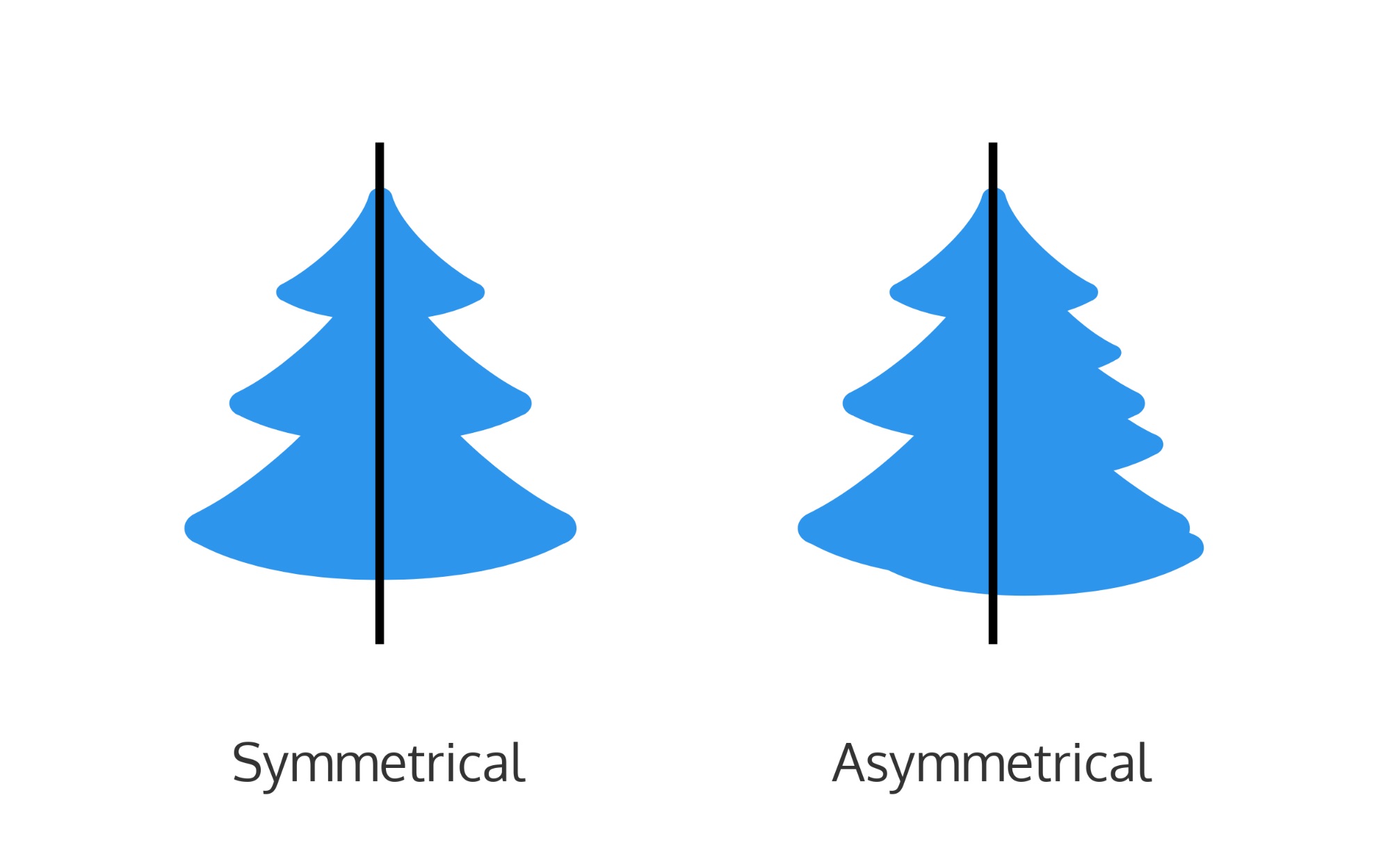
Asymmetry is the lack of symmetry or equality between halves of your design. While both halves of a symmetrical design will be the same (or similar), both halves of an asymmetrical design will be different.
That being said, asymmetry is not the absence of balance in a design.
When to Use Asymmetry In Design
While symmetry can be used to give your design a more classical, structured feel, asymmetry can be used to give your designs a more playful, dynamic feel.
A symmetrical design will look more structured:

While an asymmetrical design will look for free-flowing and fun, like in this poster:

Asymmetry can be difficult to master, since it requires an understanding of balance in design. But it can help to think of the elements in your design in terms of visual weight.
For example, larger objects carry a bigger visual weight than smaller objects. So if you place a big object on one side of your page, you can balance it out by grouping several smaller objects on the other side. Like in this graphic:

Examples of Asymmetry in Design
Asymmetry can be found in graphic design, web design, and classic art.
For example, this presentation slide has an asymmetrical layout:

So does this social media image:
