


With the number of stock photos out in the world, finding the perfect one shouldn’t be that hard.
Especially because we just added millions of Unsplash photos to Venngage! Oh, and they all can be used for free.
Yep, we now have beautiful tech stock photos, nature stock photos, and even some dog stock photos for your furry friends.
But where you still might be struggling is knowing how to incorporate stock photos into your design. Trust me, you don’t want to end up using cringe-worthy or weird stock photos!
Thankfully, I have been using stock photos in my designs for a long time. And have taken the time to outline, 10 ways you can upgrade your graphics with a simple stock photo.
1. Use strategic keywords to find the right image
A lot of people don’t see the real value of stock photos and just pick the first one that only somewhat fits their project.
Think of it this way: you wouldn’t buy the first pair of shoes you see, even if they only sort of fit, right? Instead, you would look for a pair of shoes that are your size.
So why would you pick the first stock photo you see?
Instead, take the time to find a photo that really fits the topic and desired style of your design.
You can do that by following some of these useful search tips. For example, let’s see if we can find an image that will fit this flyer example nicely:

First, set some simple rules for exactly what you’re looking for:
- Fit the topic of the flyer
- Fit the branding
- Fit the color scheme
- Look professional
- Avoid distracting features
Then start by searching a somewhat broad keyword. A broad keyword like that will give you a starting point, so you can narrow down your search after.
In this case, I selected “work.” These are some of the first images that pop up:
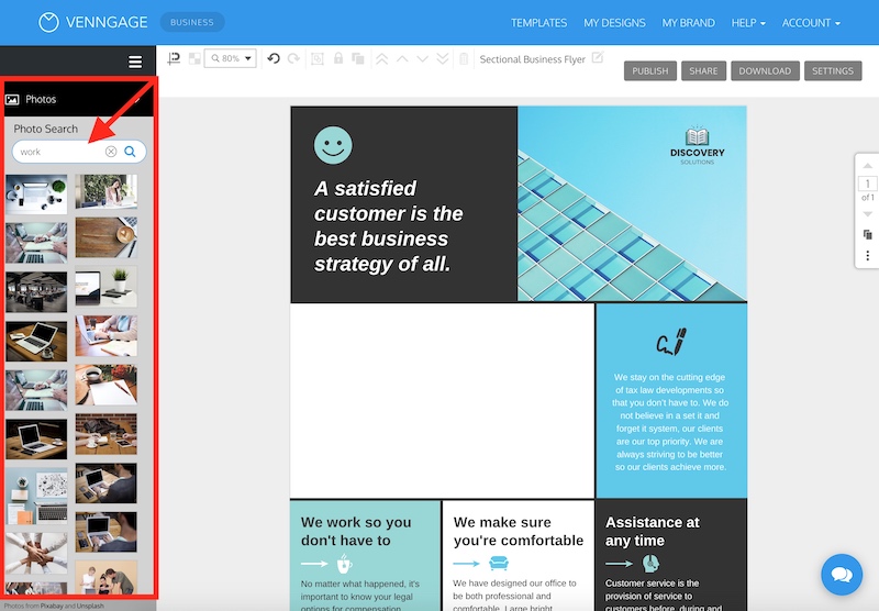
One of these stock photos fits the theme of “work” but it doesn’t quite fit the corporate vibe I’m looking for:

After searching that broad term, I can now narrow it down with the help of some of the images my first search yielded.
For example, if you saw an image depicting a meeting from above, you could search “meetings” to find more similar images.

But now I’m thinking “meetings” doesn’t really illustrate the topic of the flyer very well.
Something related to meetings might work perfectly though, like “presentation”, “leadership” or “strategy.”
The flyer mentions “strategy” a few times, so I think it’s the ideal keyword to use.

After a few scrolls, I think this stock photo is going to work perfectly:

This stock photo hits all of our criteria as well. It’s professional, reserved and fits the overall corporate theme of the flyer:

Venngage Tool Tip: Drag-and-drop your image
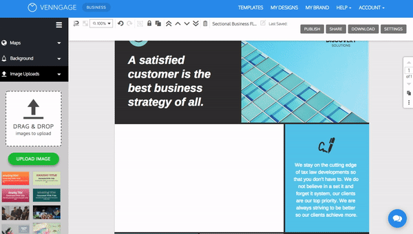
If you already have a stock photo you want to use, you can drag and drop your image directly from your desktop into Venngage. There are two ways you can do this:
Simply drag your image from your desktop into the Image Uploads tab:

Or drag your image directly onto the canvas:

There you have it, the perfect simple stock photo in under a minute. This is the same process I use to find all the stock photos for my graphics.
If you want more flyer examples, check out this guide.
2. Use image frames for consistent size and shape
If you want to incorporate multiple stock photos into your design, it can be difficult to find photos that are all the same size.

Some may have a portrait orientation, others might be landscape or even square. Plus one might be huge and the others tiny, making all of the images look inconsistent.
When it comes to design, consistency is key.
That’s where image frames come in handy. Image frames automatically crop images into a specific size and shape. This will help you make your images uniform and cohesive.
Take a look at how circle image frames are used to incorporate different sized images into this flyer template:

Just like that, they’re all the same size and shape:

In Venngage, you can create image frames in a variety of shapes, including rectangles, circles, and stars:

Just drag and drop an image frame onto your canvas, drag a photo on top of it, and you’re set!
Additionally, image frames are useful if you need to quickly swap images on a graphic. Instead of having to resize or find the perfect image shape, you can drag them to the image frame in a few seconds.
But I think my favorite part of image frames is that you can easily adjust exactly which part of the stock photo is shown. Want to show the top of one image but the bottom of another? Like you can see in the GIF above, just move them around in the frame like you would any other image.
This is also useful if you want to create variations of the same layout:

I would recommend adding image frames to any graphics you have to edit, like social media graphics, reports or even presentations. It will save you a ton of time and frustration!
3. Add a color filter to an image
How many times have you found the perfect stock image for your design…but once you added it to your graphic it looked out of place? And maybe even distracted from the text?

In the example above, the stock photo is so light that the text box blends into the background. Instead of drawing your eye to the title of the presentation.
But I have a super simple tip that will bring stock photos back into your good graces.
All you have to do is add a color filter to your image. Once you find the perfect image, it literally only takes a few clicks:
Be sure to pick a color filter that matches the rest of your design. For the slide design above, I selected a shade of purple that is used for the title and other slides.
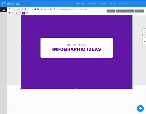
Don’t know exactly how to implement this in your own design projects? Well, let’s go through the whole process using this simple presentation example:

First, let’s start with finding the perfect stock image to incorporate into your design. Use the Image Search to find a stock photo you want to use. Then go ahead and add it to your design by dragging it onto the canvas:

After pushing the image to the background, it’s time to add the color filter! Head over to our Icon Search and drag a square to your design:

Then choose the color you want and resize it to fit your design:

Adjust the icon’s opacity until you can see the image come through:

And finally, use the layer button to push the color filter back behind the text layer. The layer buttons allow you to bring certain design elements forward, and to push other ones to the back.

That’s it! You have successfully added a color filter to your design.
Below are another few examples of how powerful and flexible a color filter really is.
Check out how out of place the image looks in the brochure on the top. But when you add a filter, the image looks at home with the rest of the design:

And in an instant, you can use a color filter to transform a poster with a color filter as well:

A social media graphic:

Or even an infographic:

4. Create a border using an image or pattern
A border can pull your whole design together nicely. It can frame your information:
Draw attention to a specific section:

Or add a pop of color:

Now, want to know how you can kick your borders up a notch? Use a stock photo as a border.
Take a look at how the invitation below was improved by adding a simple stock photo border:

The stock photo gives an otherwise minimalist invitation an extra layer of depth.
To create a border using an image, drag the photo onto the canvas. Then send it to the back of your graphic by clicking the layer button I have highlighted in a previous section. You will need to resize the shape behind your text, so you can see the stock photo behind it and create the border. Check it out in action below:

There you go! A creative border that you can easily swap out any time you want a new design.
5. Select an image that fits your brand or graphic’s color palette
Like I already mentioned, you should always try to select a stock photo that fits your brand style guidelines. An easy way to ensure this is to use your brand color palette as a guide.
With Venngage you can easily import your brand colors, fonts and logos into your Brand Kit. Then you can automatically apply them directly to your designs.

Suggested Reading:
Everything You Need to Know About Picking and Using Brand Colors
Everything You Need to Know About Picking Brand Fonts
10 Logo Design Tips to Take Your Brand to the Next Level [+ Logo Templates]
You already have a battle-tested palette of colors that your audience recognizes. So why not use them to guide your stock photo selection?
For example, take a look at the flyer template below:

This color palette is minimalistic, warm and airy. The stock photo in the header has a similar palette.
But look how out of place this similar stock photo looks because of its color palette:

It actually pulls attention away from the main content of the flyer. You never want that to happen!
Here’s another example of a stock photo matching the branding versus one that looks out of place:

The top photo reflects the warm yellow palette. Meanwhile, the one on the bottom pulls your eye away from the text.
As a rule of thumb, if you’re using a white or light color palette, try to stick to stock photos that are very minimal. Like in the poster example below:

And if you’re using a warm color palette, choose warm stock photos:

A bold palette requires just as bold an image:

And finally, if you’re using a dark palette, select some monochrome or darker photos:

Just be sure to take time to find a stock photo that not only fits your brand but also your design.
Remember, if you can’t find an image that perfectly fits your branding, use a color filter!

6. Design around the background image, instead of over it
Stock photos are usually added to design projects in the background or behind the main content. Most of the tips so far have shown you how to incorporate stock photos into your designs that way.
But you can incorporate stock photos in a ton of unique ways! For example, take a look at how the text content was inserted around the elements in the photo below:

Instead of making the photo secondary to the text, the text is incorporated into the image using a diagonal orientation. This makes everything feel very consistent and professional.
Here are a few other examples of this concept in action. First, on a beautiful poster:

And a presentation title slide:

However, not every photo you find can be used in this way. First, the photo needs to be relatively flat or shot from directly above, like the examples below:

If you’re struggling to find some photos, I would recommend searching “flat”, “minimal” or “flat lay” in Venngage’s Image Search.

As you can see from the example above, your image also needs to have a large chunk of white space available for you to work with:

If you’re not familiar with the term white space, it means the open space in a graphic.
After you find the perfect stock photo, it’s time to start adding your content!
Let’s run through the whole process using the social media graphic template below:

First, go ahead and search for your stock photo and add it to the graphic. In this case, I picked a pineapple picture that has a TON of white space and not a lot of distracting features.
Then add your written content to the white space, and pick a font that fits the theme. For a fun social media graphic like this, I would recommend using a whimsical or modern font:

Next, make your design elements match the stock photo. You don’t have to do much here, a simple font color change should do the trick:

Finally, you can add some embellishments or icons, but only if you feel like it:

And there you have it! Now you can use stock photos to guide the structure of your graphics, not just fade into the background.
7. Use simple images to add a pattern or texture
Sometimes you want a stock photo to actually fade into the background. Instead of being the main focal point, it subtlety adds some extra flair to the graphic. Like in this report example below:

In these situations, I would recommend using extremely simple images that feature a pattern or texture. Like some of the examples below:

These simple background images will make your designs a lot more interesting and add some depth. Check out how much better the graphic looks after you add a pattern:

Try to match the pattern to the topic of your graphic, like the honeycomb pattern above.
And when you combine these textured images with a color filter, you can quickly create a pattern that fits your graphic.

I think that stock photos that are very light or even white make the best patterns because you can use a ton of different color filters. Stock photos with hard lighting are also a current stock photo trend.

Look at how the stock photo below can be used with many color palettes above.
To find a good selection of stock photos like this I would start by searching “pattern”, “texture” or “surface.”

Also, searching more specific terms brings up a lot of good examples too. Try “wood”, “marble” “fabric” or “wall” for some interesting patterns!

8. Leave adequate white space around your stock photo
We have already talked about taking advantage of white space in stock photos. But in this section, we are going to focus on giving the image proper white space.
Because poor spacing can make your graphics look cluttered!
White space is the open or negative space in an image. Some stock photo are composed to offer white space, while others will require you to create your own.
For example, check out how much white space the photo in this proposal template cover includes:

There are plenty of spaces on the image where you could add text. Click the template above to enter our online proposal maker tool to customize it–no design know-how required.
A few ways to make sure there’s adequate white space around your photo include using a small border:

You can also create white space by placing a solid shape over your image, like in this poster template:

Remember, give your text and images space to breathe.
9. Use consistently themed photos across multiple pages
Consistency in design is extremely important and can make or break your graphic. If you’re working on something that has multiple pages or elements, it’s even more important.
Take a look at how well the stock photos work on this presentation template because they are all so consistent:

Selecting stock photos that share a color palette is the easiest way to achieve visual consistency. As you can see in this multi-page presentation template, each photo uses a very bold yellow:

Finding a singular visual theme between all photos is another way to keep things consistent on each page. These images don’t have to look exactly the same, but they should feel like they belong in the same design.
For example, check out all the colorful stock images used in this creative presentation:

You can use a number of the tips we have offered so far to make them consistent.
For example, adding a color filter will make them all look consistent:

And using your brand colors to guide your palette is always a great idea:

I have seen a lot of people try to use images that don’t fit the whole theme of their project, and only work with the single page they are working on. This will definitely hurt them in the long run and could derail your whole design project!
So just remember: consistency is key!
10. Create collages of related images
As you probably noticed, I’m a big fan of using collages in my content. That’s because you can easily show off a lot of examples in one graphic.
There are a lot of different situations where you might want to incorporate multiple photos into one graphic. Like on a blog header:

Or in social media post, where you really only have room for one image:

In this example, the designer used a collection of related images to give you a preview of the content’s topic.
A reader can quickly absorb this info and choose if they want to learn more. When you only have a few seconds to make an impression on social media, this can be a game-changer!
I would recommend using a few image frames to create your own custom collage. Here’s an example of a graphic with multiple image frames placed side-by-side:

Then after selecting all of them (hold down SHIFT to select multiple images) use the group button to turn them into a single graphic, like so:

Now you can move or resize the collage, instead of having to edit each photo individually.
As you can see, collages can also help you keep the size and spacing consistent for each photo.
Conclusion
And there you have it! With these 10 simple stock photo tips, you can instantly upgrade your designs.
The three most important tips to keep in mind when using stock photos are:
- Use color filters and image frames to make photos look consistent
- Leave white space in your design so your text and images have room to breathe
- Pick stock photos that have consistent color palettes, styles, and compositions
With these simple tricks, you can incorporate stock photos seamlessly into your designs.
20+ Attention-Grabbing Event Poster Templates, Backgrounds & Design Tips

35+ Simple Background Images, Templates & Design Tips
