


Infographics are ideal for telling stories that involve data, numbers and statistics, and they have applications across a range of industries and use cases.
Sometimes, the figures in question are so interesting or powerful that they can exist on their own in a by the numbers infographic.
These number infographics deal with data, just as all other number infographics do. But by the numbers infographics are different because you don’t need to tie together the data with a narrative.
This type of infographic is best served by including as little text as possible so that data doesn’t have to compete for attention. That makes by the numbers infographics ideal for situations where you have many data points but not much other connective tissue.
Learn more about by the numbers infographics and how they can apply to your industry. They’re also simple to create with Venngage’s easy-to-edit infographic templates and drag-and-drop Infographic Maker.
NEW! Introducing: Marketing Statistics Report 2022
It’s 2022 already. Marketers, are you still using data from pre-COVID times?
Don’t make decisions based on outdated data that no longer applies. It’s time you keep yourself informed of the latest marketing statistics and trends during the past two years, and learn how COVID-19 has affected marketing efforts in different industries — with this FREE marketing statistics report put together by Venngage and HubSpot.
The report uses data gathered from over 100,000 customers of HubSpot CRM. In addition to that, you’ll also know about the trends in using visuals in content marketing and the impacts of the pandemic on visual content, from 200+ marketers all over the world interviewed by Venngage.
Grab your copy now — it’s not like any other marketing reports out there, plus it’s 100% free!

Want to learn more about other types of infographics? Read our blog on the 9 types of infographics or watch the video below:
Click to jump ahead:
- What is a by the numbers infographic?
- By the numbers infographic template
- By the numbers infographic for real estate
- By the numbers infographic for marketing
- By the numbers infographic for nonprofits
- By the numbers infographic for health & safety
- By the numbers infographic for finance
- By the numbers infographic for human resources
- Years by the numbers infographic
- By the numbers infographic for social media
- By the numbers infographic FAQ
What is a by the numbers infographic?
In by the numbers infographics, data is used almost exclusively to tell the story, while text-based elements are eliminated or played down. While that sounds similar to other numbers-heavy infographics, they aren’t all the same.
To fully understand what distinguishes by the numbers infographics from their statistical infographic cousins, let’s check out examples of each and discuss key differences by looking at two interpretations on the same topic.

In the above example, while there’s a great deal of data and many numbers for the viewer to consider, the text-based section headers are dominant. The color choices, while they help with information grouping, detract a bit from the presentation of the numbers.
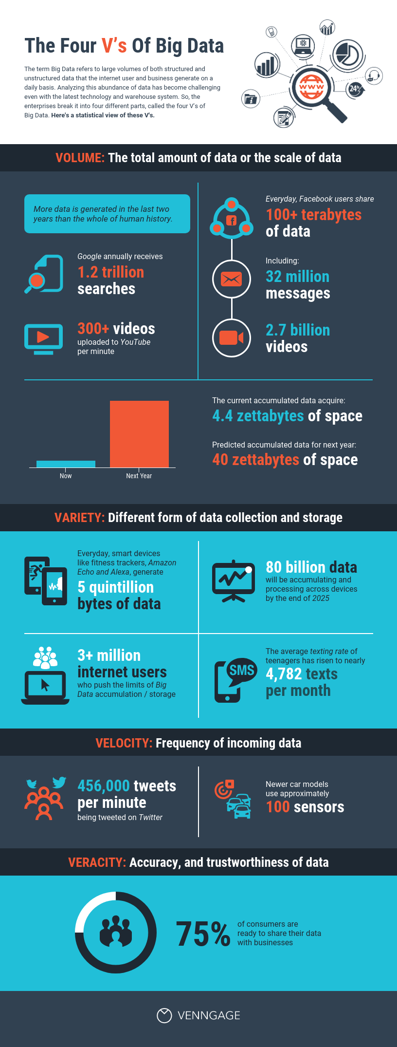
However, in another take on nearly identical information, down to the “four V’s,” the text is small, which allows the numbers to shine. And while there’s a consistent color palette, it’s a simple one that makes for a high-contrast number presentation.
Both are good ways of telling this story, but the second version puts data front and center and focuses less on ensuring readers are left with the text-based takeaways of the first example. An approach like this is ideal for cases where little text is needed or desired.
Related: 25+ Statistical Infographic Templates to Help Visualize Your Data
By the numbers infographic template
By the numbers infographics can apply to pretty much any industry, as we’ll explore shortly, and this type of infographic offers variety in terms of layout. Some are modular, meaning the numbers and text fit together like a puzzle, while others utilize more structured formats.
In some examples, data visualizations accompany the numbers, while in others, the numbers are visualized through large-format display text.
Here’s a look at some of the most commonly used by the numbers infographic templates:

This modular by the numbers infographic template includes almost no text, which allows the numbers, icons and visualizations to draw readers into the story. There’s not a single narrative structure, and the takeaways that could result are diverse.
The modular structure is achieved by making sure that no two sections are the same size. This prevents the eye from traveling interrupted down the page, which is a drawback of grid-based layouts.

This short by the numbers infographic template uses just a handful of data points, and each of the numbers is a percentage. This makes it ideal for sharing similar information across one topic when you have limited information available.
The abbreviated size makes it easy to share and doesn’t overwhelm the reader with facts.

This grid by the numbers infographic template adds data visualization to percentages shown in large text. It’s ideal for cases where side-by-side comparisons would be helpful to readers.

This list by the numbers infographic template uses a super-simple structure, stripping away a complex design in favor of readability and ease of understanding. Most of the statistics included are percentages, but the layout also works for other types of data.
By the numbers infographic for real estate
Standing out in a crowd is vital for real estate agents, especially in saturated housing markets. Learning how to present powerful, impactful data is one way they can do that.

It’s easy to see how agents and brokers could take a page from this structured by the numbers infographic to highlight details about their listings or share the year’s successes with their social media followers.
Lest you think they only come in vertical varieties, check out the simple, effective layout of this horizontal grid by the numbers infographic that offers a different take on those same real estate statistics:

By the numbers infographic for marketing
Whether for internal or external purposes, the field of marketing is an ideal space in which to introduce by the numbers infographics. After all, the average marketing campaign generates virtually endless amounts of data.

Marketers can use internal data, surveys or research to populate this type of by the numbers infographic that they can share on social channels or send to subscribers and journalists to create traffic for their posts.
Related: 12 Survey Infographic Templates and Essential Data Visualization Tips
By the numbers infographic for nonprofits
It’s fair to say that for some nonprofits, connecting donors’ funds with those who need it is a matter of life and death. Nonprofits’ spending on fundraising varies and is the subject of passionate debate.
But however the organization spends money to make money, each of them wants to shell out as little as possible. That’s what makes by the numbers infographics an enormously valuable tool for nonprofits, especially when using simple tools like Venngage’s Infographic Maker.

In this modular by the numbers example, statistics related to child labor across the globe help the reader make an immediate connection to the topic, and the simple color palette puts the children affected at the forefront.
By the numbers infographic for health & safety
Hospitals, fire departments, police departments, doctors offices and other public health agencies all can engage and inform people about topics related to health and safety through by the numbers infographics.

This fire safety example uses icons and numbers along with a simple color palette to ensure the numbers are the primary focus in urging people to be careful if they’re planning to shoot off fireworks on the Fourth of July.

The grid layout of this by the numbers infographic uses data related to workplace wellness campaigns to leave the reader with details about the importance of such programs as well as how effective they are.
By the numbers infographic for finance
Given its focus (dollars and cents), the finance industry is a perfect candidate for by the numbers infographics. After all, they pretty much can’t escape numbers. This could mean talking about dollar amounts, profit projections or accrued interest.

In this example, dollar amounts are combined with survey data, and the numbers take up almost the entire page. While the layout is structured, the individual sections use a modular approach, which amps up the visual interest.
By the numbers infographic for human resources
Engaging and informing a diverse workforce is a challenge, but it can get a little easier when you have numbers on your side. HR departments can utilize by the numbers infographics to help answer questions about new health plans, share annual revenue results and more.

This grid by the numbers infographic shares research about employee benefit programs, but it’s easy to see how it could translate to uses both inside and outside the HR department.
Year by the numbers infographic
Percentages, dollar amounts, ratios and other numbers are all well and good. But there’s another set of digits we’re overlooking: years.

This timeline by the numbers infographic uses the familiar chronological layout, but the eras described by the large-format text give the reader all the basic facts they need to understand the topic.
By the numbers infographic for social media
Across all industries, engaging followers on social media is one of the biggest reasons to create visual content at all. Using data to help grip viewers is a no-brainer, regardless of what your organization does.
When creating any type of by the numbers infographic for social channels, remember to keep platform image sizes in mind, and consider creating a few versions with your most prized data points to repurpose content.
Unfortunately, there’s no one magic size, but here’s a detailed explanation of image sizes for 2021 across the most popular platforms.
It’s easy to create by the numbers infographics you can share with your audience in Venngage’s Infographic Maker. And once you’ve made one post (or a bunch) for one platform, you can easily reconfigure for the rest.

Because they’re just a single frame, by the numbers infographics and social media posts are a perfect match, as it’s pretty much impossible to include much content thanks to the sizing restrictions.
In the example above, while the illustration does take up the majority of the visual real estate, the data is unmistakable and the text is tightly edited.

In this example, an Instagram carousel post provides a quick-and-easy method of bringing your audience by the numbers infographics they can read and connect with instantly.
By the numbers infographic FAQ
Let’s check out a few questions about by the numbers infographics:
1. How do I make a by the numbers infographic?
Venngage’s Infographic Maker is an easy-to-use tool that allows you to see something engaging and just a short while later, be rocking and rolling with your own version.
Whether based on the inspiration we’ve explored already or something new, by the numbers infographics are usually simpler than most others. That’s because they ditch most of the content and allow the data, including numbers, percentages, dollar figures, ratios and any other digit you could imagine to be the star of the show.
2. What makes a great infographic?
The basics that go into making a great infographic include, of course, good design practices, but where infographics differ from other types of design is that their biggest goal is getting people to understand information.
So a great infographic will combine good use of colors, visuals, whitespace and layout with content that could include text, data, charts, graphs, tables and more.
Related: When and How to Create Tables for Your Infographic
3. How do I pick numbers for an infographic?
Brevity is important in creating by the numbers infographics. It’s tempting to use every data point you can find about your topic, but when picking which data to use, think like a reporter.
In the news business, five attributes make something newsworthy: timeliness, proximity, conflict and controversy, human interest and relevance. The numbers you include don’t have to meet all those criteria, but try to hit at least a couple of them so you can be sure people will care about your numbers.
In summary: By the numbers infographics tell focused stories with highlight-worthy data points
If the idea of creating a long-form infographic that mixes clever text, data visualization and a complex narrative structure seems like overkill, consider by the numbers infographics. They cross genres, layouts, industries and more, and these tightly focused data stories give you the effectiveness of statistical infographics in less visual real estate.
By limiting your scope to just a handful of numbers that will hit home the most with your audience, you can create a curated set of facts. By the numbers infographics are the tl;dr of the infographic landscape.
Ready to get started with your by the numbers infographic? Sign up for free and get creative.