


Be honest: How many infographics have you seen with raw numbers, often gigantic ones, plopped right into the middle?

Every day we are surrounded by big numbers, from the number of COVID-19 cases to the cost of the newest legislative bill to the number of revenue corporations like Amazon are accruing. It’s hard to make sense of all of these raw numbers, right?
With a little extra thought, you can make the numbers in your infographic make a whole lot more sense for your audience, whether that’s clients, internal stakeholders or customers. Here are a few quick tips to best visualize numbers in your infographics.
Click to jump ahead:
- Always put numbers in context
- Visualize numbers whenever possible
- Make numbers relatable
- Think of different angles when visualizing large numbers of people
1. Always put numbers in context
There are a few ways you can do this. It’s great when you can compare a number to an average, to an annual sum, or as a year-over-year change (for example March 2021 in comparison to March 2020).
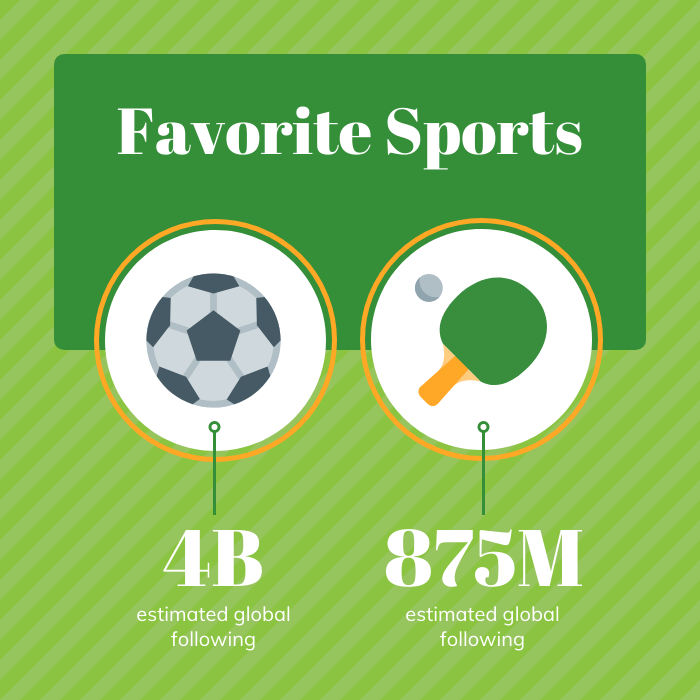
It’s often even more meaningful to compare to other times, places, industries, costs, events, etc. Here is an example that compares the number of related events to one another.

Here is another example that offers even more context because it compares levels of popularity. Without this comparison, either of these numbers wouldn’t be as meaningful.
2. Visualize numbers whenever possible
Even though those examples aren’t using data visualizations, the icons and illustrations used do help us connect more easily to the topic.
If you can use a data visualization, please do. It will allow your audience to go beyond merely reading a number to making sense of it.
Related: What is Data Visualization? (Definitions, Examples, Best Practices)
If the number happens to be small, like 20 or less, you can use a pictogram to show the actual number.
This example includes a pictogram showing the number of days (out of the total days in a month, which is great context).
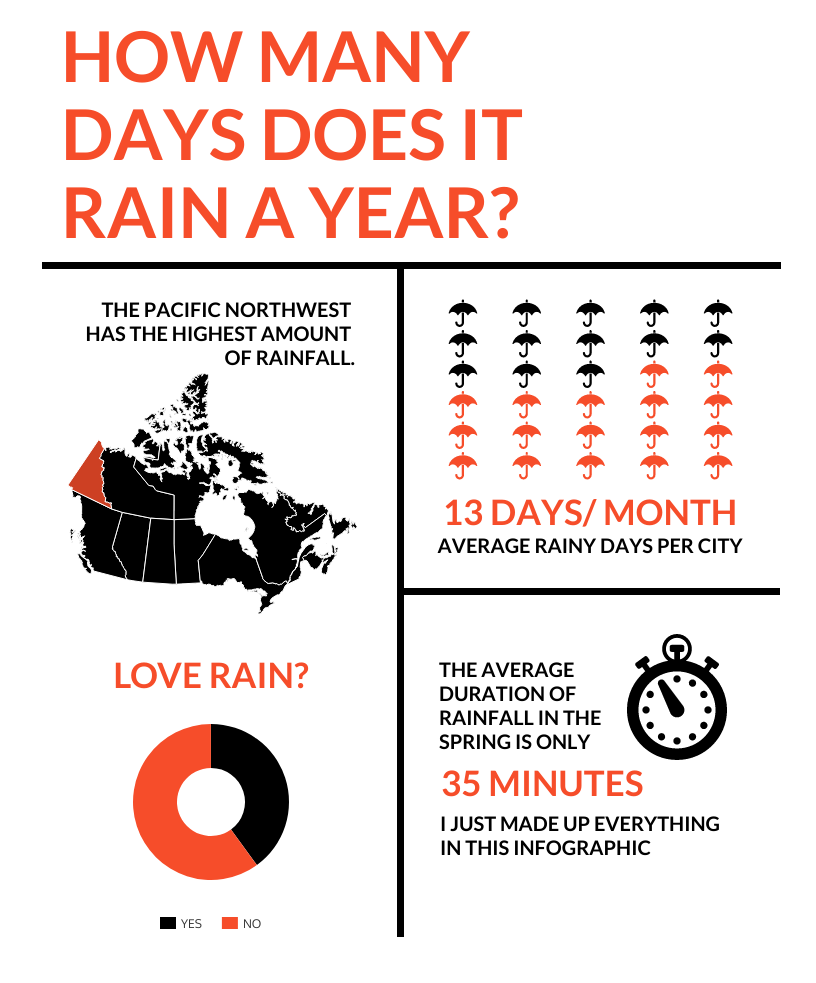
It also includes a donut chart, which brings me to percentages. If you can use a pictogram to show percents too. Notice how this helps you really see the number in a different way?

When communicating percentages, it’s often very helpful to express them as rates, for example instead of 50% you could say 1 in 2. Here is an example of a pictogram that helps audiences see an approximate rate coupled with the actual percentage.

3. Make numbers relatable
If the thing the number is counting happens to be something many people don’t fully grasp, that can make communicating the numbers even more challenging. In this case, it’s very helpful to put it into terms that relate to common everyday experiences.
Related: Data Literacy for the Data-phobic: 7 Things Beginners Need to Know
Here is an example of an infographic that helps audiences understand water volume (which is often hard to imagine, especially in large volumes) by putting it in terms of the amount of water they might be used to using for a specific activity.

Using these types of equivalencies is important if you are communicating large numbers or if you are communicating about a measurement that is unfamiliar or even abstract to most people.
If you are doing a number of these things, it is essential. This infographic, for example, is about carbon dioxide emissions, which are usually measured by weight. By putting in terms of passenger vehicles driven, it helps people get a better idea of what the numbers mean.

Making numerical data more approachable by relating it to concepts or experiences that people find more familiar with is known as social math. Social math is often used by social and political organizations to frame numerical data about issues of concern and motivate audiences to make donations or advocate for policy changes.
You might consider some ideas from the Berkeley Studies Media Group:
- Breaking a number down by day or even hour. For example, $2 billion a year is about $5 million every day.
- Comparing a large number of people to the population of a well-known place. For example, 12.5 million people is roughly the combined population of New York City and Los Angeles.
- Making it local by calculating your state’s or county’s share of national numbers. For example, if a policy impacts a certain percentage of Americans, what number of people would that be in your county?
- Comparing to something well known. For example, does a food item have the same amount of sugar as a cup of freshly brewed tea or as a can of soda?
- Making a bold (but of course data-backed) statement. For example, “More Americans believe Elvis is alive than oppose universal background checks for gun buyers” or “The cost to incarcerate one person from Baltimore could buy 1 month of housing for 30 families.”
4. If it’s numbers of people, especially large numbers of people, be sure to tell the story in other ways too
Once numbers start getting really high, definitely 100,000 and above, people really struggle to connect to them to real-life in any meaningful way.
If we are talking about people’s experiences, we should go beyond the numbers to make sure we’re highlighting the human elements.
Here is a very simple example.

Don’t you agree that the infographic above which cites a huge number of students is not nearly as effective as the one below which includes individual students’ stories?
When we’re talking about a really big number of people who are suffering, such as 500,000 COVID-19 deaths in the U.S., we need to be hyper aware of a phenomenon known as psychic numbing. Truth is, as the number grows, people’s compassion is unable to keep up, and they will care less and less.
This is a major obstacle if we are wanting to motivate people to take some meaningful action to reduce this suffering. People always connect better to individuals and their personal stories, and to emotional aspects, than they do to numbers, according to expert psychologist Dr. Paul Slovic.
Related: How to Tell a Story With Data: A Guide for Beginners
Again, visuals can go a long way to help people connect with the numbers. In particular, photos of individual people, especially their faces, can help elicit emotions that are essential for understanding why the big number really matters.
Do you connect more with the statistic that there are 9 million LGBT Americans, for example, or with the photo below of one who is openly gay?

When we visualize numbers and when we make them relatable, we can make our infographic more meaningful and more compelling for our audiences.
With Venngage, you can get started immediately by choosing one of our many infographic templates, then easily practice communicating numbers in the way that works best for your audience.