


When people think of infographics, they often think of data visualizations, visual icons, and maybe photos. But what about tables?
While tables aren’t the most visual elements to include in an infographic, there are situations where using them makes sense. There are also ways to design them well so they can be a meaningful part of your infographic.
You’ll learn when and how to best use tables in your infographics, as well as other table infographic best practices in this post. You can then start creating your own table infographic for free with Venngage’s template library and easy-to-use Infographic Maker.
NEW! Introducing: Marketing Statistics Report 2022
It’s 2022 already. Marketers, are you still using data from pre-COVID times?
Don’t make decisions based on outdated data that no longer applies. It’s time you keep yourself informed of the latest marketing statistics and trends during the past two years, and learn how COVID-19 has affected marketing efforts in different industries — with this FREE marketing statistics report put together by Venngage and HubSpot.
The report uses data gathered from over 100,000 customers of HubSpot CRM. In addition to that, you’ll also know about the trends in using visuals in content marketing and the impacts of the pandemic on visual content, from 200+ marketers all over the world interviewed by Venngage.
Grab your copy now — it’s not like any other marketing reports out there, plus it’s 100% free!

Click to jump ahead:
- When to use tables in your infographic
- How to design good looking tables for your infographic
- Using tables with other visuals in your infographic
When to use tables in your infographic
There are only four situations where using a table in your infographic might actually be a better choice than using other visuals to explain the data.
1. Your audience is skeptical
According to research, tables may be more persuasive if your audience already has attitudes that the data does not support. If they might be inclined to dismiss or argue with a bar chart, showing the actual numbers may help them see the numbers for themselves.
In this infographic, a table is used at the top to pinpoint the numbers, and some graphs are used underneath to help the audience make some comparisons more easily.

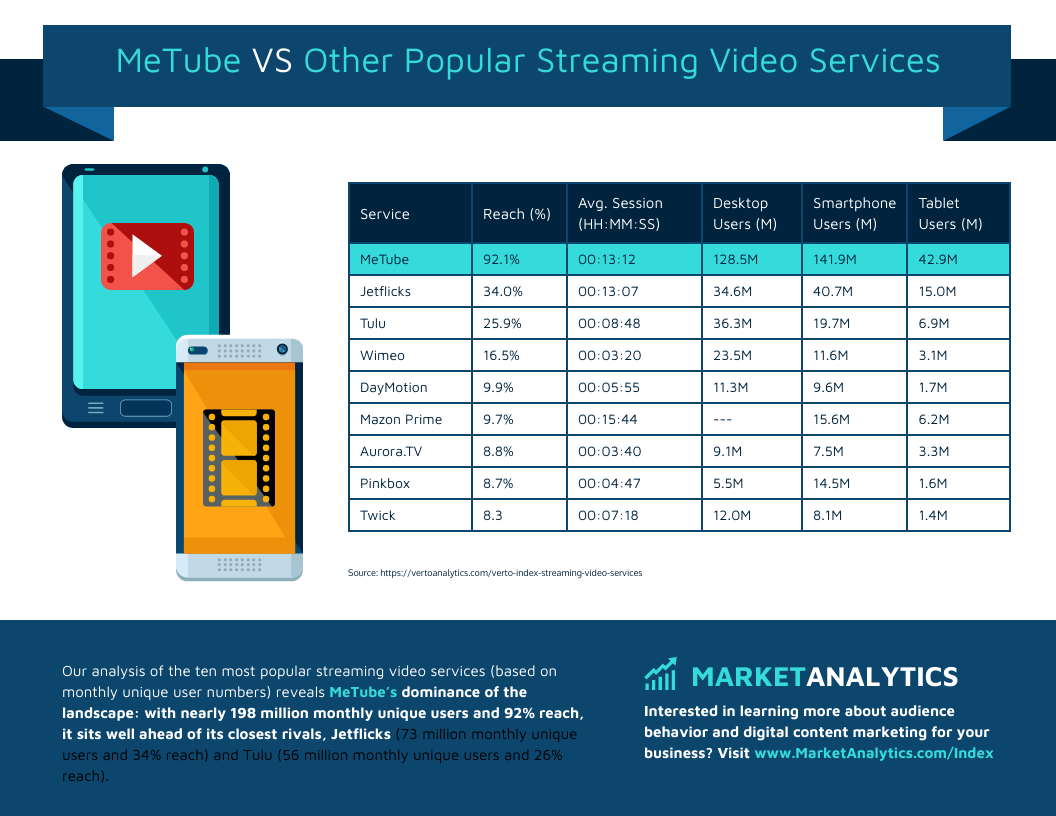
2. Your audience is data savvy and wants to see the raw numbers
Perhaps your audience is the opposite of skeptical—they actually get excited about new data. If you know they will be interested in the raw data and want to understand the analysis themselves, then they will likely appreciate a table, one perhaps as number-dense as this example.

Related: 25+ Statistical Infographic Templates to Help Visualize Your Data
3. You want to help people clearly see differences in a comparison table infographic
These types of infographics can help people compare numbers or other differences across categories.
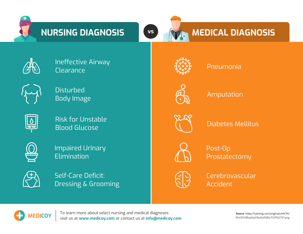
This example incorporates a lot of color and iconography so you may not even recognize it as a typical “table.”
4. Your infographic serves the purpose of allowing someone to fill details into a table
Sometimes infographics can act as templates, with content added after the design is complete.
For example, this infographic serves as a rubric for a project.

Another common example is Gantt charts, which show the stages of a project. This Gantt chart includes some detailed information about what happens in each stage, which could be modified as the project progresses.

How to design good looking tables for your infographic
Before you start designing, be sure to check your table data for accuracy and complete any desired calculations. Once you have the final numbers, you can insert them into your design.
You can use Venngage to upload, copy and paste, or manually enter data into a chart. With Venngage, you also have the design flexibility to make your table more attractive.

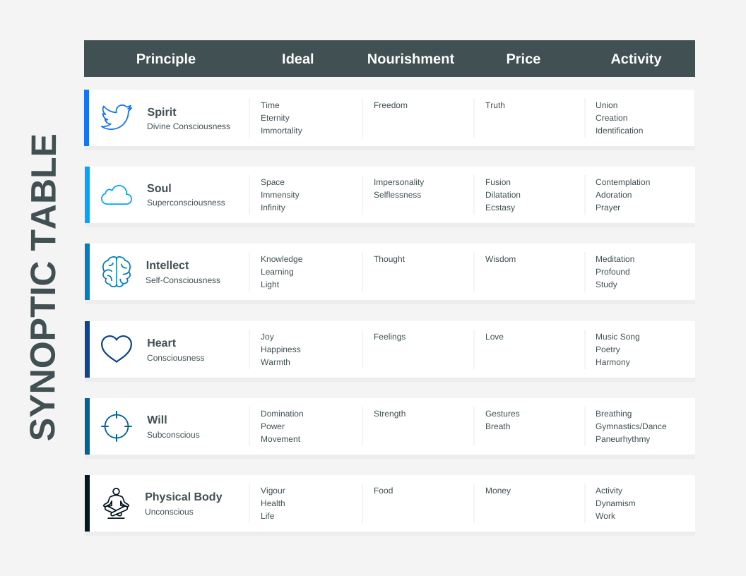
Be sure to use color to highlight important values, perhaps an entire row or column like in the example below.
You can use this same technique if your table doesn’t include numbers. In the example below, the use of red attracts the reader’s attention immediately.

If you are working with categorical data, you can also add more meaning to the content in the table by adding visual icons to accompany the text.
Using tables with other visuals in your infographic
While most of the examples above are focused on tables, often it’s more compelling to use tables in conjunction with other visual elements to help tell the story.
If the table includes numbers, consider adding a graph that allows people to grasp some takeaways immediately. This might inspire them to then review the numbers. I suspect that when you first look at this infographic, you read the graphs before you read the table, right?

This infographic uses a table to organize a series of pictograms. Substituting numbers for visuals in this way drives home the “so what” pretty quickly. Presenting it in a table may also make the information appear to be more scientific.

This is a common example of how icons are used in tables to help the audience make comparisons. In particular, the use of hourglass and dollar icons helps a reader visually distinguish between the options.

As you can see from these examples, tables can be effective visuals to include in your infographic, so long as you consider when and how to use them well.
Whether you are someone drawn to numbers, or one more drawn to imagery, with Venngage you can easily make sure you are using both to communicate information clearly.
You can start with one of the above designs or select from one of the hundreds of other templates to begin creating your table infographic today using our free, online Infographic Maker tool.