


![How to Create a Stacked Bar Chart [+ Examples]](https://venngage-wordpress.s3.amazonaws.com/uploads/2022/01/How-to-Create-a-Stacked-Bar-Chart-Examples.png)
The business world creates a large number of reports. Charts and graphs demonstrate growth, successes, and area of improvement. A stacked bar chart can do all that and more.
While a pie chart or line graph is a great tool for tracking business expenses and savings, stacked bar charts are better to compare and analyze data.
In this post, we’ll show you how to create a stacked bar chart and why you need to use them in your data visualization.
Start making a stacked column chart in minutes with the Venngage Chart Maker, without any design experience.
Click to jump ahead:
- What is a stacked bar chart?
- How to read a stacked bar graph?
- When do you use a stacked column chart?
- When should you not use stacked bar charts?
- 4 steps to create a stacked chart
- FAQs about stacked bar charts
What is a stacked bar chart?
A stacked bar chart is a type of bar graph that represents the proportional contribution of individual data points in comparison to a total.
The height or length of each bar represents how much each group contributes to the total.
For instance, you can select a stacked column chart type, like the simple example below, to illustrate the percent of a company’s sales come from each region.

You can also create a stacked area chart that compares each branch’s data points to the entirety of the data from other branches.

In short, a stacked column chart is like a standard bar chart except that it is able to show part-to-whole comparisons.
Don’t know how to create a chart? With Venngage, all you need to do is choose a template, and then you can import your chart data from an Excel CSV file or Google sheet.

How to read a stacked bar graph?
A stacked bar chart is used to show the total or average of each category. The taller a bar is, the larger the volume of those numeric values.
The bars in the stacked bar chart below show how each category compares to the average. The bottom bar shows the total for all of the categories. Note the data labels on the dual-axis charts.
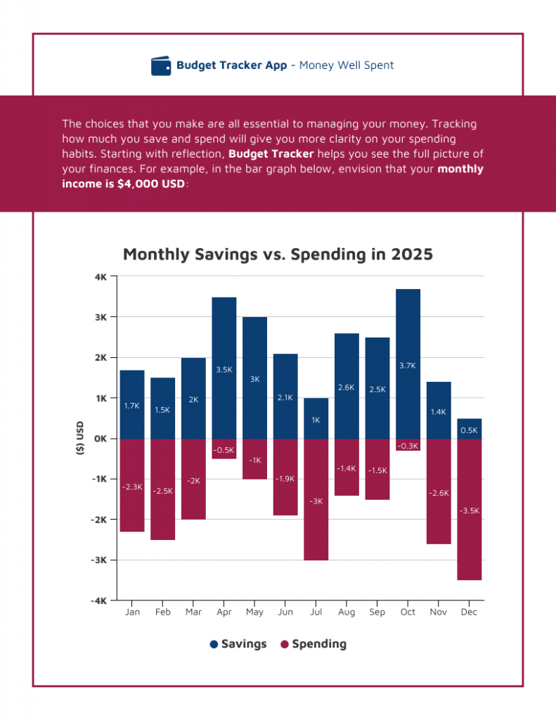
A simple clustered bar chart like this one can show your savings and spending proportions and track trends simultaneously, which is useful for visualizing data in reports.
When do you use a stacked column chart?
A stacked column chart is a useful tool for determining a trend across a time period. Here are other uses for stacked bar graphs:
- Marketing (spending vs results)
- Economy (supply and demand)
- Vehicle performance (mileage vs performance)
- Business budgets (spending vs saving)
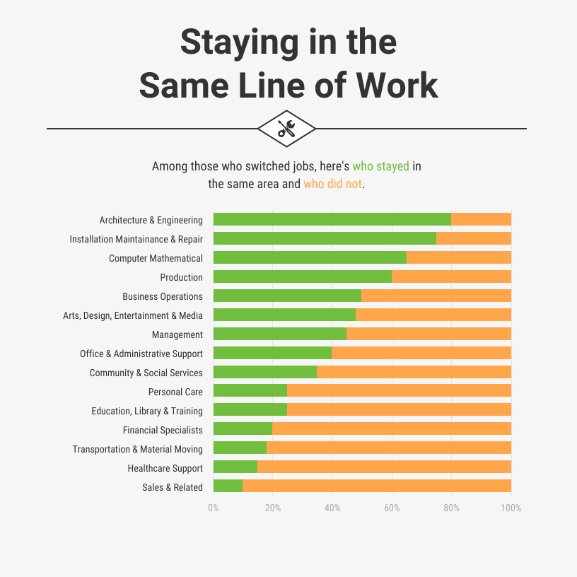
When you want to compare small aspects and the complete data of any general category, a stacked bar chart can accurately represent your data, like in this net promoter score chart.

When should you not use stacked bar charts?
There are a few situations where you don’t need a combined chart. Simple bar or column charts, a pie or line graph, or other chart types would be a better choice. Here are those instances.
Simple budgeting
Pie graphs and donut charts are better choices for creating simple budget charts, such as this pie chart infographic.

This is because pie charts are better at displaying relative or percentage comparisons. They don’t show absolute values, which a stacked column chart can show.
Analyzing stock market trends
Line charts and bar graphs are better tools for analyzing and visualizing trends than a stacked bar chart is.

Looking for trends in a data series
Scatter plot graphs make trend data much easier to understand than stacked charts.

Related: 11 Types of Charts and How Businesses Use Them
4 steps to create a stacked chart
Here are the basic steps to build your own stacked column charts.
Determine what segments you’ll be comparing
The data for a stacked bar chart is determined by the type of data that is on the axes.
The x-axis usually has the ordered values on it, while the y axis will have the list of items. The items list can be a numeric variable (i.e. 1, 2, 3) or qualitative (i.e. A, B, C), like in this example.
The data for a stacked column chart can be determined by the type of data on the axes. Sometimes, that data is simple enough to compare that it can have just one axis, such as in this example:

This is an example of a stacked bar chart that only sits on one axis with all the elements at the same height. But you can adapt it for a column chart with longer or shorter columns.
Choose a bar chart template
Once you’ve determined the ordered values and data type you’ll use on the axes of your stacked bar chart, you can start creating the first bar chart.
Instead of designing from scratch, pick a template, like the one below.

- Select the axis on this chart
- A pop-up menu will allow you to adjust the colors and visuals according to your needs
- Enter your data manually or import it into your stacked column chart from a CSV file or Google sheet.
And you’re done!
It’s that simple to customize a stacked column chart template from Venngage’s library.
Determine data clarity
Ensure your graph design has enough white space so readers can fully comprehend the data.
A stacked bar chart can use contrasting colors to show variations in data within the total amount, like in the below example.
Or use different lengths to show the relative size of segments to each other. This will help the chart make more sense to readers.
Get an external perspective
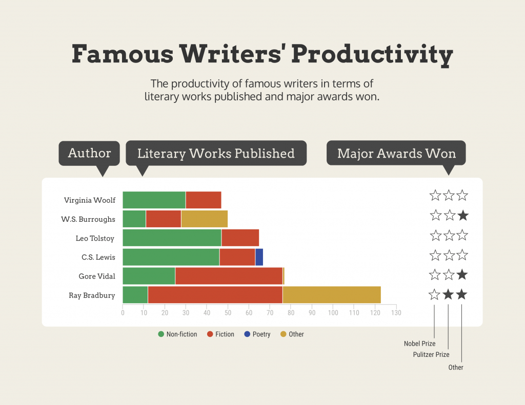
Lastly, have someone review your stacked bar chart. For example, here’s a comparison of writers as a stacked bar chart. To get this right, a number of people analyzed and edited this stacked bar chart.
It’s easy to get tunnel vision when creating your stacked column charts, so having a new pair of eyes that haven’t worked on it is an excellent way to see new ideas and find errors.
Don’t be afraid to keep on revising and improving your design until you’ve got the best stacked column chart for your needs.
Related: How to choose the best charts for your infographic
FAQs about stacked bar charts
What’s the difference between a stacked column chart and a bar chart?
A bar graph is one in which the columns are of different heights. The area of each column is proportional to the size of the data.
A stacked column chart, on the other hand, typically has columns of equal height. Each column includes segments of varying height, depending on the numeric variable of the data.
In simple terms, a bar chart displays the data as a series of bars that have a height proportional to their value, while a stacked column chart is a type of bar chart where the columns are segmented according to a specific attribute.
Can you create a stacked bar chart in Excel?
Yes, you can create a stacked bar chart in Excel, but you will need some data visualization abilities to do so.
While Excel does give you options for comparing and contrasting data, it’s best to use a stacked bar or column chart template that has done most of the work for you.
We’ve shared numerous examples of Venngage’s templates in this post.
Pick the template closest to your data, change or add values in the stacked charts, change colors, add a chart title, and make the template your own.
Create stacked bar charts and show the differences in your data
Now you know why you should create a stacked column chart or bar chart for your reports and presentations.
And with Venngage’s templates, you don’t need to have design skills to design a memorable data visualization. Choose the template you want and start designing in minutes.