Color trends are getting wacky.
Gradients everywhere, companies rebranding with bold, bright colors at every turn…it’s a lot to take in. If you’ve been living under a rock and have no idea what I’m talking about, take a look at our analysis of the top graphic design trends for 2021.
How can you possibly keep up?
Well, I’d like to throw an even crazier idea out there: creating compelling color schemes for infographics is not all about following the hottest trends.
Yes, you should definitely consider what’s trending when thinking about color. But if you’re not a full-time designer, you’ll probably struggle to make most of those trends work for you.
My advice: focus less on style, and more on substance.
Researchers spend a lot of time investigating the perception and cognition of color, and we can use what they learn to design better, more effective graphics.
WATCH: Everything you need to know about COLOR… in under 3 minutes!
A bit about color theory
We can’t discuss color without a bit of basic color theory. I’ll keep it to a bare minimum, I promise.
Meet the color wheel:

If you’re anything like me, you’re flashing back to elementary school art class right about now. Believe it or not, the color wheel is actually a very useful tool when it comes to design. It can help us understand color relationships, which are indispensable for visual communication.
I’m sure you know that the primary colors (red, yellow, and blue) mix to form the secondary colors (orange, green, and purple).
Take it a step further, and you’ll see that the secondary colors mix to form the tertiary colors (vermillion, amber, chartreuse, teal, violet, and magenta), rounding out the color wheel.

How can we use this color wheel to create impactful color palettes? Let’s start by reviewing the classic color relationships.

- Monochromatic: A monochromatic color scheme consists of a single color (or multiple variants of that color).
- Analogous: Analogous colors are side-by-side on the color wheel.
- Complementary: Complementary colors are across from each other on the color wheel.
- Split-complementary: A split-complementary color scheme is a variant of the complementary color scheme, with one base color and two secondary colors adjacent to its complementary color.
- Triadic: A triadic color scheme features three equidistant colors.
- Tetradic: A tetradic color scheme features two pairs of complementary colors.
That’s all you need to know for now. I’ll be using these terms later on, so feel free to refer back here to refresh your memory.
Harnessing the power of color for communication
Graphic designers use all sorts of tricks to enhance visual communication. When it comes to communication, color is one of the most powerful tools in the designer’s toolkit.
Color is particularly useful for:
- Creating contrast
- Grouping elements
- Encoding quantity
Let’s take a look at each of these in turn.
1. Use color contrast to make your most relevant content visually salient
Salience is a quality that makes an object stand out against its surroundings. Like a loud phone ringing in a quiet room, or the flash of some (terrifying) creature’s eyes on a dark evening, salient objects or events immediately grab our attention.
We can learn to control salience in our infographics to help our viewers pay attention to the most important elements of a composition. By playing with attributes like color, shape, size, position, and orientation we can create the contrast that our brain is hardwired to pay attention to.
Let’s do a little test.
How long does it take you to find the odd one out in this image?

How about this one?

And this one?

In the first example, we have to do a bit of work to pick out the unique shape. In the second, the larger circle jumps out pretty quickly. In the last example, we barely have to glance at the image to know that the odd one out is the far-right circle in the central row.
Color is by far the most powerful visual quality when it comes to creating visual salience through contrast.
How do we can apply this to infographics?
2. Add a single highlight color to a black and white composition
Here’s a Venngage email newsletter template aimed at sharing monthly revenue results with employees. I’ve made this first example black and white to remove any of the visual salience gained from color information:
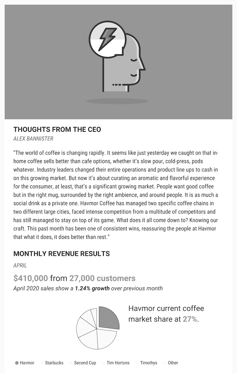
When I glance at this, I immediately see the banner image at the top and the highlighted chunk of the pie chart at the bottom, because they’re particularly dark. But the most important information here (the revenue, customer base, and market share) doesn’t stand out.
Realistically, we only have a few seconds to catch our readers’ attention before they send our email hurtling towards the trash. Using color to highlight the key bits of information, we can capture our readers in a fraction of that time:

With a single color strategically creating some visual salience, we’ve dramatically improved our chances of engaging with our readers.
When working with black and white compositions, adding a highlight color is fairly straightforward. Let’s see if we can use what we know about color theory to apply the same principles to more complex situations.
3. Use black and white to add contrast to monochromatic compositions
Monochromatic color schemes are great because you don’t have to worry about matching or balancing different colors, and they automatically inject a sense of cohesion into your piece.
But they are inherently lacking in color contrast, which is dangerous from a communication standpoint.
The workaround: use white to draw attention to the important elements, and use black to improve the readability of smaller text.
Here, the large white title captures your attention before your eye is drawn to the white highlight in the bottom right corner:

This hammers home the main takeaway of the infographic: the imbalance between supply and demand for data skills in marketing.
The added bonus of using black and white in otherwise monochromatic palettes: it breaks up the composition, giving the eye a rest from the abundance of color.
4. Use a complementary color to highlight very small bits of important information
Complementary colors (directly across from each other on the color wheel) have the greatest possible color contrast. It can be hard to make highly contrasting colors look good together in large amounts, but in small amounts they can be really powerful.
In this infographic, complementary orange contrasts with the central blue theme, drawing attention to a key statistic:

The key to making this kind of color scheme work is to allow one color to dominate the composition, and use its complementary color judiciously.
If possible, limit the complementary color to a very small area. This will keep the contrast from feeling overwhelming and clownish.
Another trick that can help here is to think about color temperature. Ninety percent of the time, a complementary color scheme works because a cool color is used for the background, while the warm color is reserved for highlights.
This is because warm colors are naturally more salient, and tend to feel like they are “advancing” towards us, demanding our attention, while the opposite is true for cool colors.
Let’s look at an example.
In this Facebook Ad template, red does its job by contrasting with the complementary green base color to highlight the key “Download Now!” call-to-action:

When the roles are reversed, the red background competes with the green CTA, demanding more attention:

It’s just as important to recognize and suppress this inadvertent visual salience as it is to consciously add visual salience to important elements.
If you want a simple take-away from this whole discussion of color and visual salience: use high contrast, warm colors to draw attention to key information.
5. Use different colors to create visual groupings
We’ve established that color is one of the first things we notice when we look at a graphic. It’s also particularly good at encoding categorical data.
Translation: we can use color to create visual groupings.
Consider this graphic communicating a company’s business strategy. It features three tiers of information (represented in three columns, each with a different visual treatment) and three categories (marketing, customer service, and productivity) which are visually identical.

We can use color to reinforce the tiers:

Or to give each category a different visual treatment, adding a new layer of information:

This kind of encoding facilitates visual comparison within categories, which is especially useful if you’re visualizing data:

What colors should you use to create visual groupings?
Triadic and tetradic color schemes are perfect for creating visual groupings when each category is equally important. As seen below, the yellow, red, and blue sections bear equivalent visual weight:

Whereas analogous color schemes can be useful when the groupings are somehow related:

In contrast, monochromatic color schemes are rarely useful for creating visual groupings because darker shades are more prominent than lighter shades.
This makes monochromatic color schemes useful for encoding quantity.
6. Use a single color to encode quantity or represent progression
It’s natural to use ordered monochromatic shades to represent sequential quantities or to suggest progression:

Analogous color schemes can be similarly useful for encoding quantities when you have many data points:

To make sure you represent quantity accurately, use Color Brewer to generate monochromatic or analogous color schemes. It was initially conceived as a color tool for maps, but it’s perfect for creating color schemes for data visualization.
Color meanings and what colors represent
The effects that different colors have on our mood and perception of the world around us is known as color psychology. Society attributes different personality traits with different colors.
The meanings of colors are deeply entrenched in our storytelling (we actually did a whole study on the color psychology of Disney characters). Color psychology also plays a big role in marketing, in brand colors and in the logo colors that companies choose. You will often see different colors of emotions represented in media and products, based on the target audience.
When creating visuals like infographics and charts, the colors you use can help tell the story behind your data.
Here is an overview of some different meanings of colors:

Red Color Meanings: Power, excitement, love, passion, strength, energy, danger.
Orange Color Meanings: Playfulness, cheerfulness, friendliness, creativity, confidence.
Yellow Color Meanings: Playfulness, cheerfulness, friendliness, creativity, confidence.
Green Color Meanings: Nature, growth, freshness, wealth, health.
Blue Color Meanings: Stability, competence, trust, loyalty, security.
Purple Color Meanings: Authority, sophistication, power, ambition, mystery, creativity.
Brown Color Meanings: Ruggedness, earthiness, warmth.
Black Color Meanings: Power, sophistication, elegance, prestige, timeliness, value.
White Color Meanings: Health, cleanliness, purity, sincerity.
Easy to use color schemes for every project
There you have it. Use color to enhance visual communication in infographics by creating visual salience, creating visual groupings, and representing progression.
By now, you should be ready to choose a color scheme and make it work for your project. To help you out, I’ve created a collection of color schemes tailored for different visual styles.
Color palettes based on color harmonies and the meanings of colors

Just pick one of these, and try applying it to your next infographic. You can also consider creating your own marketing color wheel. More than a color swatch, a marketing color wheel informs you which colors contrast and which ones complement each other.
If you want to save color palettes so you can easily apply them to any design, learn more about a handy feature Venngage offers called My Brand Kit.
Remember to identify the most salient color and use it to highlight important information. Use the remaining colors to create logical groupings which will help your readers interpret your content.
And that’s it! Everything you’ll ever need to know about color.
Kidding.
There’s a multitude of other things designers consider when it comes to color, including color blindness, the psychology of color, and the cultural significance of color. But if you focus on the things we discussed today, you’re well on your way to creating beautiful, effective graphics.
NEW! Introducing: Marketing Statistics Report 2022
It’s 2022 already. Marketers, are you still using data from pre-COVID times?
Don’t make decisions based on outdated data that no longer applies. It’s time you keep yourself informed of the latest marketing statistics and trends during the past two years, and learn how COVID-19 has affected marketing efforts in different industries — with this FREE marketing statistics report put together by Venngage and HubSpot.
The report uses data gathered from over 100,000 customers of HubSpot CRM. In addition to that, you’ll also know about the trends in using visuals in content marketing and the impacts of the pandemic on visual content, from 200+ marketers all over the world interviewed by Venngage.
Grab your copy now — it’s not like any other marketing reports out there, plus it’s 100% free!