


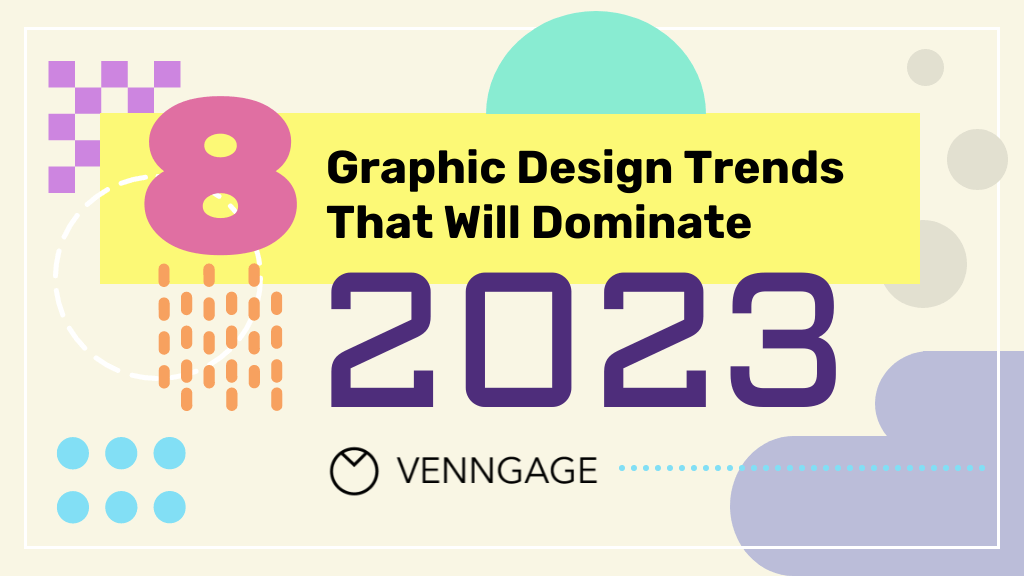
Graphic design is a sign of the times… and the graphic design trends of 2023 are certainly no exception.
The post-pandemic chaos has expedited rapid social and technological change. Short-form videos disrupt static feeds. Web 3.0 developments showcase our appetite for limitless online experiences. And our increasingly connected lives have made inclusive visuals matter more than ever.
These imaginative visions of what the future holds, mixed with a renewed desire to break out from our bubbles, beg the boundaries of design to be defied. Yet throughout it all, an ongoing nostalgia for simpler times holds strong.
All of the above have shifted the way brands and businesses visually communicate with customers. And while studying the design themes of this year, I’ve seen many of the same ideas merge. So note: this list is not ordered in any particular way.
Ready to learn which design innovations will dominate? Keep reading to find out what graphic design trends 2023 has in store…

Graphic design trends 2023:
- Motion graphics
- Bold abstract shapes
- AI generated art
- 3D elements
- Inclusive visuals
- Surrealist maximalism
- Colorful retro illustrations
- Virtual reality
Curious about infographic design and data viz trends specifically? View The Infographic Design Report: Trends to Try in 2023
Prefer to watch instead? Check out this video for a summary with examples, design tips and more:
1. Motion graphics
While video content isn’t exactly new, its widespread popularity has changed the branded internet landscape as we know it.
And yes, we largely have TikTok to thank for that!

The format, popularized by ByteDance’s short-form video hosting site, has papered the walls of social media in the last few years.
And it’s not hard to see why: according to the Washington Post, no other app has grown faster past a billion users. The average American viewer watches 80 minutes of TikTok videos per day — more than the time spent on Facebook and Instagram combined.
Now, everyone and their dog is capitalizing on the motion graphics trend, reposting TikTok content to Instagram reels and YouTube shorts alike. Check out Hubspot’s feed:

This makes sense, considering short-form video’s ability to engage and inform viewers for longer periods of time, remix consumer trends and humanize brands.
No, seriously. Go to virtually any brand’s Instagram, and you’ll find short-form videos taking up the vast majority of their grid. Here’s Salesforce, for example.

Now here’s Zendesk.

And Tinder.

We’d be here all day if I went through more examples. But just take my word for the fact that every brand’s social channel has joined the short-form video craze.
Bring on all the scroll-stopping, relatable content that engages viewers longer than a static image could ever dream of!
But social media feeds aren’t the only area where motion graphics are seeing a surge.

Many of the top tech companies are using this engagement-boosting principle in their UX designs — namely, landing and product information pages. Check out the motion graphics that bring Apple Music’s homepage to life above, adding dynamic interest as the viewer scrolls through.
Neat, huh?
Meta (formerly known as Facebook)’s page addressing their vision for socially responsible virtual reality employs a similar tactic as you scroll down.

But it’s not just The Big Four capitalizing on the engagement-boosting effects of motion graphics. Litmus, the email testing and management software, embeds motion graphics into their UX designs too.

Of course, doing so is a lot more complicated than sharing a TikTok, or reposting video content as a reel.
But with our 2022 Visual Content Marketing Report showing that 90% of marketers predict video content to be the key medium brands should adopt in the coming years, it’s undeniable that we’ll be seeing a lot more motion graphics, a lot more places.
(Now feels like a good time to ask: have you followed Venngage on TikTok yet?!)
2. Bold abstract shapes
Graphic design trends come and go in cycles, evolving along the way. Which is why in 2021’s blog on upcoming design trends, we reported an influx of geometric shapes in visual assets — a pattern that still holds true today.
That’s right. Bold shapes will continue to dominate the backgrounds of websites, social media posts and beyond in 2023. But rather than rigid geometrics, more abstract forms abound.
Here’s a few recent social posts from Spotify, Trello and Slack that illustrate this colorful trend.


What’s great about these abstract elements is the additional layer of visual interest they add to any composition, through the design principles of variety and contrast. They pique viewers’ attention with their bold, bright hues without distracting from the main message at hand.
Hubspot CRM’s product page makes use of this to highlight their software.

Oracle Cloud Computing’s website shows this off well too.

Some companies have used this trend to subtly evoke shapes found in other branded assets. You can see this in Intercom’s homepage design; the blue rounded shapes echo the company’s logo.

Same with Semrush’s social posts that mirror their landing page.
And it’s easy to apply the aesthetic appeal of vibrant organic forms to your own designs. Just choose no more than 2-3 colors, and make sure your main content stands out.
To make it simple, Venngage offers several templates in this vein that you can 100% customize. Check out this single page flyer template emphasized by colorful rounded shapes:

For social media, look no further than this Instagram Carousel Post template.

Even if you’re not sharing statistics, this template can do the trick. Just swap out the information and add your message instead.
Want to keep your branding consistent? Automate your brand colors and logo with My Brand Kit, available with Venngage for Business.
3. AI-generated art
DALL-E. DALL-E, everywhere!
This year, images produced by artificial intelligence (AI) technology took the world by storm with the public release of OpenAI’s DALL-E 2 — an online images generator that creates graphics based on natural language text descriptions.
Internet users worldwide clamored to see how realistic and novel these image generations were. In fact, entire Twitter accounts dedicated to the task cropped up to facilitate the social sharing of weird and wonderful DALL-E creations.

Some accounts even automated the process, prompting the AI to generate images based on descriptions followers tweet at them.

And of course, given their inherent absurdity, many-an-internet-meme followed.

Considering the exponential growth of AI recently, it’s no surprise social media isn’t the only place image generations have caught on; big names in tech have taken note too.
In October, Microsoft announced the release of their own graphic design app featuring a DALL-E 2 integration that allows users to add supporting image generations to their files.
Not long after, Shutterstock unveiled a strategic partnership with OpenAI to make DaLL-E 2 generations available to their user base as well.
But it’s not all rainbows and sunshine.

(Yes, I just generated that image.)
While many see advanced machine learning tools as a way to democratize art, there are growing concerns over copyright and the displacement of human-created artforms.
But with machine learning advancing at a rapid clip — for example, OpenAi’s next iteration, GPT-4, is rumored to have trillions of parameters — there’s no doubt this graphic design trend will only intensify. So give DALL-E 2 a try when dreaming up creative assets!
Looking to get the rest of your team onboard with this trend? Use this report template to showcase AI’s awe-inspiring potential for your business.

4. 3D elements
If motion graphics are the new static images, three dimensional renderings are the new two dimensional assets.
At least, that’s been the case for the last few years. Especially since recent technological advancements have made it easier than ever to produce high-quality 3D visuals. (Like this reimagined IBM logo.)

From the 3D typography and icons found in recent social posts from Adobe and Later…


…and the icons graphics seen on Microsoft’s homepage and product launches…


…to the characters and avatars showcasing Humi, Salesforce and Intel’s products…


…3D elements are everywhere.
But beyond easier rendering, what else is driving these design choices forward?
Just factor in VR’s ever-increasing hold on the public. (Roblox, anyone?)
The growing demand for virtual experiences and graphics that blur the lines of computer-generated images and reality no doubt fuel this trend (something we’ll explore further on in this article). And with the metaverse’s influence only expanding, the market for 3D elements is set to increase.
So capitalize on the current digital moment and add depth, shadows, movement and textures to your designs assets. Like these two templates that’ll take your internal communications to new heights:


5. Inclusive visuals
The push for inclusivity in design is hardly news.
Our previous roundups of graphic design trends have all identified inclusivity as a key feature in future-thinking designs, helping audiences from all walks of life see themselves reflected in a business’s products and mission.
Take these illustrations from Float for example:

But design trends don’t stay stagnant, even if the overall category remains the same. So how has this continued push for inclusivity evolved?
Well, our increasing awareness of marginalization and intersectionality has given way to the need for greater representation — AKA that which goes beyond diverse skin tones and same sex relationships.
During my analysis, I noted three main areas where inclusive visuals are growing:
Gender diverse representation

Remember the Gilette commercial that sent shockwaves through the media a few years ago, because it featured a trans man?
Fast forward, and transgender and nonbinary folks are seeing more meaningful, self-directed representation than ever — along with drag queens/kings, and other folks who challenge rigid gender norms.
Check out these social posts from TikTok and Pinterest to see what I mean:
And this creative mural AT&T made for pride month.

This push for greater representation comes at a time when transgender communities are increasingly threatened by US legislaton. Thankfully, many companies refuse to stand ideally by.
For example, following Texas Governor Greb Abbott’s classification of pediatric gender-affirming care as child abuse, more than 60 companies — including Google, Apple, Meta and IBM — signed a full page ad urging state officials to reject the directive.
So join the movement. And show consumers you care, cis gender or not.
Indigenous representation
Up until now, indigenous communities have been largely glossed over by advertisers. But in 2023, expect that to change.
Famous TikTokers from different indigenous backgrounds have risen to prominence, bringing greater awareness to the diversity of indigenous cultures. And companies like Netflix and Sephora have taken note.

Looking to add some indigenous representation to your own design files? Venngage has released a 100% free people icon pack featuring 140 diverse characters. It includes EPS/SVG/PNG files you can use, publish and share free-of-charge.
Accessible design
The trend of inclusive design extends beyond pictorial and iconographic representations. Because in 2023, true inclusivity also means prioritizing accessibility.
This ensures everyone — no matter their disability status — feels valued by your organization.
For example, Mastercard released a campaign around their Touch Card product this year.

These cards feature a simple design with notches to help the visually impaired differentiate between accounts more easily.
WordPress developer Reaktive also redesigned Intuit Mint and Turbotax’s blog pages to increase the user experience for those with screen readers.
The above brands were commended for their accessibility improvements in Fast Company’s 2022 Innovation by Design awards. And with companies like Purdy’s Chocolate set to release boxes stamped with Braille, you can bet this trend will only continue to grow across all industries.
The bottom line is, accessible design is inclusive design. With 15% of the world’s population dealing with some sort of disability, your brand can differentiate itself by prioritizing accessbility.
That’s why we’ve made diverse icons, visuals and color palettes a key objective for Venngage templates and assets, like these ones:


You can also use this FREE Accessible Color Palette Generator tool to generate a range of beautiful, WCAG compliant hues.
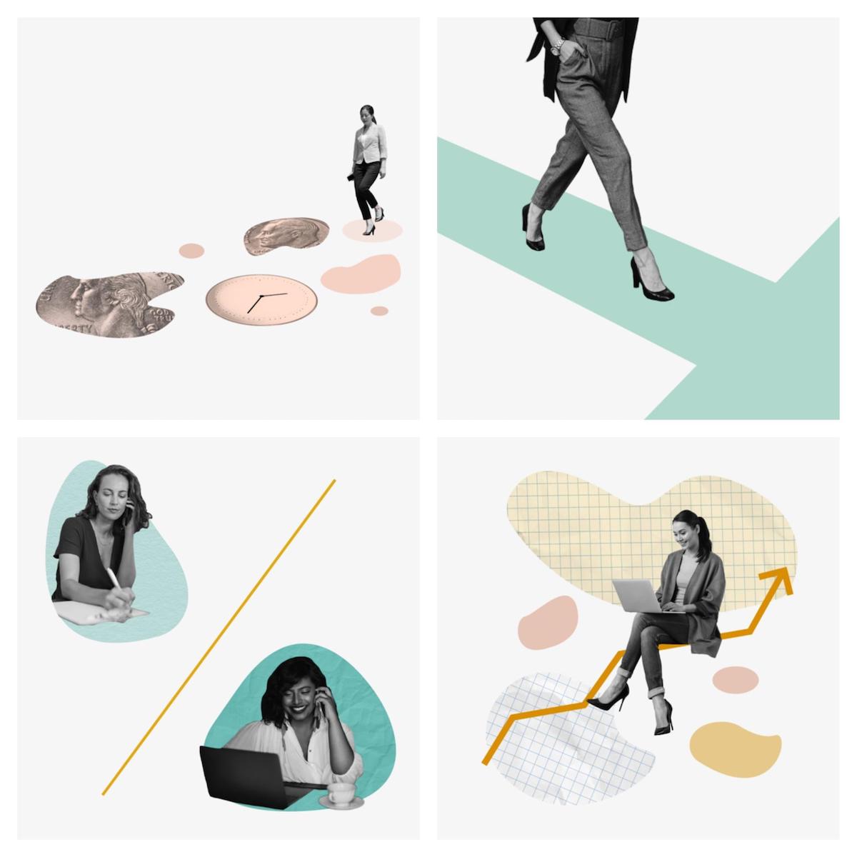
6. Surrealist maximalism
See ya, realism and minimalism! We’ve got two new sheriffs in town: surrealism and maximalism.
That’s right. The insulated COVID-19 era has given way to an anything-goes post-pandemic world — where people have no desire to stay confined or restricted.
Renewed possibilities for pushing boundaries are here. And designers are responding in turn with psychedelic images that aren’t afraid to make a statement, nor take up space.

Given this, visual storytelling will get more imaginative than ever in the coming years. So expect the unexpected when it comes to combining elements, as seen in this recent Coca-Cola graphic:

Or in Zoom’s webinar reminder ad:

Samsung’s also commissioned this surreal work to tie in with the release of the Galaxy Z phone this past year.


And design giant Adobe’s been sharing inspirational images that are as surreal and maximalist as they come:


So don’t be afraid to defy physics OR page space with dramatic mixed media images. Show your audience you’ve got a vision larger than life, and the creativity and ingenuity to get there.
One way to do this is through your personal branding, using a business card that captivates:

Have a report to share? Get your audience going with a dramatic cover image, like the one featured in the template below. The sky’s the limit in 2023.

7. Colorful retro illustrations
Another trend borne from the pandemic?
90s nostalgia! After all, we were definitely fantasizing about easier days during that period.
Well, spoiler alert: this graphic design trend will only continue into 2023 — in the form of colorful retro illustrations.
Nothing encompasses this quite like the viral trend of sharing Little Miss ___ sketches on social, like this one from Hootsuite:

But the buck doesn’t stop there. Everyone from Google…

…and social scheduling app Later…

…to MTV…

…Semrush…

…and Figma have created social media graphics out of this colorful, nostalgic sketch style.

This graphic design trend made a splash because it takes the time-tested visuals of yesteryear and translates them into the current day. So expect everything from social posts and posters, to landing pages and packaging to bring a cheerful, comforting vibe in the new year.
Like these recent releases from the skincare brand Herbivore Botanicals.


If you’re digging these designs, here’s a recent Black Friday Poster template that puts these principles to use.

Feel free to customize the content inside to suit your needs. Alternatively, this event template is all about those fun, nostalgic vibes too.

8. Virtual reality
Cryptocurrency. Non-fungible tokens. The metaverse.
A few years ago, these terms would have confounded just about anyone within earshot. But in 2022, nearly everyone knows how in-demand these Web 3.0 technologies are.
Supercharged by the pandemic’s push towards the digitization of All Things, the global market for virtual reality (VR) has undergone staggering growth these past few years. A report by Facts and Factors valued the metaverse at $210B USD in 2021, estimating it will grow to $730B by 2028.
Unsurprisingly, graphic designers have taken note, expressing the limitless potential of our technological futures with Blade Runner-style image renderings, neon palettes, futuristic liquid gradients and 3D components.
Take this Apple iPad Pro ad for example…

Or this landing page for Meta’s Connect conference…

Or this social reel from Zendesk…

To showcase their forward-thinking sensibilities, many are illustrating the hyper-connected, technologic days to come.
And with this industry developing at a rapid clip, specialized companies like Rumfoords — an advertising firm-turned-creative consulting agency for brands looking to get into the metaverse — are cropping up fast.
One look at their website provides a great example of these stylistic choices:

But the tech grounded in the here and now are similarly following a futuristic suit. Like Dyson’s Zone Headphones animation…

Or this video featured on Apple’s AirPods Pro page…

Perhaps the best example I can find — one that happens to illustrate many of the other trends discussed in the article — is the new Intel commercial for their 13th Gen Core Processor chip.
Watch this ad, and see how many 2023 graphic design trends you can spot…
Moral of the story: you don’t have to be a Blockchain Baddie or Cyborg Seller to get in on this trend!
Just incorporate some neon accents, like this timeline infographic does expertly:

Or use video game/computer game style imagery, like this infographic calculating how doomed the Stranger Things characters are in Season Five…

Or opt for a futuristic employee handbook. Because Year 3000, we’re coming for you.

The future of graphic design in 2023
So, what do you think of these predictions for graphic design trends in 2023?
Are there other significant events you believe may have influenced these trends? Or any other styles you expect to make it big?
One thing’s for sure: the world of design is constantly evolving. Keep scrolling for a roundup of last year’s graphic design trends to see exactly what I mean.
8 Graphic Design Trends That Will Define 2022
The events of 2020 are set to influence graphic design trends for years to come.
We’ve had the pandemic. The Black Lives Matter movement and #StopAAPIHate came into prominence. We also encountered devastating climate disruptions. Plus global political changes.
In the corporate world, these events have changed the way businesses and marketers communicate with customers.
There has been a visible move towards being more inclusive. Brands are also working towards backing up statements with facts and statistics.
More brands are using vibrant colors. Branded memes have become popular again.
What design innovations will we see dominate the landscape in 2022? We highlight the biggest graphic design trends below.

Not a designer? No problem. Create your own infographic today with Venngage’s Infographic Maker.
Graphic Design Trends 2022:
- Inclusive visuals
- Fun data visualizations
- Bold backgrounds
- Colorful icons and illustrations
- Serif fonts
- Branded memes
- Quotes
- Social screencaps
Click here to see the graphic design trends of 2021.
1. Inclusive visuals
Showcasing the diversity of human life is a necessity now more than ever before. That’s why it’s the top graphic design trend of 2022.
At Venngage, we’ve been regularly using diverse icons and illustrations in our templates to reflect our workforce and audience.
We’ve also been writing about diversity in design and creating visuals around the topic, such as the informational infographic below.

The events of 2020 around racial reckoning had been a long time coming. Brands have since realized the importance of creating a more representative marketing strategy.
Companies are now sharing the makeup of their workforce. They’re also implementing inclusive visuals in their marketing campaigns. 2020 has impacted the way brands approach representation.
You can see how Slack has been populating its visuals with more diverse groups of people over the last year.

And it isn’t just on highly visible platforms like Instagram where Slack has been showing its diversity. Slack’s landing pages have diverse faces greeting users.

Creating visual marketing materials that appeal to wider audiences is fast becoming the default.
We’re seeing more images and icons that reflect more races, genders, and body types. Cis-gender, White, able-bodied males were considered the default in visual media. That’s slowly beginning to change.
By being more representative, brands can reach audiences that they hadn’t catered to before. It also helps reflect the world as it is now. Plus, this approach helps attract a more diverse workforce.
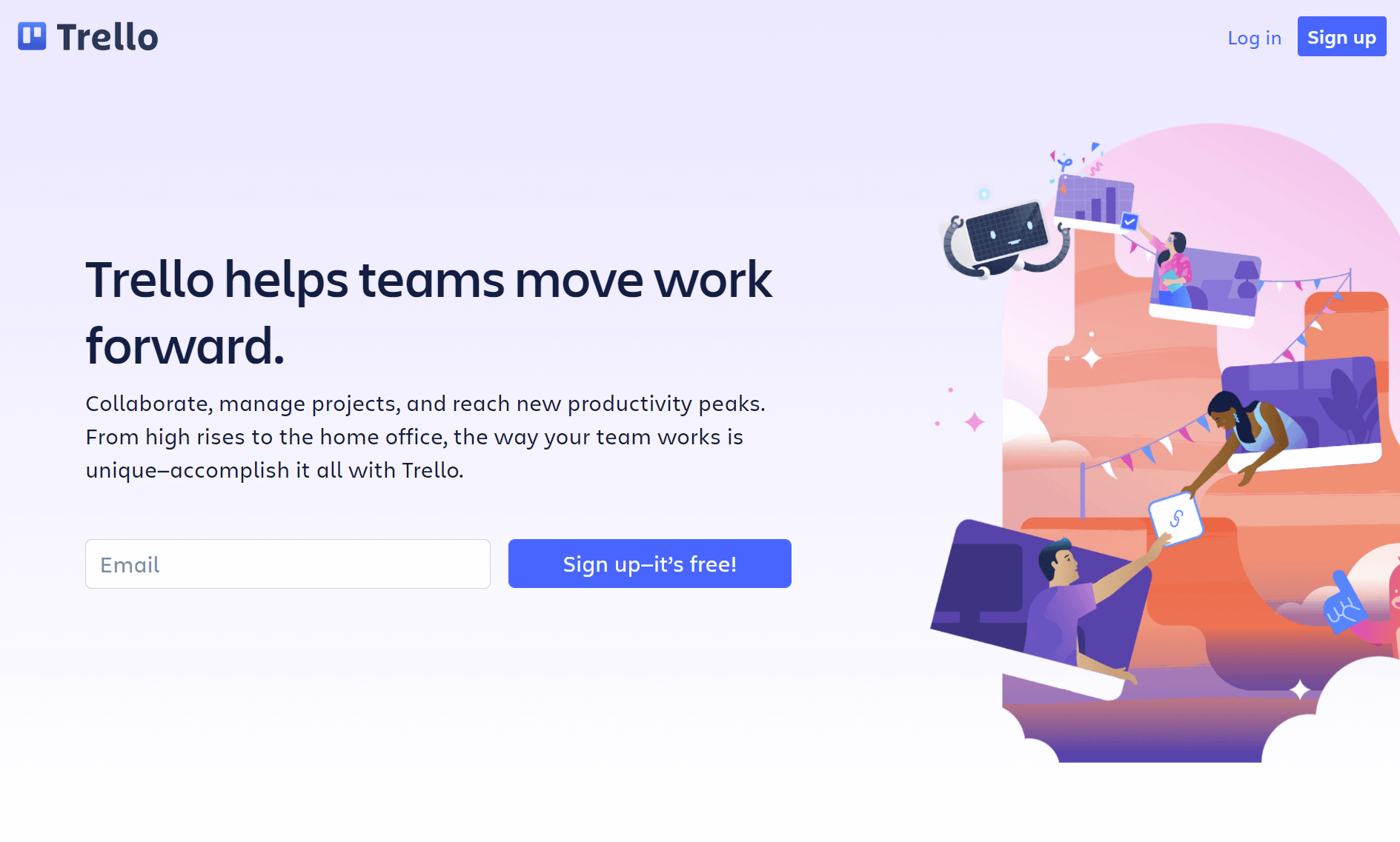
Another major business software that’s regularly incorporated inclusive visuals is Trello. Here’s the homepage with a host of diverse people illustrations.
Hubspot is another huge brand that has embraced diversity in its visual marketing strategy. From the homepage to social media visuals, Hubspot is highlighting how diverse businesses can be.

Take a look at how Shopify has been including diverse imagery throughout its site. This is a great way to show consumers that your brand is for everyone, not just a narrow audience.

Search Engine Journal has been creating gorgeous and diverse blog headers all year. Here’s a selection of our favorites below. You can see the diversity of races and abilities showcased in these visuals.

In 2022, showcase the diversity of the world in your marketing designs. It’s a great way to reflect your vast customer base and cement your brand as part of a bigger whole.
2. Fun data visualizations
Last year, we saw a proliferation of data visualizations in the fields of healthcare and marketing. This was understandable. There was a lot of complex data to share with the pandemic raging on.
With hosts of bad infographics being shared online and on news channels, there was a call for simplified data visualizations. That’s the route a lot of marketers took.
Creating simple charts and graphs that shared a story was the best way to keep audiences engaged and informed.
It looks like brands have taken that approach to a whole other level. Instead of simple charts, we’re seeing more fun data visuals becoming the graphic design trend of 2022.
Twitter marketing has been creating colorful and engaging charts and graphs for a variety of topics over the past year.

These data visualizations easily catch the eye of users on Twitter. But they’re not just visually appealing. These graphs cover fun topics like gaming or summer activities, like this tweet thread.

The pivot to fun data doesn’t come as a surprise. 2020 and most of 2021 have been emotionally challenging, to say the least.
Users in the B2C and B2B sectors are looking for a mental break when they look through social media.
LinkedIn Marketing has also taken to creating data visualizations about relevant topics. But the brand is using a lighter tone, like in this tweet about inboxes.

The chart is simple and clean. It’s unmistakably a data visual made to arrest the eye. But once you start reading the content, that’s when you see that LinkedIn is having a bit of fun.
Hubspot’s Instagram has a number of delightful data visualizations. We love their use of color, or lack thereof, depending on the topic.

This graphic design trend works best if you don’t do too much. Keep the design simple and the content relevant.
Venngage ran a few data stories on Instagram using this method. A single color theme ran throughout the visuals. This helped keep the story in focus.

Data visuals have become part and parcel of marketing now. We know that users are going to stop to look at a chart or graph.
But brands have moved away from sharing yet more devastating news about the pandemic. Instead, they’re creating data-related content about topics that are appealing and enjoyable.
At Venngage, we’ve been designing fun data visualizations for a while. We’ve created infographics about The Avengers, Game of Thrones, Netflix fonts, and Disney villains.
For example, here’s a simple but fun customer journey mind map example that brands can be inspired by.

Data is important, especially in the wake of the pandemic. With rampant misinformation, there has been a rising demand for brands to be more accountable. But that doesn’t mean that data needs to be boring.
Brands can have some fun with topics. Just ensure that the content remains relevant to your audience and niche.
3. Bold backgrounds
We’ve seen a move towards muted colors over the past few years. But graphic design trends for 2022 are going back to bolder and brighter colors.
While these colors won’t be the focus of designs, they will help visuals stand out in the busy online space.
Spotify has been using bold backgrounds across its social channels over the past year.

Visually, the bold colors, contrasted with the lighter text, make the images pop on a social feed. It immediately makes you want to click to find out more.
This is a trend that has caught on with other brands, even outside the entertainment sphere. Mailshake has embraced the multicoloured bold background on its blog posts.

This consulting pitch deck exemplifies the direction we’re talking about it. It’s multicolored, not very bright, but bold enough to draw the eye.

Note how the boldness of the background doesn’t take away from the key elements in the visuals. You can still read the text, see the icons, and understand the core message of the deck.
The same goes for this poster header. You can see the icons blend into the background colors. The white padding helps keep the icons in focus.

Don’t know how to create a bold background for your poster? Easily design visuals like the above using the Venngage poster maker.
Bold backgrounds are one of the graphic design trends that returns regularly.
What’s interesting about them is that these backgrounds aren’t meant to overwhelm the text. Instead, it’s a tool to make the information stand out.

Buffer has been incorporating bold backgrounds across its Instagram posts, Stories, and IGTV. Here’s a selection of the brand’s posts on Instagram.
They aren’t shying away from using an array of colors. And neither should you!
Similarweb’s branding has leaned strongly into a bold blue background. The company has tailored its icons to match, creating a cohesive brand presence across social media and its website.

Bold backgrounds can be overwhelming if you overuse them. They can also saturate your feed very quickly. We suggest using a combination of bright colors and muted tones. This will feel soothing for the eye.

Here’s a Venngage business proposal template that demonstrates how you can use a bold background wisely.
Only a few pages employ the bright colors in the background. The rest of the pages have a white background and use bold colors as highlights.
Bold backgrounds have made an unexpected comeback in time for 2022.
With so much content being shared online throughout 2020-21, it isn’t surprising that brands have gone back to this old favorite to capture audience attention.
But remember to use bright backgrounds sparsely. They are meant to make the information on a page stand out, not drown it.
4. Colorful icons and illustrations
Sticking with the theme of color, it wasn’t surprising that brands decided to pair their bold backgrounds with equally colorful icons and illustrations.
Icons have long been a powerful marketing tool. They share messages at a glance and are universally acknowledged.
Sprout Social has taken the colorful route with its icons. Note how the brand combines the colorful icons with bold backgrounds. The contrast is startling and engages the eye immediately.

Most icons mean the same thing in multiple languages. This makes them an easily accessible way to reach audiences.
We’ve been seeing illustrations become more popular over the years. There was a heavy focus on stock photos and images a few years ago. But illustrations are making a comeback.

These illustrations from Toolbox HR are certainly a joy to look at. There’s a good mix of interpretative illustrations and simple icons.
The brand is really leaning into colors with its visuals. Though there isn’t a color scheme to follow, the visuals unmistakably belong to the brand.
Interestingly, while flat icons and illustrations were all the rage for 2021, we’re now seeing a mix.
Flat and 3D icons and illustrations are being used across the board. The primary connection between them is how colorful they are.

This short video from Pipedrive demonstrates how important color has become in the marketing sphere. With just three colors, the illustrative video looks bright and catches the eye.
Most importantly, it gets the message across to anyone scrolling through their timeline.
Databox is another brand that has embraced a few of the graphic design trends of 2022. The company has started using colors in a big way.

You can see the hues in its backgrounds, icons, and illustrations. We also love how the site is using diverse people icons in its headers.

Salesforce has also been using a wide array of colors for its illustrations, as you can see in this post.
The colors are used strategically, in chairs, shirts, and plant pots. It’s subtle enough to draw the eye without overwhelming the reader.

Here’s another example of subtly using colorful icons from Zendesk. The background colors are more in keeping with the muted shades of last year, but most of the icons pop off the screen.
This is the kind of illustration that will have even the most ardent doomscroller stopping in their tracks.
At Venngage, we’ve been creating a host of templates that incorporate colorful icons and matching illustrations, like in this plan template.

Colorful icons and illustrations are visually appealing but they still need to adhere to your brand guidelines. They also need to reflect the central message of your blog posts, social media posts, or infographics.
With Venngage, you can access 40,000+ icons, including flat and 3D icons. We also have over 500 diverse icons for your people infographics, completely for free.
5. Serif fonts
Serif fonts made a comeback for 2021. It looks like they’re here to stay for 2022, as well. These classical type fonts have been in existence for centuries.
They can look outdated sometimes, which is why we see them falling out of favor.
But serif fonts are also elegant fonts. They look stylish and nostalgic. But more importantly, because brands so often use sans serif fonts, any serif font immediately catches the eye, like in this eBook example.

And in a crowded online sphere, particularly because of the pandemic, arresting users’ attention has become paramount.
One brand that has embraced serif fonts over the past year is Intercom. They’re using a stylish version on their homepage that manages to marry a classic style with modern aesthetics.

The brand has also been using serif fonts for its podcast series.

Mailchimp has adopted serif fonts for its brand for a while now. Here’s their homepage with a very classic serif font greeting users.

Serif fonts look dependable and calming, which is what users need to see right now. Mailchimp has paired its brand fonts with the right visuals on its homepage to create that effect.
Users in the B2B sector want to connect with brands that are trustworthy. This is especially true in the volatile environment we currently live in. That’s what a serif font can do.
This theme of trust and reassurance continues through Mailchimp’s Twitter feed.

And their podcast art.

As well as Mailchimp’s blog titles.

Brand consistency is crucial in an online space that is overwhelmed with content. Mailchimp has found the formula that makes them recognizable.
Even Shopify has embraced the serif font trend for some of its Instagram posts.

Fashion brands often use serif fonts in their marketing visuals. Here’s London Cashmere Company pairing a serif font with its Instagram post.

If you’re looking to incorporate serif fonts in your marketing visuals, Venngage has a list of the best free fonts available right now. And we have a whole guide on how to choose the right fonts for your designs.
6. Branded memes
Everyone loves memes. Or at least, they love to hate memes. It’s impossible to avoid them. There’s a meme for everything. And everything can be turned into a meme.
Some memes tend to catch on faster than others. Viral memes do have a short lifespan, though.
They can fizzle out within a day, or even within a few hours. But some memes are everlasting and continue to be recognized years later.
As with fun data visualizations, the state of the world in 2020 and 2021 impacted how brands use memes. This has given rise to one of the most fun graphic design trends of 2022: branded memes.
Posts like this one from Shopify are becoming the norm, even in so-called serious niches.

The reason why this meme works is because of its simplicity. The actors and the context may not be relevant in a few months. But the visual is so simple that it conveys the story the brand is trying to tell.
And that’s the key to meme success. You don’t want to invest time in a meme that nobody will understand in a few weeks.
The visual also needs to stand on its own. The best memes say plenty without any context.
You can find inspiration from Foundation Inc. The marketing brand has been choosing the best memes for its social media. It’s safe to say they’ve become a lean mean meme machine over the past year.

What works with Foundation Inc’s memes is how easy it is to understand the visual. You don’t need any background. The context is obvious.
For example, should you have watched Ancient Aliens to understand the fourth meme? No.
You can tell that the man in the visual is trying to say something he thinks is profound. Of course, knowing the context makes the meme infinitely funnier.
Sprout Social took a different approach to the meme format in 2021. There was an online trend about describing attributes associated with Zodiac signs.
The social media brand shared this business-relevant meme.

Buffer has also been getting into the meme game with this grid. I’m sure every social media manager will recognize these feelings.

The Olympics birthed a lot of memes that are sure to gladden a sports fan’s heart. SEMRush embraced the format and brought it into the world of marketing offices.

Sticking with the sports theme, this meme warning about PBNs couldn’t be more obvious.

Like Foundation Inc, SEMRush has gone all out on its meme marketing. Here’s how they repurposed a popular dog meme to showcase a product feature.


Zapier took the meme format to an interactive level. Check out this thread where the brand created ‘Employee of the month’ badges for users’ pets.
What a fun way to improve engagement and lighten the mood!
Over on Instagram, Zapier continued to keep things light with this recently popular Star Wars meme. It’s a great way to highlight the usefulness of their product.

Memes are fun and engaging. They share universal messages which make them an easy visual to adapt to your business needs.
The important thing to remember with this 2022 graphic design trend is avoiding overuse. Memes can become stale very quickly.
Don’t rely on memes as the sole method of visual communication. Use a variety of visual tools and pepper in memes from time to time.
7. Quotes
If there’s one thing we know about graphic design trends, it’s that they’re cyclical.
A handful of years ago, quotes were all the rage. Inspirational quotes from marketing gurus, business tycoons and experts were everywhere.
Then people started getting frustrated with the same quotes showing up all the time. Or worse, being forwarded to them by over-eager relatives.
That’s now changing. Here’s a quote LinkedIn shared highlighting a user’s reading initiative. This quote serves as social proof. But it also shows that LinkedIn is engaging with its community.

We’re seeing quotes make a comeback but with a difference. We aren’t seeing the same inspirational quotes from before.
Instead, the quotes being shared in marketing visuals have more to do with education than inspiration.

Here’s another example from LinkedIn. The post includes a quote both in the text and in the visual. This gives users plenty of context.
It’s a great way to spark conversation. Which is exactly what this campaign was geared towards.
LinkedIn wasn’t afraid to throw it back to the old classics on Twitter, though. Here’s a quote from Aristotle for the brand’s #MondayMotivation posts.

Keap has been using quotes from its customers as social proof. This isn’t a new social media method but we like their visuals. They’re including the quote alongside an image of the individual.

Teamwork has also been using customer quotes for its social media visuals. A strong quote, paired with an image of a real person, is great for social proof.

When Teamwork doesn’t have an image of the customer, they’ve used a quirky illustration instead. It’s a good substitute and does the job.

Buffer has been using quotes from blog posts as a teaser. This is something we’re seeing much more of over the last year. And it’s going to continue as a graphic design trend in 2022.

Zendesk has also been using quotes for teasers in its #VillageAtZendesk interview series. The quotes are a great way to encourage users to click on the link and read more.

Here’s an Instagram post from Asana with a quote and a branded image of the speaker. It’s a clean and attractive visual that reflects the brand and the message they’re trying to send.

The use of quotes in visual marketing has evolved. There’s certainly room for quotes in marketing collateral now. The trick is to find one soundbite that stands out and use that for your visual.
8. Social screencaps
Brands have been sharing versions of the same post on multiple social media channels for a while now.
But each platform has its unique voice and appeal. It isn’t always feasible to create separate content all the time.
Brands need to share announcements, contests or product launches on all channels. And they want to share it at the same time.
The way to do this is through social media screencaps. They have been gaining popularity amongst individuals and brands.
If you take a look at Hubspot’s Instagram posts, you will often see these types of images appear. The posts are screenshots of tweets overlayed on Hubspot’s signature brand visuals.

This trend is fascinating and we can’t help but love it. There’s no way to share posts from Twitter to Instagram at the moment. After all, Twitter is a very text-based medium. Instagram is entirely visual.
But these marketing tips and tricks that Hubspot has shared are relevant to their audience. No matter what platform they’re on!
That’s why Hubspot has taken to screenshotting these tweets and sharing them on its Instagram.
Zapier is another brand that’s been going down the social screencap route. The brand has adopted this graphic design trend in time for 2022, primarily as social proof.

It’s a clever way to cross-pollinate between platforms while showcasing the power of their product.
Last year, we saw the rise of social slide decks as a method of sharing multiple visuals on different channels. While slide decks have caught on heavily, we’ve seen the graphic trend of social screencaps take over in time for 2022.
Lululemon has also been sharing positive feedback from its customers by screenshotting tweets for Instagram.
The brand shares a carousel of tweets about one type of product per post. For example, this one focuses on their athletic shorts.

This trend is catching on beyond Twitter and Instagram. Brands on LinkedIn are utilizing posts from other platforms to engage their audiences.

Foundation Inc has been sharing screenshots of tweets by its CEO, Ross Simmonds, as well as other marketers.
This is the kind of content that speaks to the brand’s audience but isn’t readily available on LinkedIn to share. Screenshots of these posts bridge that gap.
Brands aren’t just sharing tweets on Instagram and LinkedIn. Zoom has been sharing its TikTok videos on Instagram.

Instagram’s new video settings allow a variety of sizes. And TikTok’s vertical orientation fits perfectly on Instagram.
And Zoom is sharing their TikToks on Twitter, as well.

Channels like TikTok are geared towards lighter content. But that doesn’t mean that content can’t live on other platforms.
Users aren’t visiting social media for sales-y content. They want to be entertained while they learn tips and tricks. Bringing multiple platforms together through social screencaps helps solve that problem.
Conclusion
The graphic design trends of 2022 are a direct fallout of the pandemic and the changing social and political landscape of the world.
These events have had a profound impact on the way brands communicate with their customers.
But it’s also changed how brands present themselves. There has been a great deal of self-reflection over the past 18 months.
Brands are attempting to put their best foot forward in every aspect of their business life.
The visuals that companies adopt will act as a window into their ethos and mission. That’s why we’re seeing more inclusive visuals and data visualizations.
Plus, branded memes are likely to remain trendy in the near future.
If you want to see how the graphic design trends of the past few years have changed, scroll down and take a look. We’ve collected all the research Ryan McCready conducted on trends from 2018 onwards.
7 Graphic Design Trends That Will Dominate 2021
With so many large-scale changes in the world over the past year, brands haven’t been able to take many design risks this year. They also have to do a lot more with less this year.
What graphic design trends will dominate in 2021? Check out some of our biggest graphic design trends below.

Graphic Design Trends 2021:
- Muted Color Palettes
- Simple Data Visualizations
- Geometric Shapes Everywhere
- Flat Icons & Illustrations
- Classic Serif Fonts
- Social Slide Decks
- Text Heavy Videos
Click here to see the 8 Graphic Design Trends from 2020!
1. Muted Color Palettes
Muted color palettes really took over the graphic design world last year, and show no sign of stopping anytime soon.
I try to use them in my graphic design work for Venngage as much as possible:

If you’re not really familiar with muted colors, they are basically vivid colors that have had their edge taken off with an infusion of black, white, or a complementary color.

After years of bold and bright colors, people seem to want something a little more relaxed and understated.
Especially with so many negative, confusing and loud messages we have all been receiving over the last year or so.
Muted colors feel safe and secure, even nostalgic.
One brand that used muted colors exceptionally well last year was LinkedIn, and they have continued to do so.

However, unlike last year, the messaging and visuals had to change a bit to fit the current climate.
It has to be difficult to be a networking platform in the middle of record unemployment, with a long economic recovery ahead.
Luckily, their social media graphics, landing pages, and other design assets feel genuine and comfortable because of those muted colors.

In addition to making a graphic feel more authentic, muted colors also feel very natural and organic.
Classpass uses muted colors throughout all of their visuals and it fits their health-conscious brand perfectly:


As well as Well+Good:
With health and wellness being a topic on most people’s minds, I think that organic muted colors are going to be used by a lot of consumer brands going forward.
Personally, I like using muted color palettes because they blend well with text. It doesn’t matter if you use a light font color like below:

Or a darker font–the text really stands out against the muted backgrounds and other elements:

In this template, even the small white text is easy to read because of the muted background color:

Unlike some fast shifting graphic design trends, I have seen that color palettes usually take at least 3 or 4 years to become overused and not trendy.
So don’t be scared to swap your color palette to something more muted like Social Media Examiner has done:
Or better yet, use your brand colors as a jumping off point and create a few secondary color palettes that you can use in your visual content.
Return to 2021 Graphic Design Trends
2. Simple Data Visualizations
The goal of any data visualization should be to make the complex data easier to understand.
I also think someone should be able to understand a data visualization without much extra context. You really shouldn’t have to explain what you’re trying to show.
In this example you can clearly see that search volume around health and fitness keywords crashed in April of last year:

But some designers have been chasing style over substance to stand out on social media or Behance.
Or they just overload their readers with way too much data, so the main point is lost in the noise.
Not sure what I’m talking about? Check out this example:

Anyone know what they are trying to convey with this graph? Me neither, and it doesn’t help that half the graph is cropped out in the feed.
Twitter Marketing could have used a similar graph to show off their growth, but they use a very easy to consume pie chart:

They also highlighted exactly what they wanted a reader to take away from the graph by calculating the growth percentage.
Comparing this to the previous example, you can almost instantly get value from this data visualization.
Honestly, Twitter Marketing has been doing a lot of this lately and I think it’s going to be very popular going forward.

There is a ton of complex data flying around in all parts of our life. As a designer or communicator, you should be making that data less scary and easier to comprehend.
Lately, people have been dealing with tons of data, so don’t make them work to understand your visualizations. Because they won’t…they will just keep scrolling.
As much as the simple pie chart gets hated on, it’s a pretty handy data visualization. I use them all the time!

Read More: 14 Visual Content Marketing Statistics to Know for 2020
Because most people know exactly how to read a pie chart, it’s perfect for social media sharing and quick comparisons.
With this data visualization you can see that “personal growth” was the most popular achievement:

Bubble charts are also great if you want to make a direct comparison between two things, like below:

These examples may be extremely basic, but they also help people understand the data in seconds. Plus, each of these simple data visualizations work really well with other graphic design trends like muted colors and flat icons.
But sometimes you don’t even need to create a graph or chart to visualize your data. Just create graphic with an interesting data point or statistic like this:

It will get your point across a lot clearer and quicker than trying to use a complex visualization. And when you’re sharing these visuals on social media, that counts for a lot.
Plus, people will remember that data or piece of information a lot longer if presented in that fashion.

While you’re working on a data visualization, try to think about what you want to say with your graphic.
If you want someone to focus on a single data point, the data visualization will be a lot different than one where you compare multiple things.
Return to 2021 Graphic Design Trends
3. Geometric Shapes Everywhere
One thing that really surprised me this year was that a ton of brands have started using geometric shapes in their designs.
Last year there were a plethora of designers using flowing and abstract shapes in their designs:

But those have been replaced with pretty rigid, hard-edged geometric shapes.

Not that I’m complaining–geometric shapes are a lot easier to create and use!
If you look at some of the other graphic design trends this year, the shift actually makes a lot more sense.
When you use these geometric shapes, like below, it can add order, consistency and structure to a visual:

Zendesk has been using geometric shapes all over their design assets It has almost become a recognizable part of their brand.

While the images they use may not always be consistent in style, they all feel consistent because of the similar geometric shapes.
Here’s another example from Rivet. They use a bunch of circles to make each product image visually similar.

This is a simple design trick that you can apply to your own design assets. With Venngage, you can use an image frame to make a ton of different photos feel similar. Like so:

Or just use a single background shape to make a bunch of random icons look consistent:

This graphic also blends geometric shapes with a muted color palette as well.
Because geometric shapes are so exact and precise, they create a lot of good contrast when used with a more natural muted color palette:

The right amount of contrast, like between a soft muted color palette and hard geometric shapes, can make a visual very eye-catching.
I think if they would have used some abstract shapes or patterns, the graphics would feel too casual. That may work for a consumer brand but Formstack seems to be targeting a more professional audience.
Last but not least, you can simply use geometric shapes this year to add some texture and depth to your graphics:

Or make them part of the main focal point of your graphic:

As you can see, there are a ton of ways that you can use geometric shapes this year! So get out there and start creating.
Return to 2021 Graphic Design Trends
4. Flat Icons & Illustrations
Like I said above, graphic design trends are pretty cyclical. After a while, something will go from trendy to overplayed and then back to being trendy again.
After writing about flat icons in the first edition of this article almost 5 years ago, I have seen this trend come full circle.
For example, this is what Mailchimp was using back in 2015:

Which doesn’t look too different from some of the other visuals being shared and created almost 5 years later!

This isn’t a bad thing–I just wanted to illustrate how design trends come and go.
Now if you’re creating a ton of visual content, these flat icons are ideal because they can be adapted for a lot of different graphics like social media visuals, infographics, or presentations.
Check out all the different icons that were used in the graphics below from Adjust. They all feel like they belong to a singular brand:

These flat icons can also be consumed very quickly. For example you can probably guess that the top left image has to deal with fitness and the bottom left with news.
Even if you saw those visuals without any context or text, you could still understand what the designer was trying to say.
The same can be said for this template:

Icons can be a powerful tool for visual communication. With a few icons, you can tell a simple visual story that will give a lot more context to your social media post, blog post, infographic, or video.
There are a few ways that you can use flat icons this year to upgrade your visuals. One of the easiest is to use a single icon like in these social media visuals from Databox:

Or you can use multiple flat icons to create a more complex graphic like Sprout Social has done below:

We take this approach sometimes when creating our own blog headers and infographics:

You can even inject your branding or brand colors into graphics with these flat icons. Just look at what Mailshake has created lately:

They also use them throughout their webinars and courses:

If they would have used a stock image, they wouldn’t have had such a consistent visual brand across their site and social media.
But I think the best part of these icons is you can easily change their color, size or orientation. This also makes it easy for non-designers, like myself, to create amazing visuals.
Return to 2021 Graphic Design Trends
5. Classic Serif Fonts
After working in the design world for 5+ years, I still sometimes get serif and sans serif fonts confused.
If you’re like me, I think it helps to remember that serif fonts have little embellishments at the top and bottom of letters:

This would obviously mean that sans serif fonts are missing those.
Serif fonts are one of the oldest font styles or typefaces that are still in use. They date back to the 15th century and have been in use ever since then.
Because of this, serif fonts are commonly seen as classic, elegant or trustworthy. They can evoke a feeling of nostalgia for a large chunk of the population.
Mailchimp use a variety of serif fonts throughout their designs but I think its most powerful on their landing pages:

Each of these landing pages is targeting a pain point that people running a business may face. I think the serif font helps position Mailchimp as a tool those people can depend on to help them succeed.
They use a simple font to set the tone of their whole site and although they are a huge company now, it feels very authentic.
Ellevest is another great example of this feeling of trust in action, with serif fonts being used across their website and shares:

They specifically help women invest, bank, and improve their financial future, which can be scary for all of us. I know I am terrified even thinking about buying a random stock.

But with a serif font permeating their brand, each social media post and blog post seems trustworthy. It almost brings back memories of classic banks and financial institutions of the past.
Imagine if they would have used a bold or brash font like below:

Would you want to give a company like that your money? Especially in this climate! No chance.
Schools, health departments and other similar organizations will be using a lot of these serif fonts for the exact same reason too:

Like I stated earlier with muted color palettes, brands are trying to seem a lot more genuine and positive going forward.
Some brands are even using serif fonts with muted or neutral color palettes to really drive the point home.

Another design trick is to use serif fonts as headers or in short phrases, like above.
They aren’t the easiest on the eyes but, as you can see in this graphic below, they create a lot of great contrast with a sans serif body text.

If you’re not aware of Hinge, it’s a dating app that wants to be deleted after you find someone. That might sound like an insane mission statement but they seem to stand by it.
For first-time users, that might be hard to believe but once you look at their branding, brand guide and app it seems a lot more realistic:

I think it’s because their serif font makes the information and photos feel like they came from a real person, not a bot.

Overall, the app just seems a lot more trustworthy than many other dating apps, in an industry that has been dominated by some unsavory behavior. Just take a look Tinder’s branding and shares:

This is a HUGE difference between the two, but they are looking to attract basically the same users.
So when you want to use a new brand font, take the time to think about how it’s going to fit into your visual brand.
Return to 2021 Graphic Design Trends
6. Social Slide Decks
Social slide decks are exactly what they sound like: slide decks that were created to share on social media.
These slide decks are mostly shared on Instagram or LinkedIn because of the way that those platforms handle images. They could work on other platforms but the experience wouldn’t be as smooth.
Additionally the algorithms on Instagram and LinkedIn seem to promote these slide decks a lot more than a single image.
If you follow us on LinkedIn you have probably seen some of our social slide decks like so:

We have been creating them for the past year and I even wrote a whole article on how to create LinkedIn slide decks from scratch!
These slide decks get about 10-20x more impressions and clicks then a simple visual or graphic.
I mainly use these slide decks to summarize an article or repurpose the most important content from a blog post. Kinda like in the slides below:

But recently I have seen a lot of brands do some very interesting things with these slide decks, especially on Instagram!
Zoom has put out a few decks that can help you use their product:
I really like this approach because you can still activate your followers to take an action, without needing a direct link. This slide deck also is a unique way to announce a new product feature too.
Asana used this approach to announce some new data that they collected:
They also used very simple data visualizations to make the information easy to understand without much context!
The design pros at Typetopia create a ton of these informational slide decks as well. I am a big fan of their approach because they are basically just infographics that have been repurposed for Instagram:
Brands like Quickbooks are able to pack a ton of information into each slide deck, without just listing it all on a single slide as well.
You can also combine static images with videos and more on Instagram to create a more engaging experience for your audience.
In this example from Lululemon, they use the second and third slide to give the follower more context about the simple video.
If you are a frequent Instagram user, you probably have seen people sharing these slide decks to share messages around social justice, mental health and voting.
That’s where I really first noticed these slide decks taking off. Mainly because these decks are so easy to create. They can engage your audience in a new way and are very easy to share.
Plus, the chances of people reading your whole slide deck on Instagram is pretty high, especially when compared to the caption.
But not every slide deck has to be serious–some can just be a fun way to engage with your followers. Like so:
So no matter what your goal or industry, I think your brand could take advantage of these social slide decks in 2021.
Return to 2021 Graphic Design Trends
7. Text Heavy Videos
As people will likely continue to work remotely well into 2021, shooting new video content is going to be very difficult.
You can’t really jump over to your video room and shoot a quick video with your team anymore. Or even hire a freelancer very easily.
At some point, people are going to get tired of seeing someone talk directly to their computer.
I know I am, especially because I already have all my meetings like that.
So I really believe that video content is going to lean on text and motion graphics a lot more this year. Kinda like this example:
How important is #branding for a company? This Friday, our last session of #ReimagineWithWrike features Dimitrios Papadogonas, VP of Marketing NA at @SolarEdgePV. He’ll share some insightful stories on his experiences as a veteran in the industry. Join us! https://t.co/krAgYhKhpK pic.twitter.com/ev1yTA36FY
— Wrike (@wrike) August 25, 2020
Slack has been using very text heavy videos all across their social media accounts lately. They range from very simple announcements like below:
Something about an agenda just makes it feel real. 💫 Check out the personalized sessions that’ll take place at #SlackFrontiers 2020. The agenda’s now live on the site! https://t.co/Ir9mvlFnkZ pic.twitter.com/OgSfBc4fUL
— Slack (@SlackHQ) August 20, 2020
To a bit more complicated collection of content from their users:
You’re doing great, and we want to hear about it! Share your team’s remote-work success story and help create opportunity with @YearUp. For every tweet that includes both @SlackHQ and #WhenRemoteWorks, we’ll donate $5, up to $200,000. Drop those stories ⬇️ https://t.co/f6dhz3u0zj pic.twitter.com/QUXYTEmXWO
— Slack (@SlackHQ) August 28, 2020
And even full product explainer videos:
What I like about their simple videos is that they can use their brand colors, fonts and voice in each of them. This helps them present a unified brand across all of their marketing channels.
Not one of those videos needed video footage to be shot, which means they can turn them around a lot quicker as well.
Instead of needing a whole production team to create a video, they can have a few people knock an idea out in a few days.
Here is another great example of using text heavy videos from Quickbooks:
Time is money and QuickBooks Cash keeps both moving for small businesses. With same-day money in and out processing, you can access and move your money faster.
— Intuit QuickBooks (@QuickBooks) August 6, 2020
I like how they get right to the point with this video, which is super important on social media.
Additionally, you don’t have to have the sound on to get the message, so even a passive viewer will get value from a video like this.
Now if I’m being honest, not every brand is going to have the bandwidth or expertise to create new content like that.
But you don’t really even need to create new content for your videos this year. Just repurpose things from other formats like a podcast or interview:
You can turn a slide deck, like from the previous section, directly into a video or GIF like we have done this many times at Venngage:
Amidst a global pandemic, carbon emissions are dropping but medical waste is rising steeply.
For the 50th anniversary of #EarthDay last month, we put together a study + infographic on the full impact of #coronavirus on the #environment: https://t.co/PXXPgdsYjmpic.twitter.com/aPKO5pBwWE
— Venngage (@Venngage) May 26, 2020
I like doing this because you can get around the random cropping on Twitter, LinkedIn and Facebook by sharing a video instead of a static image. Plus, it’s much more engaging than a blog header or stock photo.
You can even outsource your work and use user generated content, to create a video:
A place to connect, create and communicate. Take a look at how doing business on LinkedIn has helped these marketers succeed.
— LinkedIn Marketing (@LinkedInMktg) July 27, 2020
As you can see these simple videos can help you repurpose a lot of content for different platforms and networks.
Even if your company is cutting down on content creation, you can really give old content new life with a simple video or slide deck.
Conclusion
As you can see, this year the graphic design trends are not going to be changing THAT much.
In fact, minimalism and simple graphics are probably going to be very popular as brands try to stretch their budgets.
If you think we missed something, reach out to me on Twitter @RyanMcCready1.
Now if you want to compare the trends to some in the past years, just scroll down!
We have collected all of the past graphic design trends below.
Return to 2021 Graphic Design Trends
8 Graphic Design Trends for 2020
Design styles that were very unique just a few years ago have become just another common tactic used by massive corporations.
So to stay ahead of the curve, be sure to check out the 8 Graphic Design Trends for 2020 and beyond below!

The biggest graphic design trends of 2020 are:
- Muted Color Palettes
- Color Gradients
- Abstract & Dreamy Illustrations
- Heavy Simple Fonts
- Flowing Lines & Shapes
- Genuine & Authentic Stock Photos
- Minimalist Landing Pages
- Better Branded Animations
1. Muted Color Palettes
Over the past few years, we have seen the rise of bold colors in design, as brands looked to differentiate themselves from competitors. With bright blues, electric yellows, and toxic greens appearing all over the yearly graphic design trends.
But in 2020, we are going to see designers and brands take a step back from those vivid colors towards more muted color palettes.
Muted colors have been slightly desaturated with black, white or a complementary color. They are basically the opposite of vivid colors.
As you can see below, the LinkedIn Marketing team have been using these muted colors like a pro lately:

Presidential candidate and South Bend Mayor Pete Buttigieg even selected muted colors for all of his campaign and branding:

In each of the examples above, there’s still a lot of brand colors being used, but if they would have used vivid colors the images would be a lot more abrasive.
Now don’t worry, the design world isn’t going to get less colorful this year. The colors might just be a little more reserved across the board.

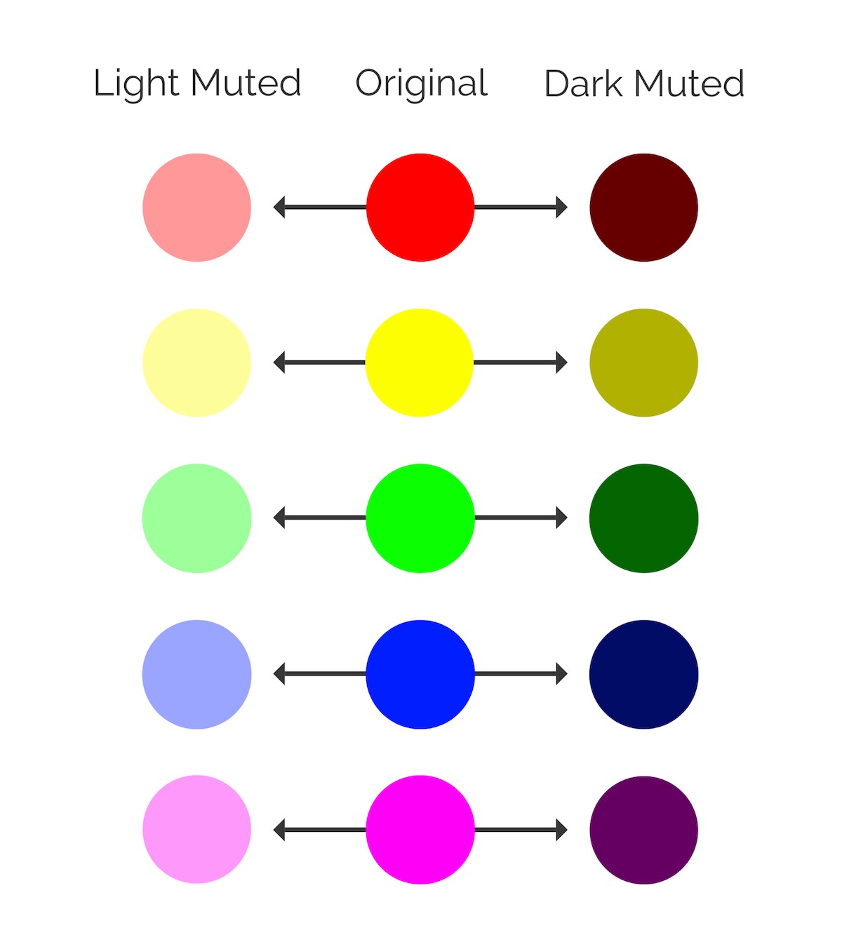
I like to think of muted colors as vivid colors that have had their “edge” taken off with an infusion of black or white. The chart below is a good example of both light and dark muted colors actually:

Because of that infusion, muted colors work almost flawlessly with neutral colors. In this example, the black background and the multiple muted colors blend almost perfectly on these charity fundraising posters:
This example from Ellevest shows that a muted color palette can be used in a similar way with a much lighter background:
When you’re working with a white background, try to use lighter muted colors and vice versa for black backgrounds. This will ensure that the colors blend well, instead of introducing a lot of harsh contrast.
Additionally, you can use a muted background color to make simple text or content a lot easier to read.

You can even use a muted font color palette to tie the whole graphic together:

There’s no shortage of color in any of these graphics. The main colors just don’t dominate the graphics like some of the trendy colors of the past.
After years of loud color palettes, these muted colors can be used by brands to signal a move towards the future.
For example, the vivid colors previously used by Apple in their marketing, and even the new iPhone colors, have been replaced by more muted tones.
As you can see, these muted colors make the product feel a lot more modern and current. The Apple Card gradient, which would normally feature loud or bright colors like with Apple Music, actually uses muted colors too!

And like last year, once Apple starts doing something, the design world follows.
One final thing that I want to touch on in this section is that muted colors can make your designs feel a lot more natural. And trendy lifestyle brands are taking notice. From the fitness innovators at Classpass:


To the cannabis company dosist:
And Zume, which is trying to eliminate food waste on a global scale:

So if you’re looking to update your graphic design for 2020, I would recommend starting with a muted color palette. You can even use your brand colors as a starting spot and build a whole secondary color palette by adding some black or white.
Return to 2020 Graphic Design Trends
2. Color Gradients
For the third year in a row, gradients are going to be a major trend in the graphic design world.
The staying popularity of gradients was one of the biggest surprises that I ran into while researching this piece. Honestly, after their nostalgic comeback tour, I thought the world would move on to something new.
But each year it seems like designers keep finding new ways to use gradients in their designs.
The year 2020 is no different. Starting a few years ago, gradients were mainly used as eye-catching backgrounds, like in this example from INC:

Color filters have also been used to add some extra texture, like in this annual report cover:

Then last year gradients became the focal points of a lot of graphics:

Now as the novelty starts to wear off, I believe that gradients are going to be used as one of the standard elements of graphic design.
I know that sounds like it might be a negative statement, but it isn’t! Instead of being thrown away as another passing fad, gradients are finding a life throughout the design world.
For example, Grammarly used gradients instead of flat colors in their social media graphics:

The designers at Trello uses them to accentuate their blog headers and social graphics too:

Instead of being the main focal point of these designs, the gradients are just one of those elements of graphic design that elevates the graphic.
Gradients can be used to add some depth to complex illustrations, like below:

With simple gradients, there’s a dream-like quality added to these illustrations.
Gradients are used a little more subtly in these Twitter illustrations below, but I still think that they add a lot of depth and texture to the illustrations:

As brands continue to use these types of illustrations, gradients will replace the flat colors in an attempt to further differentiate themselves from other companies.
Additionally, with the rise of muted color palettes, gradients also are going to become a little less vivid and bright. The Apple Card is a great example of this shift:

I truly believe that if it would have been released last year, the gradient would be a lot more vivid and colorful. But as you can see, the card feels a lot more professional, modern, and reserved by avoiding those loud colors.
The muted gradients in the example below invoke a similar feeling:

The color palette also blends well with the black background and fonts, like we saw in the first trend.
So as you can see gradients show no sign of slowing down, but the way you use them in 2020 has to be a lot more innovative than in previous years.
Return to 2020 Graphic Design Trends
3. Abstract & Dreamy Illustrations
One of the best things about using illustrations is that no other company is going to be able to copy them exactly. Casper was one of the first big companies to embrace this trend, and they have stuck with it ever since:

These examples from Asana are definitely going to stand out more on social media or in an email, than a simple stock photo:

The illustrations that Mailchimp adopted last year probably led the rapid rise in popularity of these types of illustrations:

As first movers, these illustrations were great because your brand would be the only one using them. They also would stand out against a sea of stock photos and low effort graphics.
However, as more brands started embracing simple illustrations, the uniqueness and effectiveness of the graphics have kinda worn off.
I think that your illustrations need to get a little more imaginative, abstract, and even dreamy to really stand out in 2020.
Check out some of the unique illustrations Doist has been using lately:

Skillshare also took this abstract approach across their blog images:

The trendsetters at Bon Appetit even used some of these free-flowing illustrations recently to advertise a new recipe:

Because your brand is producing these illustrations, they can be extremely specific to your topic or idea as well. No more using boring stock photos in articles or on social media!
It seems some brands decided to take it up a notch on the uniqueness scale this year. As you can clearly see in this example for Dropbox’s monthly playlists:
These examples are literally one of a kind, and you can tell that the designers wanted to create something special. Also, look at how well they used a muted color palette across all the graphics!
Although these graphics are very creative, you still can pick up on their message quickly.
I think that’s an important thing to remember when working on abstract graphics like this. Try to make sure that your audience can interpret what you are trying to say, especially if it’s being used in a business or marketing capacity.
Apple stores seem to have taken their illustration game to a whole new level of abstract this year:

I have to say that it’s a nice change of pace, for a company that has always embraced minimalist designs. Although, as you can see, this type of graphic really pops when presented along the clean lines of an Apple store.
But I think my favorite part of this shift to the more absurd is the exaggerated and abstract illustrated people. Like these dreamy examples:

This designer even uses gradients to add texture and depth to their abstract masterpieces:

This seems to be another way that designers are moving away from simple and realistic illustrations, as they attempt to stand above the noise.
Speaking of branding, a small problem with some of these abstract images is that they make it hard to build a visually consistent brand unless you go all in like Casper or Mailchimp.
But, ever the innovators, Slack has a used simple hack to get around this by just adding their brandmark to the bottom of each.

Now when anyone sees these images, they know it came from Slack! A simple hashtag can be used to make sure your message or branding is crystal clear as well:

Return to 2020 Graphic Design Trends
4. Heavy But Simple Fonts
Over the past few years, I have been seeing minimalist and handwritten fonts lose a lot of their popularity. Especially with large brands.
This shouldn’t be a huge surprise to people who have been paying attention to the design world lately.
Last year I predicted that bold brand fonts, like in the Samsung ad below, would be very popular going forward. Especially as the design world continues to buck some of the previous graphic design trends.

But this year things are getting bolder, with heavily weighted fonts being used a lot more frequently.
There are a ton of weights for fonts, ranging from thin to regular to bold, with a few steps in between each as well.

Heavy fonts are usually a bold or extra bold font–which gives them a “heavy” appearance. These types of fonts can give your designs a modern and contemporary feel.
For example, take a look at the header font in the infographic below:

I like heavy fonts because you can use them to create a ton of contrast in your graphics. Adobe used a heavy font extremely well in this exact manner below:

The strong modern fonts contrast with the cute dog pictures. I do think that contrast is what makes this graphic so interesting and powerful.

They also used a lot of reserved and muted colors as you can see above.
Try to only use these heavy fonts when you only have a short bit of text or as a header, like above. Otherwise, it will make your graphic pretty hard on the eyes of the reader.
See how Chainalysis uses the bold font only for their header, and then a regular font for the paragraph text:

SMLXL only uses their extra heavy font for short phrases or ideas:

This measured use of bold text not only directs the reader to where they should look first, it also doesn’t overwhelm them with heavy fonts.
They can also become the main focal points of a graphic as well. Especially on social media, where you want to get your message across quickly and efficiently.
In these examples from Hootsuite, there isn’t much to the graphic, but the bold font still catches your eye:

Usually, the font or title of a social media image like this isn’t the main focal point of a graphic. But in these examples, they are the star of the show.
If the designers would have gone with a thin or light font, readers probably would have scrolled right past it.
As you can see, these heavy fonts can make short phrases feel a lot more powerful. In each of the examples above, the small bit of text feels large and impressive. With another type of font, the feeling wouldn’t be the same at all.
You can match the heavy fonts with a powerful or inspiring message for double the impact:

Now, I know that most of the examples above have all been sans-serif but not all heavy fonts have to be. It just happens to be a lot easier to increase the weight of a sans-serif font because of the, well, lack of serifs.
That said, the team at Acoustic have used some amazing heavy serif fonts in their graphics lately:

Just remember, when using any kind of heavy or bold font, don’t overuse it. A heavy font will have more impact when contrasted against a more neutral background.
Return to 2020 Graphic Design Trends
5. Beautiful Flowing Shapes & Lines
Designers are going to continue to push the envelope in 2020, rejecting overly geometric, proper, and rigid shapes that were once so popular. These will be replaced by more flowing shapes, patterns, and lines, like below:

I think this shift has accompanied the abstract illustrations and muted color palettes that brands are embracing this year too.
As I noted above, muted color palettes feel a lot more natural. Flowing shapes can be used to convey the same feeling. Especially because there are not many right angles or perfect shapes found in nature.
In the annual report example below, the designer used both muted colors and flowing shapes across each page. Both of these graphic design trends play well off each other:
A designer can use flowing shapes and lines to make their graphics seem down to earth, creative, and authentic.
For example, HubSpot, a big company with over a thousand employees, has been using a lot of flowing shapes lately:
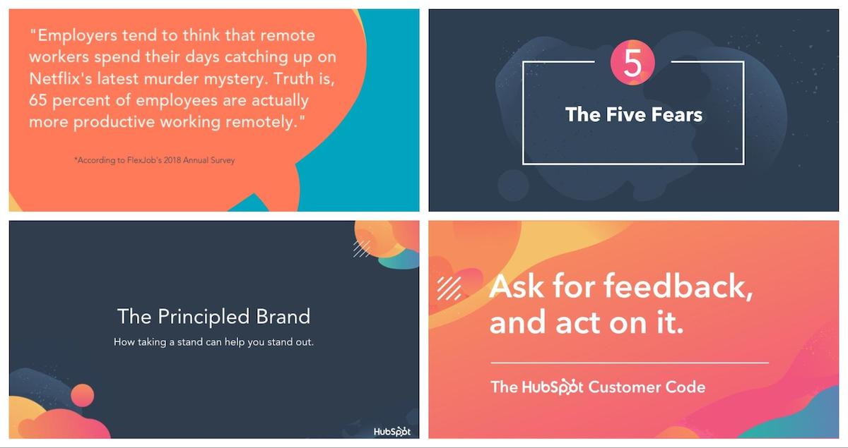
This plays well off of other big enterprise companies that seem to use more professional and rigid graphics.
The design assets for their conference, Inbound19, was basically taken over by these flowing shapes too:

Plus, I’m guessing after the tens of thousands of marketers who attended the conference saw the beauty of these flowing shapes, their popularity is going to continue to grow.
Flowing lines can be used to add some simple texture to your graphics like Bounteous did below:

As you can see in the example above, heavy and geometric fonts pair extremely well with these flowing lines and shapes because of the contrast. Not sure what I’m talking about?
Check out the contrast between the header of this page, and the flowing pattern on the right:

The header basically jumps off of the screen. The same thing can be said about the font used example below:

The hard angles of the font stand out against the flowing shapes and really grab your attention. Even when the background color changes, the content is still very easy to read.
These flowing shapes look amazing on the high definition screens that so many of us are glued to:

Actually, that might be the biggest driving force that has brought these flowing shapes and lines to the masses.
Return to 2020 Graphic Design Trends
6. Genuine, Subdued, & Neutral Stock Photos
A few years ago, bright, bold and colorful stock images become extremely popular. Designers were cranking up the saturation or boosting colors, and the photos didn’t even look real.

But once color trends start to shift, stock photo trends are pretty quick to follow.
That means in 2020, expect to see a lot more muted, genuine, and neutral stock photos being used.
For example, these photos really look like something that your trendy friend might have posted on Instagram:

The photographers that took the example photos might have even toned down the colors to make them work well with a muted color palette.
Like I have stated a few times in this article, muted color palettes make graphics seem more natural and authentic.
Because the past is always seen with rose-colored glasses, I’m pretty confident that you can tap into the positive nostalgic feelings of your audience with photos like this.

Speaking of the past, last year I recognized that stock photos that feature people need to be a lot more authentic, almost candid, to succeed. That trend continues this year, with a bigger focus on neutral color palettes across the board.

This combination of straightforward compositions and muted colors will make the photos feel even more genuine.
I mean, the bottom-left photo looks like you snapped your very fashionable friends just hanging out.
This shift continues to push back against the overly edited, posed, and produced stock photos that some companies still use.
Why do they still use these? I have no idea. Especially when you can find some of these winners in just a few clicks:

I know “genuine stock photos” might seem like an oxymoron. Especially because the point of most stock photos is to be ambiguous enough to be used in a bunch of different situations.
But if you know what to look for and follow some of the tips above, you can find a super authentic stock photo in no time.
Plus, you can find these great examples and millions of more stock photos for FREE on Venngage.
Return to 2020 Graphic Design Trends
7. Minimalist Landing Pages
Most of the other trends in this article have been reactions to popular design trends of the past. With muted colors becoming popular after vivid colors dominated, and abstract illustrations replacing the realistic icons.
However, I think that the shift to somewhat minimalist designs and homepages has also been driven by the need for better load times and smaller page sizes.
If you weren’t aware, Google rewards pages that load fast with better spots in the search rankings. This can be a huge deal for a lot of SEO-focused companies!
Our friends over at Buffer use a very minimalistic landing page that looks great on desktop or mobile devices:

Zendesk used a similar layout, embracing muted colors, heavy fonts, and abstract illustrations as well:

With a flat background and modular design, these homepages can easily be used for mobile or desktop users too. Sometimes, when a company uses a large photo, video, or illustration, that shift isn’t as seamless as it should be.
That’s another positive aspect of these minimalist pages, they a lot easier to navigate for the user. Instead of distracting elements, the messaging or information stands out instantly.

As well as direct them to your main call-to-action, like Slack did below:
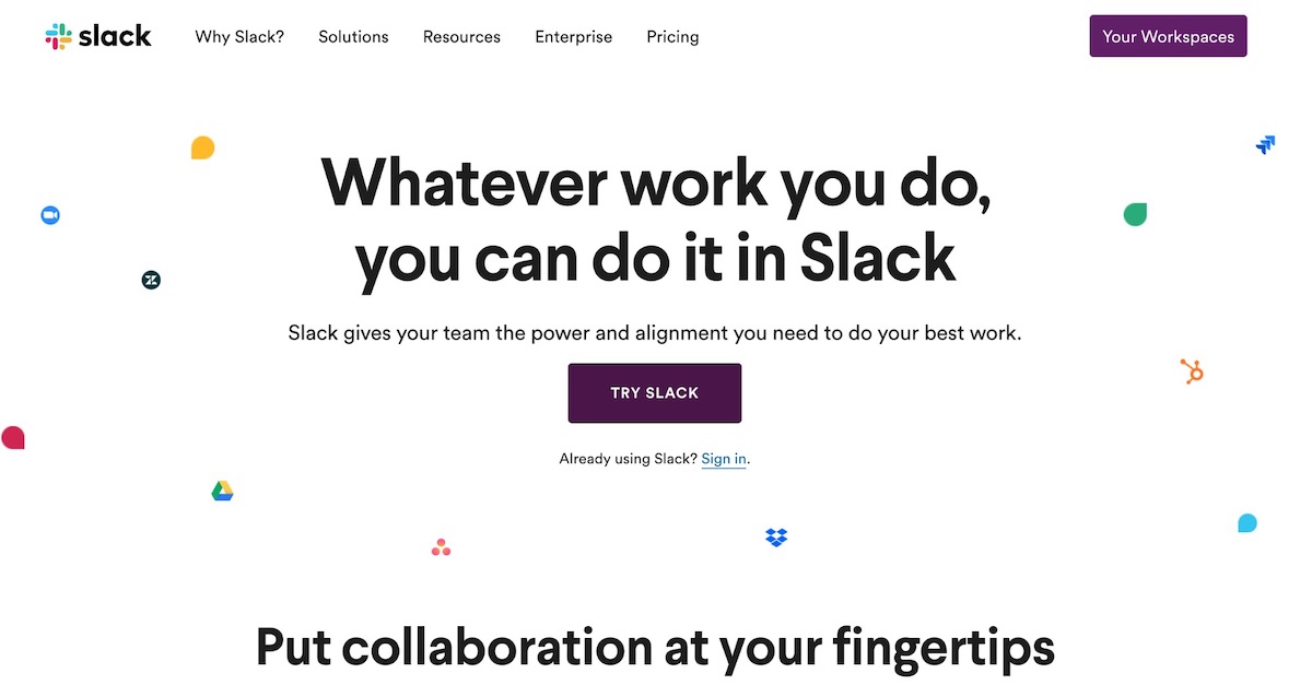
It’s hard not to immediately be drawn to and click on the main purple button. And that’s the point!
That said, you don’t have to avoid using an image, video, or graphic. Just make sure the rest of your page is easy to navigate and the image, like below, is actually optimized.

If you were curious, that GIF in the example above was around 100KB, which is TINY in the grand scheme of things.
One final thing I really like about some of these minimalist landing pages is that they make things easy for new and returning users. Just check out how easy it is to sign in to your Dropbox account below:

It’s literally one of the first things you see on the homepage! Now if you don’t have an account you can quickly sign up for the service as well.
The designers at Sonder used a minimalist layout that makes it easy for you to search for lodgings as soon as you land on their page too:

Little user-experience decisions like this can really help push your visitors in the right direction and convert them into long-time users.
So just remember that in 2020, sometimes a picture is not worth a thousand words. Especially if that picture increases page load time.
Return to 2020 Graphic Design Trends
8. Better Branded Animations
I think it’s safe to say that reaction GIFs are used so frequently, they have just become part of the way we communicate.
But because they are used so much, these types of GIFs have lost some of their original punch.
Some of the most popular ones really just fade into the noise of social media, instead of sticking out like they used to.
Now, I’m not saying you should stop using these types of GIFs…just don’t use them exclusively in 2020.
It’s pretty easy to create your own branded GIFs, even if you don’t have a designer on staff. These branded GIFs will have a much bigger impact on your audience, especially in the digital world and on social media.
The GIF below from Revolut could have been a reaction GIF from Friends or The Office:
We just reached 7 million customers! How about that for some #MondayMotivation? A huge thank you to all of our customers, old and new for believing in us.💙 pic.twitter.com/A3IUnkmq9P
— Revolut (@RevolutApp) September 2, 2019
But to celebrate hitting 7 million customers they created a pretty unique GIF featuring their mascot.
MeetEdgar took a similar approach when talking about a giveaway for their users:

Again, I bet I could find both reaction GIFs to replace both of these in a few seconds. But those don’t have the same impact as something that is unique to your brand or design team.

You can even mix some of the other graphic design trends into your GIF, as Cash App did below:
Bitcoin — it's just like us pic.twitter.com/Cs0JM07WJf
— Cash App (@CashApp) September 25, 2019
This may be the most absurdly unique GIF I have seen in a while, in a good way. That said, it fits their overall brand extremely well. They seem to lean into the weird.
Now just because you should be using more branded GIFs that doesn’t mean they can’t be funny! These illustrated GIFs from VOO are a solid example of that idea:

These would make you stop scrolling or want to learn more about what each was trying to say. And that’s the whole point of a lot of GIFs.
I would recommend taking the time to create more branded GIFs this year. Because honestly, the reaction GIFs are about as eye-catching as a stock photo now.
Congratulations! You made it through the latest installment of our graphic design trends series. With this knowledge, you’re ready to take on the world in 2020. I guarantee it.
One of the best things about the trends this year is that all of them work together pretty well. You can easily add a muted color to your flowing graphic, all without throwing off the vibe.
The muted color palettes blend well with the new crop of genuine and authentic stock photos.
A heavy font can even be used sparingly on an abstract illustration, and without distracting from the design.
As you find different ways to combine these 8 trends, I think you will be able to create something truly unique this year.
Now that you have seen what will dominate graphic design trends in 2020, why don’t you take a look at the trends that were popular in 2019!
Click here to jump back to the biggest graphic design trends in 2018
Or click here to jump back to the biggest graphic design trends in 2017
If you liked this post, why not check out our top marketing trends for 2020?
Return to 2020 Graphic Design Trends
8 Biggest Graphic Design Trends of 2019
Last year was all about taking risks in graphic design.
But most of the graphic design trends I predicted last year have become mainstream. With brands like Apple, Google and other tech giants embracing bold and unique designs trends.
So you’re going to need to take it up an extra notch, or three, to be seen and heard in 2019. That means more vivid colors palettes, bold fonts, and futuristic patterns.
Luckily, this guide will help you stay ahead of the curve.

Click here to jump back to the biggest graphic design trends in 2018
Or click here to jump back to the biggest graphic design trends in 2017
1. Pops of Vivid Colors
You may have noticed the world of design feels a little more colorful lately. You would be right.
Splashes of electric yellows, bright corals and vivid blues are replacing the reserved colors of the past. More brands and designers are adding vivid colors to their palettes for 2019 and beyond.
I love it–more color is always a plus in my books!
If you aren’t familiar, vivid colors include lighter hues that are intense or attention-grabbing. Kinda like the blues, pinks, and reds in the example below:

Or literally any of the colors used in this beautiful annual report:

I believe that this shift towards more vivid colors is a continuation of the rejection of bland minimalist designs and colors of the early 2010’s. Also, as brands proceed to fight for our attention, they must take bigger design risks.
Last year was dominated by bold colors, this year very vivid and bright will reign supreme.
After one of the largest trendsetting companies, Apple, added vivid colors to their designs a few weeks ago, I expect these colors to continue their takeover.

As you can see, they used a bunch of vivid color palettes to announce the new iPad Pro…and it was a hit!
We have already seen vivid colors start making their way into other Apple graphics as well:

But I think this year these vivid colors will become part of their core creative and brand strategy. Plus these colors just look amazing on their, and other brands, ultra HD device screens.
And once Apple does something, many brands will follow.
Spotify is another big brand that is usually ahead of the most popular trends, and this year is no different. Bright, vivid colors have made their way into their marketing material:

And on their wildly popular app:

We saw Spotify embrace gradients, bold colors, and flat design before it was fashionable, and I see bright colors taking the same path.
I do think it’s important to note that you don’t have to only use vivid colors. In fact, mixing those color with stronger or flatter colors will help you stand as well. Check out how well the colors come together in the presentation template below:
It’s like the two trendy color palettes of the past few years teamed up to create something very unique.
Return to 2019 Graphic Design Trends
2. Strong Typographic Focal Points
Over the past few years, we have seen bold fonts and typefaces become the norm.
From Adidas using it across all of their marketing:

To Samsung, which illustrates nicely the move to more vivid colors this year as well:

This bold font makes it easy to read the text on social media feeds and on mobile devices. As well as instantly projecting strength, innovation, and individuality.
However, as you can see in all of these examples, the bold font is often the supporting partner to the other elements of graphic design.
But this year the bold font will become the main focal point in a lot of graphics. Especially if your graphic only has a few seconds to grab the reader’s attention.
Like with a poster, social media graphic or flyer. In these poster examples from the CTA18 conference you can see how powerful a bold font can be:

Each of the font-heavy posters stands out like a beacon, compared to the other futuristic-looking posters. Even if you knew nothing about the conference or company it would pique your interest.

This bold font was used throughout the rest of their conference material and it helps project a daring and confident message.
All of this was achieved with a single bold font, and no supporting images.
Another great example of using bold font comes from Nike at the Public School New York Streetball Classic:

This bold font just screams strength. It’s extremely fitting for an athletic display. Plus those posters will definitely stand out on the busy streets of NYC.
If you’re looking for something a little more colorful, check out the bold font used on this design project from CalArts:

It dominates the graphics but fits extremely well with the vivid color palette. Could you imagine a minimalistic font having the same effect? I think not!
This example is begging you to read more. It could even catch your eye from across a crowded room.

I do think it’s important to point out that I’m not advocating only using text-heavy graphics. There should be some other interesting elements of graphic design included, like in this gradient-filled festival flyer:

This modern sales poster:

Or this brilliant flamingo adorned hiring poster example:

The main header and font of each example definitely grab your attention, but the other elements could be what catch your eye first.
So don’t forget to include some of these interesting elements, even if you want the text to be your central focal point! The harmony between all of those elements could really make or break your designs in 2019.
Return to 2019 Graphic Design Trends
3. Futuristic Influences Are Mainstream
I guess since we are technically living in the future that so many 80’s films predicted, it’s time for our designs to reflect that.
This means a lot of futuristic patterns, colors and ideas are about to dominate the design world for the next few years.
We do have most of the futuristic devices they predicted in our pocket each day. So you might as well take advantage of that tech with your design work!
I believe that this approach will help brands create unique content that will stand above the noise on social media.
The visual rebrand of BBCTWO this year is a solid example of a large brand embracing this idea:

They could have taken the boring route that so many brands take and just refresh their typeface or logo. But they have let the futuristic patterns, textures, and colors define their branding across all of their content.
Additionally, I don’t think it’s a coincidence that the rise of vivid colors matches up almost perfectly with the explosion of futuristic influences. They both have been used recently to stand out from the noise created by other brands.
When futuristic designs and vivid colors are used together, they can create something really cool. For example, these album covers from the europe.collective project looks like they were ripped from a futuristic record store:

Honestly, these are works of art and are likely to stick in someone’s mind a lot longer than some of the other album covers I have seen.
Plus these futuristic examples will look amazing on your iPhone, Android or Mac screen. Or on the side of a building, like with this innovative event poster example:

With futuristic designs, you can take a lot of risks and let your creativity run wild.
Let’s break down some of the common elements of these futuristic designs:
Bright color palettes:

Gradients and other color transitions:

Abstract patterns:

“Glitches”:

Holographic and reflective elements:

Geometric influences:

…and more! But since we don’t know what the future holds, there’s no right way to do it! So get out there and create something that looks like it was ripped straight out of your favorite science fiction movie.
Return to 2019 Graphic Design Trends
4. Light and Dark Color Schemes
You may have noticed that some of the largest companies are adding light and dark modes to their apps. Or embracing light and dark color schemes across different devices and avenues.
This includes Apple recently adding Dark Mode for all of their Macs:

Facebook just added a dark mode to its Messenger platform:

But they are about a year behind Twitter, who integrated that feature all the way back in 2017:

You may be asking why I’m highlighting these companies now. I do like talking about tech companies but that’s not the reason.
Instead, I wanted to point out that the biggest brands in the world of tech are embracing this dual-colored app design trend. So it’s pretty easy to see the graphic design world wholeheartedly adopting it this year.
These apps use different modes to make the apps more useful for the user depending on the situation. You can use this same flexible technique in your design work to instantly adapt to many mediums or screens.
In fact, one of my favorite flyer examples uses a light and dark color scheme. Each fits the subject matter and event extremely well:

Like I said above this dual color scheme makes the poster a lot more flexible. If you need to hang it up on a dark wall, the white colored poster is perfect.

But it also won’t stand out if you need to place a poster on a blank office wall, which is where the black color scheme saves the day.

In these beautiful poster examples, the designer used a duotone blue and white as the main color influences. But it has the same effect as the flyers above.

With this kind of technique, you’re not putting all your eggs into one basket. Saving you from a ton of wasted time and effort.

The light one could catch the eye of some people, but the dark one could do the same thing for another group.

The change between light and dark graphics can be quite subtle. For example, in these graphics they only really change the borders from light to darker colors:

It may seem like a lot of work to create multiple versions of your design but with Venngage’s My Brand Kit, you can switch between color palettes with a single click.
You can also import your brand colors, fonts and logos into your Brand Kit. Then you can automatically apply them directly to your designs or presentation templates. Like so:

You already have a battle-tested palette of colors that your audience recognizes. So why not use them!
Return to 2019 Graphic Design Trends
5. Complex Gradients and Duotones
Gradients are one of my favorite things to add to any design project to give it a little more depth. Plus, like some of the other rising graphic design trends, they look incredible on mobile devices.
Last year I predicted that gradients would begin to take over the world. Especially after seeing large companies embrace it, like Microsoft:

And the payment giant, Stripe:

Even the designers over at Apple Music:

With their vivid colors and futuristic patterns, they feel right at home with some of the other graphic design trends of 2019.
However, I think this is the year the gradient grows up and is used in more ways than just a simple background. Just like any new trend, people are going to find unique ways to use it as time progresses.
For example, take a look at how Fast Company uses gradients as color filters across their content:

This simple overlay can instantly upgrade even the blandest stock photo. Also, this visual strategy can become part of their brand, making it easier for readers to spot their content.
Overall it’s a simple way to differentiate from the competition that even the most novice designers can emulate.
After seeing the rise of gradients last year, we added the gradient backgrounds to Venngage. Apply them to your designs in a single click:

If you’re looking for something a little more complex, check out these examples from the Adobe 99U Conference:

In these examples, the gradients are the main focal point and dominate the graphics. In the past, they would have of being pushed to the background and only played a secondary role to another element.
This approach takes a little more skill to master, but definitely will stand out:

And if gradients were used to advertise, say, a conference on the future of design, I think it’s safe to say they are here to stay.
If you want to blow readers out of the water, take note of these slides from the Ringling College Motion Design conference:

These slides are literally called “Future Proof” and feel like they were pulled straight from an episode of Star Trek or Blade Runner. I could honestly look at them all day, or make them the background of my laptop. Actually, maybe I will!
Duotones are another design tactic that fits extremely well with the other design trends. Most graphics that use duotones feel very futuristic and colorful, almost by definition.
In the simplest terms, duotones are images that replace the whites and blacks in a photo with two colors. Like how the graphics designers at TQ used a blue for the dark parts, and a pink for the lighter ones:

I like duotones because you can make almost any image match your company branding. And as you probably know, keeping things consistent is extremely important in the design world.
Duotones aren’t as popular as they once were a few years ago. But they still can be used to create some interesting graphics, like these blog headers from The Health Diaries:

Additionally, like gradients, they really pop when used on a white background, social media or a mobile phone.
Return to 2019 Graphic Design Trends
6. New “Colorful Minimalism”
I think it’s pretty common misconception that minimalist designs only used black text and white backgrounds. Or another combination of the two.
But minimalism is actually about paring down design to only the necessary components. It’s seen as the rejection of complicated and cluttered ideas.
Many people have interpreted that as using only muted and neutral color palettes. Especially after the main tech giants used it for about a decade in their marketing.

A lot of the graphic design trends I have witnessed over the past few years have been a reaction to that kind of minimalism. From the explosion of hand-drawn graphics, bold color schemes, and abstract patterns. Each of those trends is the opposite of what minimalism is at its core.
Despite that, this year, some of those more complex graphic design trends are going to mix with traditional minimalism to create a new type of minimalism. One that is dominated by color and creativity, instead of blandness and conformity.
For example, take a look at this product poster series from Nike:

Each poster is traditionally minimalist, with not a lot of flair or unneeded elements. And without the vibrant gradients, it’s just another boring poster.
But this simple color addition makes it very eye-catching, without abandoning the main tenets of minimalism. It masterfully walks the fine line between too dull and too complex.
You can also take some of the ideas we have outlined in this article and integrate them into your minimalist projects. Things like a bold font, futuristic elements or a simple gradient can really upgrade your simple designs:

Just be sure that they don’t dominate the graphic, and instead are used in a supporting role to other elements.
These logo examples from Aula Visual are a perfect illustration of that idea:

In each of the graphics, both a futuristic pattern and color are used to up add a little something extra to the brand mark. Without those elements, I think this would just be another boring logo.
The same thing can be said about these graphics for Black[Foundry]:

It honestly looks like they were able to combine almost all of the graphic design trends we have talked about so far with the minimalist ideals. We’ve got a bold font dominating a few graphics, a gradient peeking through and even a futuristic pattern making an appearance.
Now if you don’t want to go the color gradient route, you can still inject some color into your designs. In this presentation template example, they use only three colors to build an interesting visual:

The slides use exactly the same layout throughout the whole presentation, only swapping the colors on each. This minimalist approach keeps the presentation cohesive and eye-catching, all without being too complex.
The designer used exactly what they needed to get their points across, no more and no less. And at its core, that’s what minimalism is all about.
Return to 2019 Graphic Design Trends
7. Dynamic and Complicated Hand-Drawn Illustrations
Custom or hand-drawn illustrations are an excellent way to make your visual content stand out. And stand above all the other brands that take the easy way out.
That’s because no other brand is going to be able to exactly replicate these visuals. Competitors can copy your color scheme, your social media strategy and the stock photos you use.
Plus, in the quest for a strong brand, unique content such as this is extremely valuable.
That’s why I believe that hand-drawn graphics and illustration will continue to be a graphic design trend this year.
However, like some of the other graphic design trends we saw roll over to this year, things are about to get a bit more complicated.
Last year you could get away with using simple flat doodles, like the examples from MailChimp below:

This year that’s not going to cut it! Because everyone else picked up on the simple sketch trend, it’s not unique anymore.
Like I said above, you’re going to have to take it to the next level with your hand-drawn illustrations and visuals.
Mailchimp, among others, has risen to this challenge and blown the doors off of it with their custom illustrations.

These illustrations were added to literally every page of their website, and all social media accounts. And I kinda love it.

Additionally, they used these custom illustrations to help inspire their customers to be themselves and embrace simplicity…as well as reject the overly polished company image that they see online every day.
Their designers have always been known to take big risks, and this one seems to have paid off. It was talked about by every designer and marketer for weeks after the rebrand was unveiled.
The project management masters over at Asana took a similar approach this year. Last year used the simple doodles and sketches throughout their marketing graphics.
But this year they invested in some more dynamic illustrations across their social media accounts:

I like that these illustrations look like they were all created by the same designer, which is very difficult sometimes. Especially when they have a whole team of designers working on one project.
This method makes each share or email from them look like it came from a single voice, that their readers can easily recognize.
In this noisy world that we all live in, that can be a huge benefit. Also, it’s nice to see them using some very vivid colors in their designs!
At Venngage we got the memo as well when we created this fun Halloween infographic:

One of our designers created each of the illustrations from scratch, and it makes me smile each time. There are a ton of similar Halloween infographics in the world, but ours is incredibly remarkable because of the custom illustrations.
To conclude, if you’re looking for a little more inspiration to create your own illustrated masterpieces, I would check out these examples from The New Yorker:

And the perennial innovators over at Slack:

They actually were one of the first companies that I noticed creating these works of art. And they have been creating amazing illustrations for their content ever since!
Return to 2019 Graphic Design Trends
8. Authentic and Genuine Stock Photos
As you have probably noticed many brands are creating some very creative designs to seem more genuine. Or to make them feel more authentic, instead of a faceless corporation.
This push into the more real and genuine will be seen in the type of stock photos they use this year as well.
I feel that a lot of stock photos have become too professional, polished and vague. In their quest to reach as many people as possible, these photographers choose a safe subject.
Overly edited photos are also out this year, readers really want more genuine and authentic-looking photos of people. The viewer should be able to see themselves reflected in the photo.
These new stock photos look like they were taken with someone’s personal camera or phone. Kinda like the examples of people below:

These examples honestly look like they were taken by a bunch of friends hanging out, not by a professional.
The same thing can be said about these photos as well! In each of these free stock photos, the colors look real and not like it was overly edited:

Almost like something you would see in your Instagram feed from your cousin that travels too much.
And I was able to find those examples relatively easy, so it baffles me when brands all use the same generic photo.
Those ultra-generic pictures that might relate to the content should be avoided this year. Like this example, which has been used by almost every tech company at least once:

As a reader, this photo tells me nothing about your content because it’s so general!
Instead, shoot for photos that help you tell a visual story and add to the narrative. Instead of just filling an open space on your blog or social media feed!
For instance, compared to the example above, these photos would work much better in a tech-focused blog article:

Like I said previously, these photos depict a real scene that you could put yourself into. And they feel like they were snapped in the moment.
Not meticulously planned like some of the examples below:

Ugh, that fist bump photo makes me cringe a little bit.
Now in my experience, the laziest content creators love the generic and overtly planned stock photos. Ones that took them a few seconds to find, and have already been used by millions of people.
I hate those kinds of stock photos.
I mean, if you can’t take the time to create or find a better stock image, why should I take my time to read it? I think many of you will agree with that statement.
So in 2019 don’t be one of those creators, instead strive to be more weird, unique and genuine with your visuals!
And best of all, you can find these great examples and millions of more stock photos for FREE on Venngage now:

Now that you have seen what will dominate graphic design trends in 2019, why don’t you take a look at the trends that were popular in 2018!
The biggest graphic design trends for 2018:

1. Multiple brand color schemes
Traditionally, companies have a few colors that they use across all of their branding and design work. This helps people recognize them out in the world, on social media and other places online.
But I think this design “tradition” is going to be completely upended as brands look for more ways to stand out in 2018 and beyond.
In fact, companies rebranding with a plethora of colors schemes is one of the first graphic design trends that I see really taking off.
Spotify started doing this a few years ago in all facets of their design but they were one of only a few.

Now they have such a strong visual brand that I know something came from Spotify almost instantly.
Dropbox also decided to completely ditch their old color palette in 2017 to help update their brand and reach.
Usually, a rebranding effort updates the font or graphic of a company logo, but this one was completely different.
Instead of changing their logo design, which everyone already knew, they added a ton of new official brand colors to use with it.
They built this new branding to show that great things can happen when diverse minds work together. And I hate to say it because some people were not big fans, but I kinda love the rebrand.

They already had a logo that everyone knew, but now they have a ton of new ways to use it. When you are a massive company like Dropbox that needs to appeal to almost every industry, this kind of flexibility is ideal.
I also think that this change really reflects their growth as a company from a free place to store your school paper, to something that connects the creatives of the world.
Just take a look at how they evolved their social media presence from last year:

To this year with the rebrand:

It’s almost like night and day. Who would have thought that breaking design conventions would have allowed for so much creative freedom?
However, I do think that this kind of rebrand can only work with a company that is as big and recognizable as Dropbox.
Or eBay, which actually rebranded a few months before Dropbox. In their rebrand, eBay also decided to add a ton of new colors, while keeping their recognizable logo.
If we want to compare the two rebrands, I think that eBay would win. That isn’t because I was not impressed by Dropbox’s efforts, I just think that it fits eBay’s core business and products better.
Plus, they are using the rebrand across all parts of their platform.
The designers at eBay have used the color upgrade to unify millions of products across their site.

They may not all share the same colors, but they have the same feel. Even though it’s a mix of pastels and bold colors, the site still looks incredibly clean.
Additionally, they have found a way to inject color into a place that is usually boring and bland: the background.

This subtle boost of color makes almost everything they share on social media stand out from the rest. Are you seriously going to be able to scroll past this pastel mixer?

I think not.
Return to 2018 Graphic Design Trends
2. Color gradients are making a comeback
Whenever I think of color transitions and gradients, I can’t help but remember the bad word art from Microsoft Word over the past 20ish years.

As kids, we thought this was the best way to make your report on dinosaurs look professional. And I think that we were on to something back then.
Because in 2018 color gradients will be literally everywhere, from web design to Twitter headers, and even presentations. Instagram, always ahead of the curve, has used it in their branding and logos for the past few years, actually:

Now the rest of the world is starting to catch up.
One of the best examples I have seen of gradients being used comes from Mixpanel, an analytics company. As you can see below, they have adopted a gradient as the main background of their site:

This is a common way for sites to keep a simple background, and add a few flourishes. Otherwise, you’re stuck with a pretty boring single-colored background.
What I haven’t seen much of is gradients being used in every piece of visual content, like Mixpanel did:

This wholehearted adoption of color gradients gives the company a lot of creative freedom, without straying too far from their brand. Because in this case, multiple color gradients is their branding.
The graphs and charts are by far my favorite use of color gradients. It adds that little something extra and helps them stand out from the noise. These principles are similar to website design must-haves.
A few other large tech brands are bringing gradients back into their designs. Like Stripe:

Polaroid, with a more subtle gradient:

And even Skype:

But my favorite way to use a gradient is by overlaying it on an image or creating a duotone. Kinda like what The Next Web did below:

It adds so much extra power to the image.
All this with a simple gradient, a design trick the internet loves to hate. But as we’ve seen in these examples, they are a great way to add a little bit of eye-catching color to your design. Plus, they can help improve any image or stock photo.
Return to 2018 Graphic Design Trends
3. Better branded social media images
Last year I talked a little bit about using more authentic photos in all parts of your design and marketing strategies. This year, I really want you to focus on extending that trend to your social shares as well.
Readers and consumers use social media to distract themselves from what is happening in their life.
They don’t want to see a tenuously relevant stock photo that you picked in two seconds for the sake of having an image. That shows readers that the person who produced the content didn’t care enough about their work to find an impactful image.
If the person who created the content doesn’t care, why should you?
For example, if you were scrolling through your Twitter feed, would you click on the tweet that used this image?

Or this one from Cubeit?

Now, technically either would work for the same tweet, but the one from Cubeit is the clear winner. By a mile.
How do I know this? Because that image made me stop in my furious scrolling tracks and want to read the article.
I must sound like a broken record by now because of how often I talk about not using bad stock images in your design work. But I also believe that this is one of the easiest ways for your brand to stand out on social media.
The image will be the first thing the readers are going to see on social media, and maybe then they’ll read the text.
Your content could be great but it will never get the chance because you picked a bad featured image. Even something as simple as what Quuu did below looks a hundred times better than a stock image of a computer:

One of my favorite examples of this trend comes from Moz:

They attach a face to almost all of their tweets. Instead of a generic stock photo, you see a friendly face, from the person who wrote the article, shining back at you.
They also use Rand Fishkin, in as many images as they can. This is not only a great branding play, it also humanizes the company as a whole.

When I think of Moz now, I don’t think of a faceless company–I think of an innovative person.
Return to 2018 Graphic Design Trends
4. Unconventional colors everywhere
As we have seen so far, 2018 is the year of taking risks in your design.
One of the best places to start taking risks is in the colors that you use.
That doesn’t mean that you need completely rethink your brand’s color palettes, like some of the brands I’ve mentioned already. Instead, be ready to inject some more risky colors in your design projects this year.
Bold colors are the most common driving force that we have seen behind each of the design trends this year. I wouldn’t call any of the following colors traditional in any sense of the word:

Sticking to the traditional corporate blue palette isn’t going to cut it this year. Also, if you noticed, minimalism and neutral color schemes are on its way out.
Instead, I recommend going a little off the rails with the colors you pick–within reason.
Find a few colors that you can call your “unofficial brand colors” and use them across all your projects. This way, you can do something new and exciting but still stay close to your core values in other places.
A great example of using bold color comes from the sports world, in Bleacher Report. They are in an extremely competitive space, fighting with thousands of sports writers for your eyeballs.

But they consistently use bold, bright colors in their designs to differentiate their content from those others. Because they do it so well, you can quickly spot a Bleacher Report article or Tweet out in the world.
Another example is Fast Company, who have taken to using more non-traditional colors in their magazine cover designs to entice readers.

Like Bleacher Report, they’re also using bright and bold colors to stand out in a very competitive space: print journalism. With each issue, they are fighting with thousands of competitors to get the attention readers. And that isn’t an easy task.
Even online they’re using color to add something extra to their design work.

With the simple addition an interesting color–or five–they made each graphic much more captivating.
Now, I hate to bring Spotify up again, but they have effectively been disrupting the space for the past few years. You can definitely see this in their color usage lately as well:

I have talked a few times before about being to spot something from Spotify just from their non traditional color usage. Especially in their most recent Wrapped experience, which shows your listening habits for the past year:

For a few weeks after they launched this promotion, I was even able to spot other people’s lists, just based on the colors they used.
If that isn’t an effective use of color, I don’t know what is.
Return to 2018 Graphic Design Trends
5. Bold & handwritten fonts dominate
Another way to add some eye-catching features to your designs is to use some bold or handwritten fonts. This is another trend that seems to come from the design world, moving away from boring minimalism as a whole.
Bold and handwritten fonts are going to stand out against the simple or overused fonts that your competitors are using. And they will help your content jump off the screen on social media–whether it’s infographics for your blog, Facebook ads, or motivational quotes on your social media.
Kinda like my alma mater, the University of Arkansas, does below:

They are definitely fans of bold fonts, however what they are not fans of is winning apparently.
Now, instead of looking at more examples that only use bold or handwritten fonts, I thought it would be interesting to find ones that effortlessly use both.
A great example comes from the shoe giant, Adidas. They may actually be my new favorite company in 2018. I mean have you seen those NMDs and Ultraboosts?!
Across their site, they use bold fonts in their graphics or text, which looks great:

And when you jump over on social media, bold handwritten fonts take over:

But neither feels out of the ordinary for a brand like Adidas. Everything they create and share feels natural because they have created such a strong visual brand over the past few years.
I believe that this adoption of ultra bold and handwritten fonts coincided with their plan to become a more fashion-forward brand. That choice has helped really sell the mystique of these new types of shoes they are creating.
Another incredible example of using both bold and handwritten fonts together comes from Adobe:

With this Digital Marketing Report, they are able to seamlessly blend together both bold and handwritten fonts, in addition to using some awesome gradients, GIFs and unique colors.
In fact, Adobe seems to be embodying all of the graphic design trends I’ve mentioned so far. If the leader in design is using them, I think they’re a safe bet.
Return to 2018 Graphic Design Trends
6. More custom illustrations
Over the past year or so I have seen designers move away from cookie-cutter graphics to more custom icons and illustrations. And I could not be happier.
This movement started to take form last year with the rise of hand-drawn illustrations and icons.
But these illustrations and icons will become even more unique in 2018, as brands look to differentiate themselves even more. I mean, look at how Strikingly has used the illustrations to make their blog headers look amazing:

No one else is going to be able to replicate that, especially with a stock image.
So instead of using a boring photo, I would recommend creating some custom graphics. Like Discord has done below:

As a tech company that caters to gamers and techies, those icons fit them perfectly. I mean just take a look at their homepage:
That is a well thought out brand!
Also, I believe that this trend is another rejection of the overly clean and somewhat boring design “rules” that dominated the past decade.
Now, instead of following those rules, designers are making their own. You can clearly see this with the rise of custom illustrations and icons being used across the spectrum.
From the simple hand-drawn icons that MailChimp uses:

To the one-of-a-kind illustrated images in InVision blog posts:

If you are looking for something that looks a little more like art, I would check out the examples from Slack below:

Additionally, when someone takes this much time and effort to create a featured image, you know the content is going to be good. They are able to use the image to make a first impression with their audience almost instantly.
That’s why I’m pushing for more graphics like this in 2018 and beyond!
People are looking for more authenticity in all parts of their digital life and this is a great way to appeal to that. Instead of using a bad stock image, use an awesome illustration or icon.
Return to 2018 Graphic Design Trends
7. Better GIFs, less reactions
One of my favorite things to come out of the internet–maybe ever–are GIFs.
I use them on a daily basis to communicate with my friends and coworkers. They are perfect little ways to show how you are feeling. They are also used by your favorite hip brand to show they are still cool.

Using reaction GIFs and such are great to send on Slack or Tweet to your friends. But in 2019, your GIF usage as a brand or company needs to be taken to the next level.
Most people would also recognize a GIF as the reaction ones we are all so fond of. But they can be used for so much more.
Like as infographics that actually add to your share or article in a meaningful way. One of the best examples of using GIFs in this manner comes from the sports world, actually.
My hometown Kansas City Chiefs are big users of GIFs on game days and it truly adds to the experience.
Now, I usually don’t have time to watch a whole game, but I love that I can quickly scroll through my Twitter feed and get an update.
Those updates stick out more than a simple text update would. They may not be the most breathtaking GIFs but they help people keep track of what is going on.
It helps foster a conversation with their audience and that should be one of your goals when using GIFs this year. Don’t just slap a reaction GIF on a share or article, because someone will laugh and move on with their day.
Another way to use GIFs this year is to replace your featured images and blog headers. Like in this one from Axios about nuclear tax credits:

That will definitely grab someone’s attention, no matter the platform.
But just because I’m recommending that you upgrade your GIFs, doesn’t mean they all have to be bland or serious. They can still have that element of silliness that GIFs are known for.
If you can create and share GIFs that marry those three ideas together nicely, you will be set in 2019 to really capitalize on this social media marketing trend.
Return to 2018 Graphic Design Trends
8. Cinemagraphs are gaining more traction
After talking about GIFs, it’s time to talk about their more refined cousins: cinemagraphs.
Cinemagraphs are basically GIFs or videos that have been completely frozen, except for a tiny area of subtle movement. Here is one of my favorite examples:
I’m guessing you have more experience with GIFs. But cinemagraphs are going to continue to gain ground in 2018.
Especially with more design and tech-focused companies in the world. Like my friend’s podcast, the Pitch, which has a large audience of tech and startup aficionados.
The subtle changes in the stars may not seem like much, but they definitely add a little something that people will stop and take a look at.
Cinemagraphs are less obtuse than a GIF or a video, and can still be used in all parts of your marketing or design work.
Because of that somewhat subtle movement, I believe that they are more eye-catching than a video or static image. Plus they can be little works of art that bring customers to your post or share.
Design that fights back
The driving force behind this year’s graphic design trends is the rebellion of designers against the plain, white color schemes and sparse aesthetics that the titans in the tech industry have pushed for the past few years.
Now we will see designer take a whole new approach. It will be intense, innovative and beautiful. I mean, look at this year’s explosion of colors!
As we have seen in previous years, most of the innovating will be done by the top tech companies. They are the ones that have the bandwidth, money and talent to test a bunch of ideas to see what works best.
But that doesn’t mean that you can’t implement some of these in your design. Remember, 2018 is all about taking risks!
I hope these tips will guide you in taking on some new design challenges and getting ahead of your competitors.
Check out last year’s graphic design trends below.
The biggest graphic design trends of 2017

1. Louder and brighter colors
Over the past few years, many tech leaders used muted, safe and easy to digest colors. This was in an attempt to create a very clean and controlled design scheme. It was almost an attempt to show people that the sleek, functional future they have seen in science fiction movies was already here.
But now that everyone and their mom have seen this design style work for Apple, the copycats have killed the power it once held.
Now, in 2017, there will be a shift away from neutral colors like whites, grays and black, to bolder and brighter colors.
Some companies are already doing it and have been for a while, like the music wizards over at Spotify. In fact, they are already leading the pack, using bold colors mixed with professionally edited photos to create in-your-face designs.

This kind of color usage has become part of their brand, which means that their images are instantly recognizable. And when you are fighting for real estate on social feeds, powerful branding like this will help you win 2017.
Just because many companies will be ditching their boring color schemes in 2017 doesn’t mean there needs to be a color revolution in your company. Some companies will be adding just a bit of color, and it will make all the difference.
Using bold color accents will also help many brands cling to their minimalist roots. By infusing bright colors with traditional neutral backgrounds, companies can give their branding a fresh new look without straying too far from what made them great.
For example, we already saw this type of redesign from Instagram a few months ago.

This simple redesign helped bring them into a whole new era and unified all of the different apps under one color. And just like with Spotify, this type of bold color usage is recognizable across the web.
A large driving force behind the trend of bold and bright color usage in design comes from Google’s Material Design. Their design language focuses on flat, organized, and intuitive design. They use “unexpected and vibrant” colors, as well as fonts and images that are as functional as they are pleasing to the eye.

Actually, a lot of the things that will be trending in 2017 are influenced by the adoption of the Material Design principles.
We took their advice when designing this graphic to promote a new ebook. It has been an insanely popular featured image!

Don’t be afraid to use colors that contrast starkly against one another.

Return to 2017 Graphic Design Trends
2. Bold typography
In 2017, bold typography will also fight against the ever-dwindling attention spans of readers, and the saturation of content. Big and daring fonts will be used to grab the eye.
One of my favorite examples of this would have to be Wired. They use a mix of fonts to emphasize individual titles and establish a hierarchy of information on the page.
Just take a look at some of the examples from their homepage below:

Additionally, the shift to mobile and extremely high definition screens will also increase the need for bold fonts. Obviously, more and more people will be using their phones to get content, and the way that content is presented will need to keep up.
Buffer uses strong headers in the body of their articles, not just at the beginning, to give them a backbone and make it easier to read across different devices. I would recommend using this approach to help people navigate long reads, no matter the screen size.

We also took a similar approach, when creating this infographic template. Mixing bold font choices with interesting colors to create an eye-catching graphic:

Return to 2017 Graphic Design Trends
3. Google Fonts
I have been using Google Fonts for a while now because they are so versatile. If I need to design one thing online and then add it to my slide deck, I am confident the fonts will work together. And they play nice with about every website you build.
Oh, and did I mention most of these 810 different fonts are free to use? Yeah, people like free. And they like things that are insanely easy to use. Like this example that uses a mix of a few popular Google Fonts:

Some of our most popular fonts on Venngage are bold Google Fonts, like Roboto from above or Open Sans.
Return to 2017 Graphic Design Trends
4. Authentic photos
As the amount of content created each year continues to increase, the need for quality images has increased as well. And to maximize the shelf life of some of these images, the creators have had to make them as generic as possible.
The only problem is that the best generic images get overused by everyone. If you have been active in tech or marketing scene lately I am guessing you have seen the following image:

It has been used in landing pages on, blog headers, and even some Instagram posts. To be fair, I even used it for one of the sites I was building a few years ago. But because of the popularity of this image and other stock images like it, the authenticity has plummeted.
The need for clean and perfect images in everything has only exasperated the problem as well.
As reader seeing this image for the hundredth time, I would think that the writer or creator does not care about making their work original. So why should I read it?
That is why you need to start using authentic images that represent your brand. Stop using the most popular images and start making some of your own.
I am guessing everyone on your team has a camera phone in their pocket. Why aren’t you using them? Snap a few photos of your product, office or some fun pictures of your logo and use those instead.
Or if someone on your team is a budding photographer, give them a day or two to shoot some images that you can use for a year!
For example, we took a picture of some of our employees for our new website and could not be happier.

By doing this, we added the human element back to our images, that so many of these stock photos are missing.
Return to 2017 Graphic Design Trends
5. Hand-drawn graphics and icons
The need for more authentic images will also influence icons and graphics. Recently we have seen brands embrace this wholeheartedly as they look to differentiate themselves from the pack. This will also add a personal or fun element back into your design or content work. And this can’t be done with off-the-shelf icons or graphics.
Many may see this trend as childish or unprofessional, but it will definitely help you stand out online. Like many of the graphic design trends in 2017, this is a push back on the clean and almost clinical nature of design in recent years.
For example, Dropbox has adopted the use of hand-drawn illustrations in everything they do. It has become part of their brand now and is easily recognizable.
Plus, it puts the user at ease, appeals to the child in all of us, and makes the product seem more accessible. This is especially helpful if you are a large tech company like Dropbox.
Another great example of hand-drawn icon comes from Casper, a mattress company. They use illustrations on almost all of their landing pages Like this interesting one below:
MailChimp also got into the spirit and used hand-drawn illustrations in their 2016 annual report!
And finally, for one more GREAT example, we look to Moz. They use illustrations in their blog headers, like this one:
We also have introduced more hand-drawn illustrations in Venngage as well. I am particularly a fan of some of the ones below:
And our love for hand-drawn icons sometimes makes its way into other projects as well.
Return to 2017 Graphic Design Trends
6. Minimalism that goes back to its roots
If you were to describe what minimalism was to a stranger, you would probably talk about a lack adornment in design, with a focus on functionality. You would probably also think of a neutral color palette of blacks, grays, and whites.
It seems that the true spirit of minimalism–pared down, functional design elements–has been lost and, instead, replaced with boring black and white color schemes. I suspect this was done to make up for the lack of processing power and screen size on mobile devices.
In 2017, that will all change. This is the year that minimalism, hopefully, gets its groove back. And that involves using a lot more color. Mobile devices are now just as powerful as computers and some even have better screens.
One of my favorite minimalist-influenced designs would have to be Medium’s logo. They were able to include a bunch of different colors but still create a very minimalist logo.

Another logo redesign that influenced minimalism with color happened a few years ago with Google, who happens to be a catalyst for many of these new graphic design trends. They shaved a little bit off their typeface but also debuted a whole new “G” logo, which I am still a fan of.

Everything about that screamed minimalist but there was not one mention of it in the press because true minimalism has been lost to the general public. Because it did not look like it was created before color was invented and only used one shape, it was not a minimalist logo.
Instead, it was more colorful and popped off the page–but it was still a minimalist logo. And following that redesign, like so many things before, people followed Google’s lead.
We have even started emulating a more minimalist style with our featured images for blogs.

The simple design clearly communicates the message of the graphic.
Return to 2017 Graphic Design Trends
7. Useful GIFs
Everyone (well, almost everyone) loves GIFs. They are the perfect little conversation helper that expresses emotion when text won’t do the trick.
Plus, they do not require any special software to run, usually have a small file size, and can be embedded just about anywhere.
So they are better than videos and images, in most cases when loading time or data usage needs to be minimized. And I think that versatility is what will make them even better and more useful in 2017.
One of my favorite ways to use GIFs is as featured images for your blog posts or article. Instead of using boring stock images, invest a few minutes of your time in creating a GIF.
It does not have to be a work of art, but it definitely will draw attention to your post when shared on social media.
Return to 2017 Graphic Design Trends
8. Duotones
Duotones are simply the combining of two colors on an image, usually using very bright or contrasting colors. They require a bit of design work but it is most definitely worth it.
Only a skilled designer can really create an amazing duotone. It is honestly past my skill level but that does not mean you should not include it in your 2017 design plans!

Spotify was one of the first to really push this type of design into all parts of their branding, and many other brands have followed their lead since. Like below:

They have been able to use this approach to color to stand out in not only the streaming space but music in general. And you can use it in the same way for your industry!
This bold use of contrasting color will also bring some originality into your design. And hopefully, make it pop on the white backgrounds of the many social media sites.

