


A good statistic can be a powerful backup for an argument you’re making. A statistic can make people pause and think about a problem, or a solution.
But to get people to stop and pay attention to statistics, you need to present them in a visually engaging way.
Infographics are one of the most popular ways to share statistics with your audience, and for a good reason. Not only are statistical infographics eye-catching, they also make data more engaging and impactful.
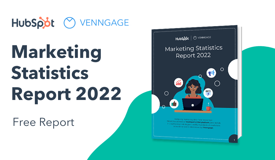
NEW! Introducing: Marketing Statistics Report 2022
It’s 2022 already. Marketers, are you still using data from pre-COVID times?
Don’t make decisions based on outdated data that no longer applies. It’s time you keep yourself informed of the latest marketing statistics and trends during the past two years, and learn how COVID-19 has affected marketing efforts in different industries — with this FREE marketing statistics report put together by Venngage and HubSpot.
The report uses data gathered from over 100,000 customers of HubSpot CRM. In addition to that, you’ll also know about the trends in using visuals in content marketing and the impacts of the pandemic on visual content, from 200+ marketers all over the world interviewed by Venngage.
Grab your copy now — it’s not like any other marketing reports out there, plus it’s 100% free!
There are plenty of examples of statistical infographics that have gone viral. Remember the World’s Deadliest Animal infographic that Bill Gates posted on his blog a few years back? It went viral because it presented a shocking statistic in such an impactful way.

Meanwhile, in the business world, we were excited to see one of our statistical infographics gain some serious traction: 10 Visual Content Marketing Statistics. Years after being published, this infographic still pulls in some of the highest traffic on our blog.

That’s because the infographic is highly relevant to marketers. It’s easy to scan for stats that marketers can cite in their own blog posts, ebooks, and infographics.
Not a marketer? You might have seen our viral Games of Thrones post where we mapped every single betrayal within the show… (and there were A LOT).

One of the best things about infographics? Anyone can make them, even if you don’t have a design background. Plus infographics are fun and easy to share on social media or in your own blog!
How to create a statistical infographic:
- Pick an infographic template that fits your topic.
- Customize the icons, charts, pictograms and maps to fit your data.
- Customize the color scheme, fonts and decorative visuals to fit your brand.
- Share your infographic design in a blog post, on social media, in a white paper–anywhere you need to communicate data in an engaging way!
Keep reading for 20 statistical infographic templates to get you started, along with some helpful infographic design tips and inspirational statistical infographic ideas.
 :
1. Use icons to illustrate and emphasize key statistics in your infographic
Icons are simple vector visuals that convey concepts. They’re perfect for illustrating and reinforcing statistics on your infographic.
- Pick an icon that reflects the theme of your statistic.
- Place the icon beside your statistic to draw attention to it.
- Pick a font style and color that matches your icon for the statistic text.
For example, look at how these infographic templates use icons to draw attention to each statistic:


New to the world of icons? Watch: Everything you need to know about ICONS in less than 3 minutes
2. Divide your statistical infographic into sections using colored blocks
A simple but effective way to organize your statistical infographic, while also making the information pop, is to divide the data into segments using solid colored blocks.
You can pick a different color for every section, or alternate between two. Take a look at what this infographic example does to emphasize each of the 6 infographic statistics:

In this presentation design statistics example white blocks have been used on a blue background to help break up the sections of the statistical infographic. This helps achieve a clean and professional look.

3. Create a pictogram to visualize your statistic
Pictograms are data visualization where each unit is represented by an icon. They’re a creative way to visualize a statistic, especially if you’re creating an infographic for social media.
How to make a pictogram:
- Focus on one shocking, surprising or empowering statistic.
- Use icons with a darker shade and a lighter shade of the same color to show a percentage.
- Include descriptive text under the pictogram and pick a bold font to emphasize the number.
Take a look at how this social media infographic combines a pictogram with big, bold text to create an infographic with impact:

You can use a pictochart as the main focus of an infographic, like in the statistical infographic template above, or as a smaller section with a template like in this example:

4. Use a variety of chart types to give your statistical infographic variety
Looking at a row of bar charts with the same style can make it easy for your eyes to skim and miss information. Finding different ways to visualize your statistics will help make your infographic design more engaging.
Try using a bar chart or pie chart for one section and a map for another section, or a pictogram to highlight a particularly important statistic. Check out our full guide on how to pick the right type of charts for your data.
For example, this statistical infographic combines two types of charts and a timeline to make the information engaging:

In this statistical infographic example, a pie chart is used alongside icons and bold fonts to showcase a variety of information. You can use your main chart as a central focus, and use other elements to support the chart.

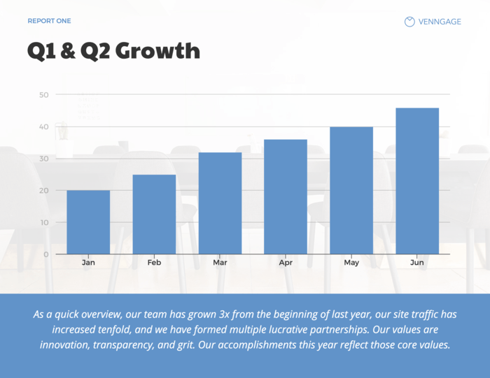
5. Clearly frame the problem or question that your statistic addresses
It’s important to give your audience context for why they should care about your statistic. That’s why, if you’re presenting your data in a chart, it’s good practice to include a description under your chart. If you’re pressed for space, at least include a descriptive header.
For example, this powerpoint slide template provides context for the chart in the side bar by explaining the problem (dealing with customer complaints). Then, a description under the chart describes the data and suggests what readers should take away from it:

You can use a combination of text and icons, as well as numbers in a bold font to help express to readers why your statistic is important. For this Fireworks Safety infographic this approach of icons and text helps convey the seriousness of the situation to readers instantly.

6. Use a contrasting color to highlight a point on a chart that you want readers to notice
If you’re using data to back up an argument you’re making, then you want to make sure that people take away the right information from your charts. In that case, using a color that highlights the particular data point you want them to look at can help.
Pick one color for the rest of the bars, sections or points on your chart, and pick one contrasting color for the particular point you want to emphasize.
Take a look at how this statistical infographic chart uses a contrasting color and an icon to draw attention to “Big Data”:

If you are creating your statistical infographic for a brand or company make sure to use their brand colors and brand fonts in the design. Making sure that you use the same colors and fonts throughout all of the materials you produce is really important for professional looking designs.
It’s super easy with Venngage’s My Brand Kit tool. Business users can upload their logos and fonts, and select a color palette and see it instantly applied to their designs.
7. Annotate your charts clearly so that your data is easy to understand
While you should generally include a description of your chart to give your readers context, you may also want to annotate your charts to give readers a deeper understanding of particular points.
This is particularly helpful if you want to explain outlier points on a chart. You can annotate your charts by simply as adding a label or brief description and highlighting particular points.
For example, look at how this statistical infographic template uses a red circle to highlight two particular points, and a label to explain why the numbers dip so much at that one point:

8. Don’t be afraid to give your statistical infographic personality with quirky icons and visual motifs
Just because you’re working with statistics, doesn’t mean you infographic design has to be dry. Especially if your brand is known for being fun and approachable!
Icons are the perfect way to introduce some personality to your design. Pick icons that reflect the theme of your data, with colors that match your brand and/or the mood you want your statistical infographic to convey.
For a fun example, take a look at how speech bubble icons are used in this coffee infographic:

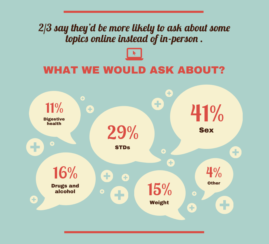
If you are creating a statistical infographic about a serious or sensitive subject, you can still use icons to create bold visual elements. In this LBGTQ infographic example, the stat “4/10 LGBT Youth believe their community is not accepting of LGBT persons” uses pink crosses and simple black icons to add impact to that statement.

9. Create an illustration about your infographic statistics using icons
Another creative way you can use icons is to use them as the building blocks for an illustration. Search for icons (Venngage has a library of over 40,000….) of objects you want to include, and arrange the icons the same way you would arrange parts of a drawing.
For example, this statistical infographic template uses speech bubble icons to illustrate conversations happening:
In this coffee infographic various icons have been used to illustrate the whole story of coffee in a visual appealing way. The use of arrows really helps propel the journey forward, and we can see the progression of the seeds to the plants really easily.

10. Group your statistics into sections based on the topic, key information, or region of the data
To encourage people to find patterns and make connections with your data, it can be helpful to group the data into sections. Look for connecting characteristics or theme in your statistics and group them into sections in your infographic, with descriptive section headers.
Ways you can group data in your statistical infographic:
- By topic
- By region
- By demographic
- By time period
For example, this statistical infographic template groups data by region and topic:

In this statistical infographic example, we’ve grouped information into specific “company culture myths”, and then used a combination of charts, graphs, and text as well as visual cues like green fonts and check marks.

Breaking the infographic up like this into “sections” helps the reader digest information more easily. Want to see how we used this infographic? Check out our Busting 8 Company Culture Myths blog post.
11. Use directional cues in your statistical infograph to guide readers’ eyes to the most important data
Smart infographic design means thinking about how your audience will read your infographic.
Things to think about it when you design your infographic:
- What is the biggest thing you want them to take away from reading your infographic?
- What information do you absolutely not want them to miss?
- What order do you want them to read the information in?
In all of those cases, directional cues can guide readers to the information you want.
Directional cues are visual indicators of where a reader should look. Think visuals like arrows, lines, pointing, numbers, and eyes looking in a certain direction.
For example, this statistical infographic template uses lines to guide readers from section to section. The zig-zag layout also helps keep readers engaged, since it’s a break from your typical right-to-left layout:

Directional cues don’t always have to be as obvious as arrows or connecting lines though. Sometimes adding bold headers is enough to guide the readers eyes down the page.
In the statistical infographic we created for our Marketing Strategies blog post, we used bold colors in the header banners to help break up the sections, and to entice our audience to keep reading.

12. Use one bold color on a neutral background to make numbers, icons and key text pop
When set against a neutral or greyscale background, color highlights really stand out. If you want specific number or text to stand out, make those key parts a bold, bright color. That way, even if someone is just skimming over your infographic, they won’t likely miss those parts.
Take a look at how this infographic template uses color to make a few key elements pop out at you:

13. Use color highlights and matching flat icons for a modern, minimalist design
Do you want to put your statistics forward, without too many distractions? Then you may want to opt for a more minimalist design.
Use a neutral background color and make fonts and a few flat icons the backbone of your design. For example, this infographic uses a light blue accent color to emphasize the statistics:

14. Overlay charts on a background image that reflects the theme of the data you are representing
A simple hack for making charts more engaging is to place them over a background image.
Make sure the background image has muted colors, so the chart numbers and points stand out. You can do that by selecting the background image and adjusting the image opacity to make it more see-through.

The result is a chart with a background image that reflects the theme of the data, but doesn’t take away from the data.
15. Pick one shocking or game-changing statistic for a social media infographic
When you’re creating infographics specifically for social media, the key is to not go overboard with your design. Since people will probably be looking at your infographic on mobile, you need to optimize your image for mobile viewing.
A few key things to keep in mind when designing a social media infographic for social media:
- Keep your infographic brief and focused on one key statistic.
- Use brief text in bold, easy to read fonts.
- Use one focal visual to stop readers in their tracks and draw them in.
For example, this social media infographic template uses an eye icon to grab people’s attention. Then, the infographic pulls them in with a relevant statistic to the audience (in this case, marketers):

Got too many interesting statistics to just pick one? If you want to share multiple statistics within your infographic make sure that you differentiate each statistic with a different design. Separating statistics this way helps each statistic deliver impact without your infographic becoming confusing.

16. Number your list of statistics to make it easier for readers to scan your infographic
Articles with numbers in the titles are popular. Using the same token, you can number the points on your infographic to encourage people to want to read it.
Something about a numbered list just feels nice and organized!
According to our study on blog titles, 3, 4, 5, 7 and 10 are actually the best numbers to use in a blog article title or an infographic. This statistical infographic template uses the number 7:

17. Try using a light text and visuals on a dark background for a boldly contrasting design
We’re all used to designs with stark white backgrounds and cool, metallic accents. If you want your design to stand out, try making your infographic design unexpected.
One way to do that is to use a dark background, with light accent colors. Just make sure that your text is easy to read!
For example, this statistical infographic template uses a bold color scheme of white text and charts on a black background, with shadow-like grey icons.

18. Use statistical infographics as a marketing material
Infographics are highly visual, highly shareable graphics that are perfect to use as a marketing material for your business. Adding extra value for your customers or clients is a great way to help build your reputation and stand out amongst your competitors.
Since statistical infographics are used to visualize complex ideas or data, a real estate infographic can be used to help explain the current market, the real estate progress or specific features of the property.
In this real estate infographic example a variety of icons, data, and design styles are used to help clearly and easily explain a complicated element of rental properties.

Using a statistical infographic is also a great way to promote your website. Blog posts or articles can easily be turned into infographics which can then be shared on social media. It’s something that we at Venngage do so often that we even wrote an entire blog post on repurposing content!
For this healthy living website, they created a food infographic to help share their findings about healthy countries around the world:

Remember:
When you set out to create a statistical infographic, the most important thing to focus on is making the data easy to understand. When in doubt, ask someone to look your infographic over and see if they understand the information.
Want more infographic design tips? Here are some more guides:
9 Infographic Templates to Help You Present Data Visually
10 Flow Chart Templates, Design Tips and Examples
20 Timeline Template Examples and Design Tips